Two of my favorite string-manipulation functions in the SAS DATA step are the COUNTW function and the SCAN function. The COUNTW function counts the number of words in a long string of text. Here "word" means a substring that is delimited by special characters, such as a space character, a
Search Results: ellipse (50)
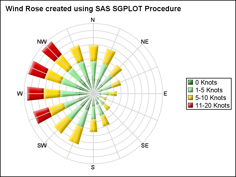
Last week I posted an article on displaying polar graph using SAS. When the measured data (R, Theta) are in the polar coordinates as radius and angle, then this data can be easily transformed into the XY space using the simple transform shown below. x=r*cos(theta * PI / 180); y=r*sin(theta * PI

There are many situations where it is beneficial to display the data using a polar graph. Often your data may contain directional information. Or, the data may be cyclic in nature, with information over time by weeks, or years. The simple solution is to display the directional or time data
~ This article is co-authored by Biljana Belamaric Wilsey and Teresa Jade, both of whom are linguists in SAS' Text Analytics R&D. When I learned to program in Python, I was reminded that you have to tell the computer everything explicitly; it does not understand the human world of nuance

I began 2015 by compiling a list of popular articles from my blog in 2014. Although this "People's Choice" list contains many interesting articles, some of my favorites did not make the list. Today I present the "Editor's Choice" list of articles that deserve a second look. I've highlighted one
The topic of VENN diagrams had come up a while ago. At that time, I thought it may be interesting to build a proportional VENN diagram. But, reading up on VENN Diagrams, I learned that VENN diagrams represent all intersections of N sets, regardless of whether there are actually any observations in one

This SAS tutorial video will show you how to generate plots for two continuous numeric variables with Base SAS. Basic scatter plots, linear or curvilinear regression lines, confidence intervals or ellipses, and multiple plot overlays are demonstrated. To learn more about this topic, check out our SAS Programming 1: Essentials
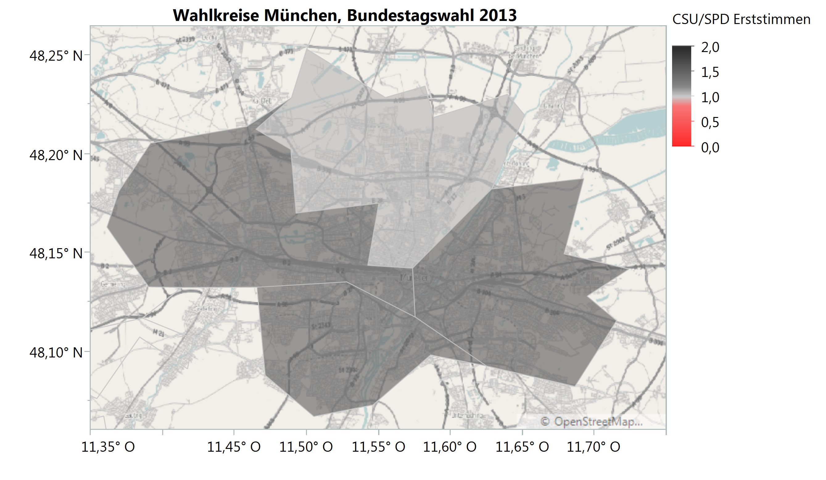
Wahlen sind ein beliebtes, aber auch kontrovers diskutiertes Thema. Es erregt Gemüter, liefert Diskussionsstoff und polarisiert Meinungen. Insbesondere Präsidentschaftswahlen oder Parlamentswahlen sind für Medien wie Volk gleichermaßen von großem Interesse. Aber auch Kommunalwahlen haben durchaus ihren Reiz. Vor allem wenn sie eine nahezu historische Bedeutung haben und eine Ära zu
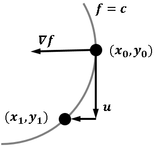
Like many other computer packages, SAS can produce a contour plot that shows the level sets of a function of two variables. For example, I've previously written blogs that use contour plots to visualize the bivariate normal density function and to visualize the cumulative normal distribution function. However, sometimes you
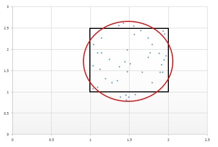
Engineers who implement process control can use analytics to think outside the of box. Better yet, they can use analytics to help solve the issues and risks associated with being inside the box or outside the box in the first place. Read on to learn what box I'm referring to
A recent article in the SAS and R blog was about current winter temperatures in Albany, NY. The temperature data for the recent winter (Dec 2011 - Mar 2012) was plotted on a polar graph. Robert Allison posted an article on displaying the same data as a Polar Graph using SAS/GRAPH . Here is his
In the previous post, “Roses are red, violets are blue…”, I discussed the general problem of getting style attributes to line up with specific group values and some ways to overcome the problem. In this installment, I want to elaborate on the attribute map functionality in the Graph Template Language
This classic start to a romantic poem assumes that the correct colors are always assigned to the correct flowers; but, for those who create graphs for reports, consistent color assignment can be more of a challenge than an assumption. This challenge is particularly true for the display of group values.
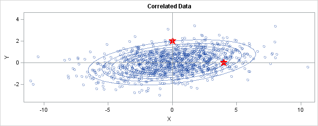
I previously described how to use Mahalanobis distance to find outliers in multivariate data. This article takes a closer look at Mahalanobis distance. A subsequent article will describe how you can compute Mahalanobis distance. Distance in standard units In statistics, we sometimes measure "nearness" or "farness" in terms of the
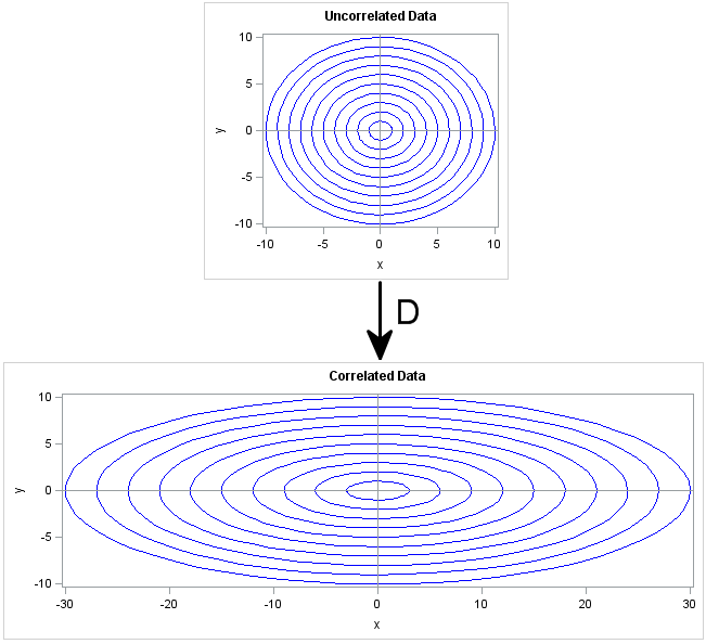
A variance-covariance matrix expresses linear relationships between variables. Given the covariances between variables, did you know that you can write down an invertible linear transformation that "uncorrelates" the variables? Conversely, you can transform a set of uncorrelated variables into variables with given covariances. The transformation that works this magic is
When I give presentations on using the SG procedures, I try to describe how you can take simple plots and layer them to create more complex graphs. I also emphasize how you must consider the output of each plot type so that, as you overlay them, you do not obscure
In this blog we will discuss many aspects of the SG Procedures. This article will cover some basic features and workings of the SGPLOT procedure to establish a baseline. The single-cell graph is the work horse for data visualization. From the simple bar chart to the complex patient profiles for clinical

A few sharp-eyed readers questioned the validity of a technique that I used to demonstrate two ways to solve linear systems of equations. I generated a random n x n matrix and then proceeded to invert it, seemingly without worrying about whether the matrix even has an inverse! I responded to the
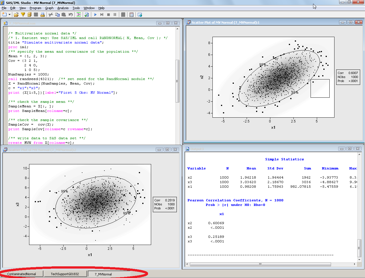
NOTE: SAS stopped shipping the SAS/IML Studio interface in 2018. It is no longer supported, so this article is no longer relevant. When I write SAS/IML programs, I usually do my development in the SAS/IML Studio environment. Why? There are many reasons, but the one that I will discuss today
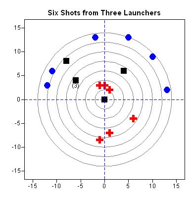
I was inspired by Chris Hemedinger's blog posts about his daughter's science fair project. Explaining statistics to a pre-teenager can be a humbling experience. My 11-year-old son likes science. He recently set about trying to measure which of three projectile launchers is the most accurate. I think he wanted to


