I was inspired by Chris Hemedinger's blog posts about his daughter's science fair project. Explaining statistics to a pre-teenager can be a humbling experience.
My 11-year-old son likes science. He recently set about trying to measure which of three projectile launchers is the most accurate. I think he wanted to determine their accuracy so that he would know which launcher to use when he wanted to attack his little sister, but I didn't ask. Sometimes it is better not to know.
He and his sister created a bullseye target. They then launched six projectiles from each of the three launchers and recorded the location of the projectile relative to the center of the target. In order to make the experiment repeatable, my kids aligned each launcher with the target and then tied it down so that it would not move during the six shots.
For each launcher, they averaged the six distances to the center. The launcher with the smallest average distance was declared to be The Most Accurate Launcher in the World.
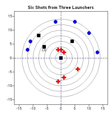
In the accompanying figure, the red crosses represent the winning launcher. The average distance to the center is 5.2 centimeters, whereas the black squares have an average distance of 6.7 cm and the blue circles have an average distance of 13.1 cm. Three of the black squares have the same location and are marked by "(3)."
When I saw the target on which they had recorded their results, I had a hard time containing the teacher in me. This target shows two fundamental statistical concepts: bias and scatter.
Bias Explained
When I look at the target, the first characteristic I see is bias due to a misalignment of the launchers. Two of the three launchers are aimed too high relative to the bullseye. This kind of experimental error is sometimes known as systematic bias because it leads to measurements that are systematically too high or too low.
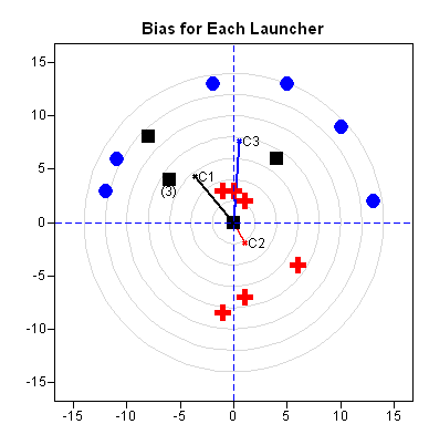
The second figure shows the average locations of projectiles for each launcher. The average location of the red crosses (marked "C2") is the closest to the center of the target. The next closest is the center of the black squares, which is marked "C1." The fact that "C1" and "C3" are far away from the center of the target shows the bias in the experiment.
I pointed this out to my son, who shrugged. "I guess the launchers weren't perfectly lined up," he said.
Thinking that perhaps he might want to realign the launchers and re-run the experiment, I asked him what he intended to do about this bias.
He hesitated. I could see the wheels turning in his mind.
"Aim low?" he guessed.
Scatter Explained
The second feature of the data that I see is the scatter of the projectiles. The way that the projectiles scatter is measured by a statistical term known as the covariance. The covariance measures the spread in the horizontal direction, the vertical direction, and jointly along both directions.
I pointed out to my son that the red crosses tend to spread out in the up-down direction much more than they do in the left-right direction. In contrast, the black squares spread in both directions, but, more importantly, the directions tend to vary together. In four out of five cases, a shot that was high was also left of center. This is an example of correlation and covariance.
I asked my son to describe the spread of the blue circles. "Well," he cautiously began, "they vary a little bit up and down, but they are all over the place left-to-right."
"And do the shot locations tend to vary together?" I prompted.
"Um, not really," he replied.
Bingo! Covariance explained. All of the launchers show up-and-down and left-and-right variability, but the black squares also exhibit co-variability: the deviations in the horizontal direction are correlated with the deviations in the vertical direction.
For Adults Only
My son ran off to attack his sister, grateful to escape my merciless questioning.
I carefully measured the locations of the data, created a SAS DATA step, and began to analyze the data in SAS/IML Studio.
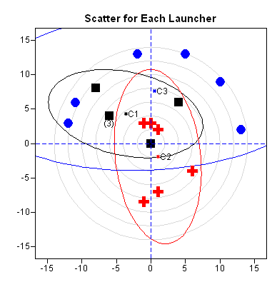
The third figure shows the center of each group of projectiles. I have also added ellipses that help to visualize the way that the projectiles scatter. (Each ellipse is a 75% prediction ellipse for bivariate normal data with covariance equal to the sample covariance.)
The ellipses make it easier to see that locations of the red crosses and blue circles do not vary together. The red ellipse is tall and skinny, which represents a small variation in the horizontal direction and a medium variation in the vertical direction. The blue ellipse is very wide, representing a large variation in the horizontal direction. The black ellipse is tilted, which shows the correlation between the horizontal and vertical directions.
The programming techniques that are used to draw the figures are described in Chapters 9 and 10 of my book, Statistical Programming with SAS/IML Software.

1 Comment
Pingback: Eight blogging secrets from a successful corporate blogger - Customer Analytics