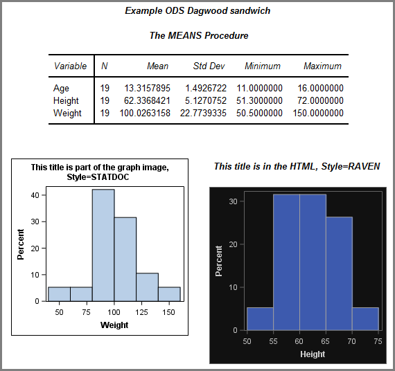
Search Results: sgplot (958)

Rick Wicklin 0
Regression coefficient plots in SAS

Last week's post about odds ratio plots in SAS made me think about a similar plot that visualizes the parameter estimates for a regression analysis. The so-called regression coefficient plot is a scatter plot of the estimates for each effect in the model, with lines that indicate the width of

Rick Wicklin 0
The relationship between toothlessness and income

My colleague Robert Allison finds the most interesting data sets to visualize! Yesterday he posted a visualization of toothless seniors in the US. More precisely, he created graphs that show the estimated prevalence of adults (65 years or older) who have had all their natural teeth extracted. The dental profession

Data Visualization
Sanjay Matange 0
Big Data Visualization

Big data is a popular topic, with multiple articles about the analysis of the same.  Today, "Big Data" is measured in multiple of Tera Bytes, and SAS provides special software for analysis and visualization of Big Data - Visual Analytics. When data is very big, it may be meaningless, let alone inefficient, to plot

Rick Wicklin 0
Simulating a drunkard's walk in SAS

You've probably heard of a random walk, but have you heard about the drunkard's walk? I've previously written about how to simulate a one-dimensional random walk in SAS. In the random walk, you imagine a person who takes a series of steps where the step size and direction is a

Data Visualization
Sanjay Matange 0
Bubble Plots

Bubble Plots provide additional ways to visualize your data.  The plot supports display of multiple response characteristics of the data in one graph.  Bubble plots were introduced with SAS 9.3 in GTL and SG Procedures. A bubble is drawn at each (x, y) point in the graph, and each bubble is

Data Visualization
Sanjay Matange 0
Is that Annotate?

The SGPLOT procedures includes features to add annotations to your graph in many different ways.  Annotations provide you a flexible way to add features to your graph that are not available through the standard plot statements. Recently, I saw this graph on the web that caught my attention.  Clearly, this looks like

Rick Wicklin 0
Fit a circle to data

I still remember the first time I was asked to "consult" on a statistical problem. A former physics professor had some students who had gathered data that should lie along an arc of a theoretical circle. The professor asked if there was a regression technique that could find the center

Rick Wicklin 0
Direct me to the nuclear Bessels!

When I was an undergraduate physic major, my favorite professor would start each class with a joke or pun. One day he began class with a paraphrase of a famous quote from the movie Star Trek 4: The Voyage Home (the one with the whales). "Today," my professor said, imitating

Rick Wicklin 0
Improving the NC vehicle inspection pie chart

North Carolina is a state that requires yearly inspections of motor vehicles. An inspection checks for safety features (lights, brakes, tires,....) as well as checking vehicle emissions to ensure that vehicles meet air pollution standards. I recently had a car inspected and noticed a pie chart on the inspection's summary

Data Visualization
Sanjay Matange 0
Report from SGF 2015

SGF 2015 was a blast with a focus on Visual Analytics, SAS Studio, Hadoop and more.  Graphs were everywhere, and it was a banner year for ODS Graphics with over 15 papers and presentations by users on creating graphs using SG Procedures, GTL and Designer. Dan Heath, Prashant Hebbar, Scott

Rick Wicklin 0
Create a cascade chart in SAS

Sometimes different communities use the same name for different objects. To a soldier, "boots" are rugged, heavy, high-top foot coverings. To a soccer (football) player, "boots" are lightweight cleats. So it is with the term "waterfall plot." To researchers in the medical field, a "waterfall plot" is a sorted bar

Rick Wicklin 0
Create a waterfall plot in SAS

In clinical trials, a waterfall plot is often used to indicate how patients in the study responded to treatment. In oncology trials, the response variable might be the percent change in the size of a tumor from the individual's baseline value at the start of the trial. The percent change

Data Visualization
Sanjay Matange 0
Micro Maps

MicroMaps are a powerful way to display data where the display includes small, lightweight maps to provide geographical information regarding the data.  This geographical information gives clues to the relationship between the data that could lead to more insight. The SAS SG Procedures and GTL do not currently have built-in

Rick Wicklin 0
The distribution of Pythagorean triples by angle

Last week I was chatting with some mathematicians and I mentioned the blog post that I wrote last year on the distribution of Pythagorean triples. In my previous article, I showed that there is an algorithm that uses matrix multiplication to generate every primitive Pythagorean triple by starting with the

Data Visualization
Sanjay Matange 0
Sankey Diagrams

Sankey Diagrams have found increasing favor for visualization of data.  This visualization tool has been around for a long time, traditionally used to visualize the flow of energy, or materials.   . Now to be sure, GTL does have a statement design for a Sankey Diagram which was implemented only in Flex for use

1 21 22 23 24 25 32