Big data is a popular topic, with multiple articles about the analysis of the same. Today, "Big Data" is measured in multiple of Tera Bytes, and SAS provides special software for analysis and visualization of Big Data - Visual Analytics.
 When data is very big, it may be meaningless, let alone inefficient, to plot a scatter plot of such data. This is especially true when the data is on a server, and we want to create a X-Y plot on a local computer. Bringing all the data down to plot is prohibitive, and the result is not very helpful.
With the release of SAS 9.40M3 this week, the SGPLOT procedure introduces the HEATMAP statement, a plot type suited for visualization of bigger data. In this case, the data can be analyzed and binned into discrete bins along X and Y axis, and the results displayed using a color gradient.
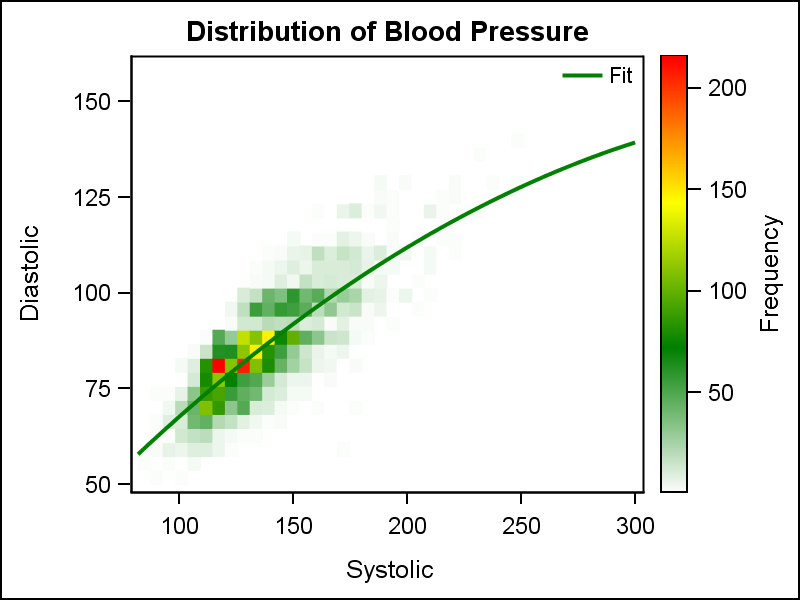
The graph above shows a heat map of the distribution of the subjects in a study for Diastolic and Systolic blood pressure. Admittedly, this graph is of a relatively small data set "sashelp.heart". This data set has about 5200 observations, which is small from a "Big Data" perspective. But for our purposes, we can assume we have a data like this for millions of subjects or billions of credit card transactions. The binning of the data is done on a fast server, along with the computation of the regression fit. Only the "graphical" information for drawing the bins and the curve are sent to the renderer to creating this graph.
title 'Distribution of Blood Pressure';
proc sgplot data=sashelp.heart;
  heatmap x=systolic y=diastolic / colormodel=(white green yellow red)
          nxbins=40 nybins=30 name='a';
  reg x=systolic y=diastolic / nomarkers degree=2 legendlabel='Fit';
  gradlegend 'a';
  keylegend / linelength=20 location=inside position=topright noborder;
run;
 This graph now allows us to view the blood pressure distribution of the subjects in a study. The Heat Map statement works seamlessly with most other statements available in the SGPLOT procedure, so we can plot a regression plot on the heat map as easily as we did on the scatter plot. In the graph above, I have set a custom color model for the display of the frequency data, starting with white to green to yellow to red, as displayed in the gradient legend on the right. A discrete legend is displayed identifying the Fit plot. This results in a nice, clean graph.
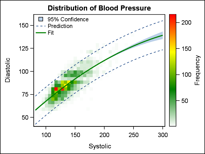
We can go a step further, and display the confidence and prediction limits on the heat map as shown on the right. Once again, the same options are used as would be in the case of a scatter plot.
 For both of these graphs, the X and Y axis represent continuous, numeric data. The data is binned into a set number of bins by default as determined by the underlying analytical code. Bin counts can be controlled as we we have done using the statement options.
Heat Maps are also useful to view response data for the binned data, as shown in the graph on the right. Here, we have a heat map of weight by height of the subjects in the study. However, now each bin now shows the Mean of the Cholesterol level for all the subjects in the bin. This show us the associations between Cholesterol by two analysis variables.
Another interesting use case would be to visualize the credit card balance for all customers of a bank by family income and value of the mortgage.
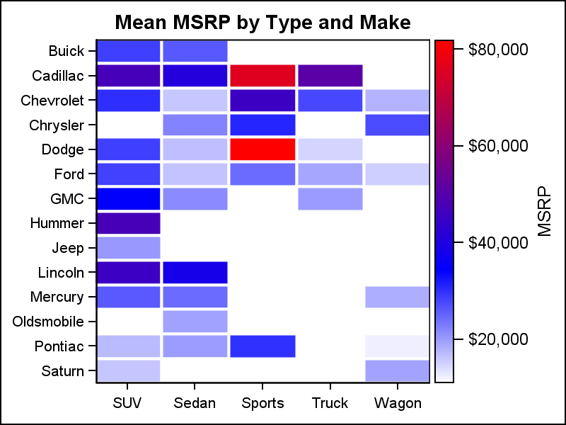 The SGPLOT heat supports numeric axes and discrete axes, and any combination of the two. The graph on the right displays the mean MSRP value of the cars by Type and Make. Both axes are discrete, and each bin displays the mean value of MSRP for all the observations in the bin.
Heat Maps have been supported in GTL, and you can find previous articles on GTL Heat Maps and Calendar Heat Maps.
SAS 9.4M3 code for Heat Maps: HeatMap


1 Comment
Pingback: Unicode in Formatted Data - SAS 9.40M3 - Graphically Speaking