SAS 9.4 Maintenance release 3 was released on July 14. The ODS Graphics procedures include many important, useful and cool features in this release, some that have been requested by you for a while. In the next few articles, I will cover some of these features. Last time I covered the new HeatMap statement useful for Big Data Visualization.
One cool and useful new features is the support for Unicode values in SAS Formats. For long, certain parts of the graph could have Unicode text. These included user provided text strings for Titles, Footnotes, Entries. These support Unicode characters, and also commands such as SUP and SUB to make any character string into a sub or super script.
Other items like Axis Labels, etc. support Unicode strings but not the commands like SUB and SUP. However, there was no way to have data strings (from data set) to be displayed on the axis, data labels or legends. Till now, that is. Now, with SAS 9.40M3 you can have data values that can be displayed in the graph as Unicode strings using the user defined formats.
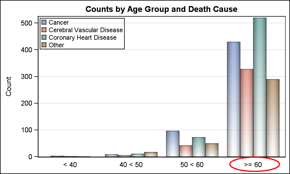 Here is a simple example of a graph showing the counts of deaths by Age Group and Death Cause for the sashelp.heart data set. I have created a format to break up the age values into four groups. Here is the code:
proc format;
value agegroup
0 -< 40 = '< 40'
40 -< 50 = '40 < 50'
50 -< 60 = '50 < 60'
60 -< high = '>= 60'
;
run;
The code for the graph is shown below. The graph is shown on the right. Click on graph to see the full view. Note, I have added some annotation around the last tick value ">= 60", which is the formatted label for the last age group. The full code, including the annotation is shown in the link at the bottom.
title 'Counts by Age Group and Death Cause'; proc sgplot data=sashelp.heart(where=(deathcause ne 'Unknown')) sganno=annoAxis; format ageatdeath agegroup.; vbar ageatdeath / group=deathcause groupdisplay=cluster nooutline baselineattrs=(thickness=0) dataskin=pressed filltype=gradient; keylegend / location=inside across=1 title=''; xaxis display=(nolabel noticks); yaxis label='Count' grid; run; |
Now, with SAS 9.40M3, I can include a Unicode string in the label for the last age group as shown below. Here, I have used the unicode value '2265' for the "greater than or equal" symbol. Note the use of the full default ODS escape character string (*ESC*). This must be used in the format syntax, and a user defined escape char cannot be used.
proc format;
value agegroupUnicode
0 -< 40 = '< 40'
40 -< 50 = '40 < 50'
50 -< 60 = '50 < 60'
60 -< high = "(*ESC*){unicode '2265'x} 60"
;
run;
 Now, running the same SGPLOT code again with the new format name produces the graph on the right. Click on the graph to see the full image. Now, the highlighted tick value uses the Unicode symbol.
This is very convenient, as the only alternative (pre SAS 9.40M3) is to replace the tick value using annotate, which is a messy and non scalable process. Now, the value is what you want, and will automatically adjust to changing data, sort, graph orientation, etc.
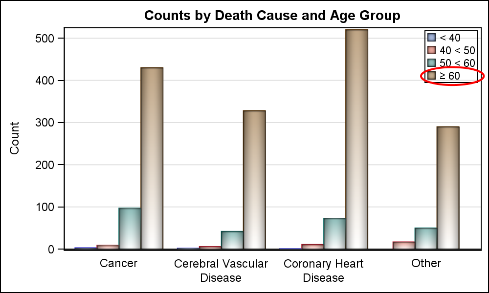 To illustrate this point, the graph on the right switches the category and group roles. Now, age group is used as a group, so the formatted value for the fourth group is displayed in the legend. Using this new technique, this happens automatically, no extra work is required.
It is still not possible to send entire long Unicode strings in the data set itself. However, most of the use cases can be handled by creating a format that includes the unicode value.
Aside: Personally, I don't like to see grid lines showing through the transparent bars. I have prevented that in this graph. Can you see how I did that in the linked code?
I know some of you already have SAS 9.40M3. Please give this a spin to see how well this works for you and the mileage you get from it. You still cannot use the SUP and SUB commands to do something like Alpha ** Beta, but many simple numeric powers and subscripts are available in the Unicode fonts. Please chime in with your comments.
Full SAS 9.40M3 program: Unicode


2 Comments
Thank you for this post Sanjay! It's great to know that it's much easier to use Unicode values within graphs.
Regarding your question, I guess your using the code below to first create bar charts that are filled with the color white (to make the bar charts be in front of the gridlines), and then you're putting the transparent bars over the white bars. That's a nice trick!
vbar deathcause / group=ageatdeath groupdisplay=cluster fillattrs=(color=white);
vbar deathcause / group=ageatdeath groupdisplay=cluster nooutline
baselineattrs=(thickness=0) dataskin=pressed filltype=gradient name='a';
Thanks!
Pingback: How to create checklist tables in SAS® - SAS Users