Search Results: sgplot (958)

Analytics | Data Visualization | Learn SAS | Programming Tips
Sanjay Matange 0
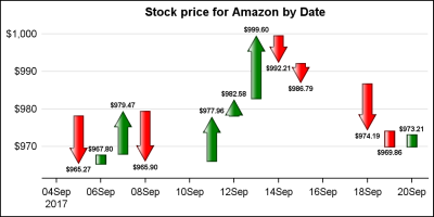
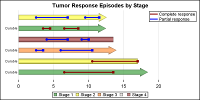
Getting started with SGPLOT - Part 8 - Horizontal HighLow Plot

On a recent visit to an In-House Users Group meeting at a Pharmaceutical company, I presented a 1/2 day seminar on creating Clinical Graphs using SG Procedures.  Polling the audience for their experience with these procedures indicated that many SAS users are not familiar with these new ways to create graphs. So,

Data Visualization | Learn SAS | Programming Tips
SAS Korea 0
Proc SGplot으로 '멋진' 지도를 만드는 법

예술가들은 몇 가지 도구만으로도 멋진 그림을 그릴 수 있습니다. 물론, 물감, 색연필, 목탄 등 선호하는 도구는 저마다 다를 수 있겠지만 말이죠. SAS에서 멋진 그래프를 만드는 방법도 크게 다르지 않은데요, 오늘은 그 방법을 예를 들어 설명해보고자 합니다. SAS에서는 SAS/Graph Proc GMap을 사용하여 멋진 지도를 만들 수가 있습니다. GMap은 SAS가 지도 제작용으로 특별 개발한

Data Visualization
Sanjay Matange 0
Getting Started with SGPLOT - Part 4 - Series Plot

This is the 4th installment of the Getting Started series.  The audience is the user who is new to the SG Procedures.  Experienced users may also find some useful nuggets of information here. Series plots are frequently used to visualize a numeric response on the y-axis by another numeric variable on

Data Visualization
Sanjay Matange 0
Dial KPI using SGPLOT

Last week I was at PharmaSUG 2016, where I presented a 1/2 day seminar on creating Clinical Graphs using SAS.  I was gratified to have a enthusiastic audience of about 28 attendees and we had a great interactive session.  I also presented a paper on Clinical Graphs Using SAS.  More

Rick Wicklin 0
Create a map with PROC SGPLOT

Did you know that you can use the POLYGON statement in PROC SGPLOT to draw a map? The graph at the left shows the 48 contiguous states of the US, overlaid with markers that indicate the locations of major cities. The plot was created by using the POLYGON statement, which

Rick Wicklin 0
Create heat maps with PROC SGPLOT

When SAS 9.4m3 was released last month (including SAS/STAT and SAS/IML 14.1), I was happy to see that a HEATMAP statement had been added to the SGPLOT procedure. Although heat maps in the SAS/IML language have been available for several releases, you previously had to use the Graph Template Language

Data Visualization
Sanjay Matange 0
G100 with SGPLOT

The GCHART procedure has a popular option called G100 to display all the subgroups in % format such that all the subgroup values add up to 100% for each group.   Each subgroup is labeled with its own % values. SGPLOT procedure does not such an option, but with a little bit of

Data Visualization
Sanjay Matange 0
Animation using SGPLOT

Often we want to visualize the relationship between variables over time.  The understanding of such data can be improved by viewing the animated graph over time.  With SAS 9.4, you can create animated graphs using the new animation options on the OPTIONS statement and the PRINTER destination. A popular example an

1 2 3 4 32