All Posts


Comparing Logistic Regression and Decision Tree - Which of our models is better at predicting our outcome? Learn how to compare models using misclassification, area under the curve (ROC) charts, and lift charts with validation data. In part 6 and part 7 of this series we fit a logistic regression


Synthesizing data? Who does that? Aren’t we supposed to be running the experiments and measuring things to produce real data? While generally true, there are scenarios in which the use of generative AI (GenAI) is beneficial. Let’s explore the benefits via “what if” scenarios. Before we begin, it’s important to
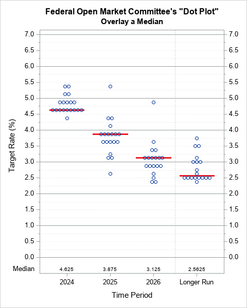

A dot plot is a standard statistical graphic that displays a statistic (often a mean) and the uncertainty of the statistic for one or more groups. Statisticians and data scientists use it in the analysis of group data. In late 2023, I started noticing headlines about "dot plots" in the


Authors: Steven Harenberg and Amy Becker The total solar eclipse taking place across a thin band of the United States on April 8, 2024, is going to be a stellar event. In this post, we will help plan a journey to see the total solar eclipse. We will use algorithms
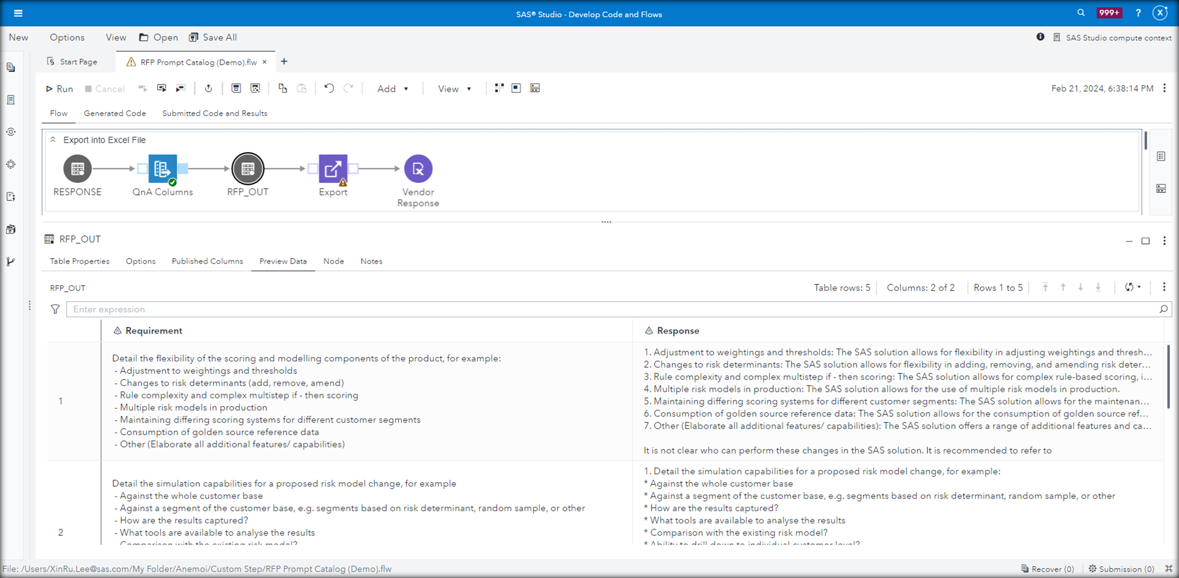

SAS Viya can allow users and organizations to more easily interface with the LLM application, build better prompts and evaluate systematically which of these prompts leads to the best responses to ensure the best outcomes.


There's a lot to gain for insurers that move fast enough to adopt promising applications of trustworthy AI.


Imagine if your job was to sort a massive pile of 40,000 stones into about 200 buckets based on their unique properties. Each stone needs to be carefully examined, categorized and placed in the correct bucket, which takes about five minutes per stone. Fortunately, you’re not alone but part of
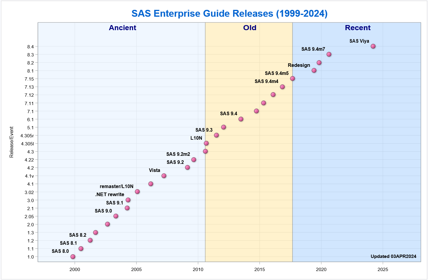

My colleague Rick Wicklin maintains a nifty chart that shows the timeline of SAS releases since Version 8. A few of you asked if I could post a similar chart for SAS Enterprise Guide. Here it is. Like Rick, I used new features in SAS 9.4 to produce this chart


Customers are buzzing with stories of how SAS Viya has transformed how people work with AI, data and analytics. But where are these stories coming from? Users across various industries have shared their experiences, highlighting the impact SAS Viya has had on their productivity, decision making and overall work experience.


This International Women's Day (IWD) was one of the best yet, with exciting things to celebrate across the globe! From a new blog series to upcoming events at SAS Innovate, Women in Analytics (WIA) is excited to play a part in empowering and advocating for women at SAS and outside


SAS' Varun Valsaraj demonstrates how to build a digital assistant for a warehouse space optimization use case.


Do you get excited about the newest innovations and technologies on the market, the world of data and the future of AI? Then mark your calendars because SAS Innovate in Las Vegas is just around the corner. SAS Innovate, our annual event for business leaders, technical users and SAS partners,

Recently, I saw a scatter plot that displayed the ticks, values, and labels for a vertical axis on the right side of a graph. In the SGPLOT procedure in SAS, you can use the Y2AXIS option to move an axis on the right side of a graph. Similarly, you can


SAS SVP Kimberly May provides an update about the new Support Operating Model.

Adopting analytics and AI in the public sector is changing how governments make decisions. Technology improves the efficiency and transparency of work processes, positively impacting service delivery to increasingly demanding citizens. However, many government organizations still need help fully embracing a data-driven culture. The Covid-19 pandemic is one of the