Comparing Logistic Regression and Decision Tree - Which of our models is better at predicting our outcome? Learn how to compare models using misclassification, area under the curve (ROC) charts, and lift charts with validation data.
In part 6 and part 7 of this series we fit a logistic regression and a decision tree. We assessed each model individually and now we want to determine which of these two models is the best choice based on different criterion like misclassification, area under the curve (AUC), and lift charts.
Using the validation data created in part 4, we will calculate these criterion and decide which model works best based on each criterion.
What to consider when comparing models?
When comparing predictive models, there are several key considerations that a modeler should use to determine which model performs the best for a particular problem. Here are some important factors to consider:
- Accuracy and Performance: One of the primary considerations is the accuracy of the model in making predictions. This can be assessed using various metrics such as accuracy, precision, recall, F1 score, or area under the ROC curve (AUC). The model with the highest performance on these metrics is generally preferred.
- Generalization: It's crucial to assess how well the model generalizes to unseen data. Overfitting, where a model performs well on the training data but poorly on new data, should be avoided. Cross-validation or holdout validation techniques can help evaluate generalization performance.
- Interpretability: Depending on the context and requirements, the interpretability of the model might be important. Simple models like linear regression or decision trees are often preferred when interpretability is crucial, as they provide insights into the relationship between predictors and the target variable.
- Model Complexity: The complexity of the model should be considered, as overly complex models might lead to overfitting and decreased interpretability. Occam's razor principle suggests that simpler models should be preferred if they perform similarly to more complex ones.
- Computational Resources: Practical considerations such as computational resources and time required for training and deploying should also be considered, especially for large datasets or real-time applications.
- Robustness and Stability: A good model should be robust to changes in the data and stable across different datasets. Sensitivity analysis and testing the model's performance under various conditions can help assess its robustness.
- Business Objectives: Ultimately, the choice of the best model should align with the specific objectives of the project and the broader business goals. For example, if the goal is to minimize false positives in a medical diagnosis task, a model with high precision might be preferred over others.
By carefully considering these factors and selecting the model that best balances performance, interpretability, and practical considerations, a predictive modeler can make informed decisions about which model is the most suitable for their particular application.
When to use one comparison criteria over another?
Misclassification rate, area under the curve (AUC), and lift charts are all commonly used evaluation metrics in predictive modeling, but they serve different purposes and are best used under different circumstances:
Misclassification Rate (or Accuracy) Best Use
The misclassification rate, or accuracy, is a straightforward metric that measures the proportion of correct predictions made by the model (i.e. it measures what the model got right vs not right)
When to Use: Misclassification rate is best used when assessing the accuracy of a binary classification model for example for identifying fraudulent transactions in a banking system, where both false positives and false negatives have significant consequences.
Area Under the Curve (AUC) Best Use
AUC is a metric that evaluates the ability of a binary classification model to distinguish between positive and negative classes across all possible threshold values.
When to Use: AUC is best used when evaluating the performance of a machine learning model for example when predicting customer churn in a telecommunications company, where class imbalance is prevalent and accurately distinguishing between churners and non-churners is critical for targeted retention strategies.
Lift Charts Best Use
Lift charts are used to assess the effectiveness of a predictive model in targeting a specific outcome (e.g., response rates, conversion rates) by ranking observations based on their predicted probabilities.
When to Use: Lift charts are best used when analyzing the effectiveness of a predictive model for targeting high-value customers in a marketing campaign, where identifying segments with the highest response rates can optimize resource allocation and maximize return on investment.
Compare the Logistic Regression and Decision Tree Models
Let’s now compare our two models by calculating misclassification, area under the curve and lift for these two models.
To calculate these metrics, we used the percentile action set and the assess action in parts 6 and 7 of this series.
Using Python assign the model name logistic regression and decision tree to the appropriate access data files created using the percentile action set for each model.
# Add new variable to indicate type of model dt_assess["model"]="DecisionTree" dt_assess_ROC["model"]="DecisionTree" lr_assess["model"]="LogisticReg" lr_assess_ROC["model"]="LogisticReg" |
Next append these data files together to create two data frames.
# Append data df_assess = pd.concat([lr_assess,dt_assess]) df_assess_ROC=pd.concat([lr_assess_ROC, dt_assess_ROC]) |
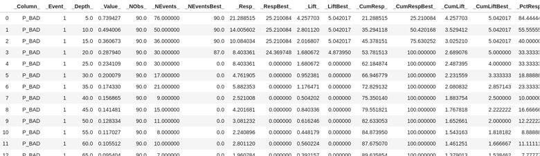
Look at the first few rows of the data from the combined assess action output dataset df_assess. Here you see the values at each of the depths of data from 5% incremented by 5.
Look at the first few rows of data from the combined assess action output data set df_assess_ROC. This data is organized by cutoff value starting .00 and going to 1 incremented by the value of .01.
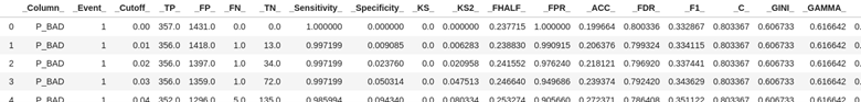
As explained in the last two parts of this series, for decision trees just like logistic regression, we use a cutoff value to make decisions, kind of like drawing a line in the sand. In this case if we use a cutoff value of .03 using the table above it means we are using the prediction probability of .03 to predict if someone is going to be delinquent on their loan. If we look at .03 above then for our validation data with the logistic regression (it was first on our concatenation statement) the predicted true positives will be 356 and true negatives 72.
The default cutoff value is typically .5 or 50% and we will use it to create the confusion matrix.
Create a confusion matrix, which compares predicted values to actual values. It breaks down these predictions into four categories: true positives, true negatives, false positives, and false negatives.
# create confusion matrix cutoff_index = round(df_assess_ROC['_Cutoff_'],2)==0.5 conf_mat = df_assess_ROC[cutoff_index].reset_index(drop=True) conf_mat[['model','_TP_','_FP_','_FN_','_TN_']] |
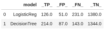
This confusion matrix indicates that the decision tree is doing a better job at predicting the true positives, and the logistic regression is better at predicting the true negatives.
Next let’s calculate and look at the misclassification rate for the two models.
# calculate misclassification rate conf_mat['Misclassification'] = 1-conf_mat['_ACC_'] conf_mat['miss'] = conf_mat[round(conf_mat['_Cutoff_'],2)==0.5][['Misclassification']] conf_mat[['model','Misclassification']] |
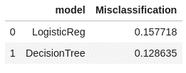
Remember the misclassification rate gives us the rate of what the model got wrong. It his case the misclassification rate for the decision tree is lower at 12.8% vs the logistic regression at 15.7%.
Now let’s calculate the area under the curve (AUC) measurement for each model.
#print Area under the ROC Curve print("AUC (using validation data)".center(40, '-')) df_assess_ROC[["model", "_C_"]].drop_duplicates(keep="first").sort_values(by="_C_", ascending=False) |
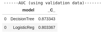
The decision tree again edges out logistic regression with a higher AUC measurement at 0.87 vs 0.80 for logistic regression.
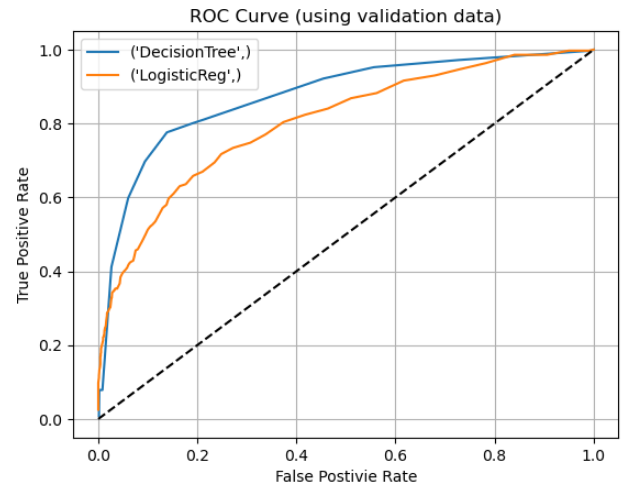
A picture or graph is always a great way to visualize our metrics. Let’s create the ROC chart which will illustrate both the tradeoff of true positives and false positives and show the AUC for both models.
Using the matplotlib package create the ROC charts with both models.
# Draw ROC charts from matplotlib import pyplot as plt plt.figure() for key, grp in df_assess_ROC.groupby(["model"]): plt.plot(grp["_FPR_"], grp["_Sensitivity_"], label=key) plt.plot([0,1], [0,1], "k--") plt.xlabel("False Postivie Rate") plt.ylabel("True Positive Rate") plt.grid(True) plt.legend(loc="best") plt.title("ROC Curve (using validation data)") plt.show() |
The last criterion we will calculate and create is a lift chart.
First, What is a Lift Chart?
A lift chart shows how much better a predictive model is at targeting a specific outcome, like response rates, compared to random selection. It does this by plotting the cumulative response rates of different segments of the population, helping to identify the most responsive groups and optimize marketing strategies.
Using matplotlib package lets plot our lift chart.
# Draw lift charts plt.figure() for key, grp in df_assess.groupby(["model"]): plt.plot(grp["_Depth_"], grp["_Lift_"], label=key) plt.xlabel("_Depth_") plt.ylabel("_Lift_") plt.grid(True) plt.legend(loc="best") plt.title("Lift Chart (using validation data)") plt.show(); |
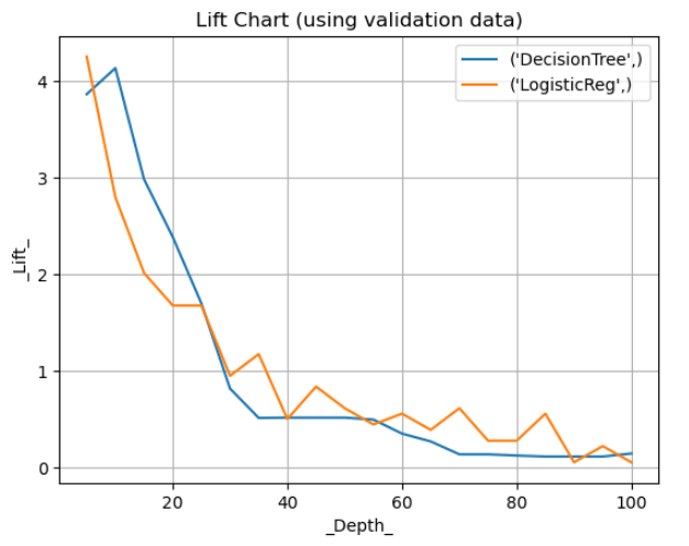
In the depicted chart, at a depth of 20, the lift is approximately 2.5 for the decision tree model and 1.8 for the logistic regression model. This indicates that at the 20% threshold, the decision tree can identify individuals prone to loan delinquency around 2.5 times more effectively than random selection, compared to 1.8 times for the logistic regression model.
The Wrap-Up: Comparing Logistic Regression Model with Decision Tree Model
In conclusion, when comparing the performance of logistic regression and decision tree models for predicting outcomes, it's crucial to consider various evaluation metrics such as misclassification rates, area under the curve (AUC), and lift charts. By assessing each model against these criteria using validation data, we gain valuable insights into their effectiveness and suitability for the task at hand.
Throughout this blog series, we've delved into the intricacies of each model, examining their strengths and weaknesses. Now, armed with a deeper understanding of their performance, we're equipped to make an informed decision about which model to choose.
In our analysis, we found that the decision tree model outperformed logistic regression in terms of misclassification rates, AUC, and lift at a depth of 20. This indicates that the decision tree is better at identifying individuals who are likely to default on their loan, making it a more favorable choice for our predictive modeling task.
However, it's essential to remember that the best model selection ultimately depends on the specific objectives of the project and the broader business goals. By carefully weighing the trade-offs between accuracy, interpretability, and practical considerations, we can ensure that our chosen model aligns with our overarching objectives and delivers actionable insights to drive decision-making.
In the next post, we will learn how to fit a random forest model using the decision tree action set.
Related Resources
SAS Help Center: Percentile Action Set
SAS Help Center: assess Action
SAS Tutorial | How to compare models in SAS (youtube.com)
Building Machine Learning Models by Integrating Python and SAS® Viya® - SAS Users

1 Comment
Melodie, this is a great article on the comparison of models. While the analytic process you is a very good one, you might also want to consider the business need for model selection type as well. For example, if the goal of the model is hypothesis testing, the a logistic model might be preferable to a Decision Tree in that the strength of interactions can be uniquely tested along with main effects whereas in a ML model that isn't always available. How the model is to be used and implemented and for what purpose should be of utmost initial concern in the selection process of the type of model(s) to use.