Get the right information, with visual impact, to the people who need it
Captain Kirk travels into space!

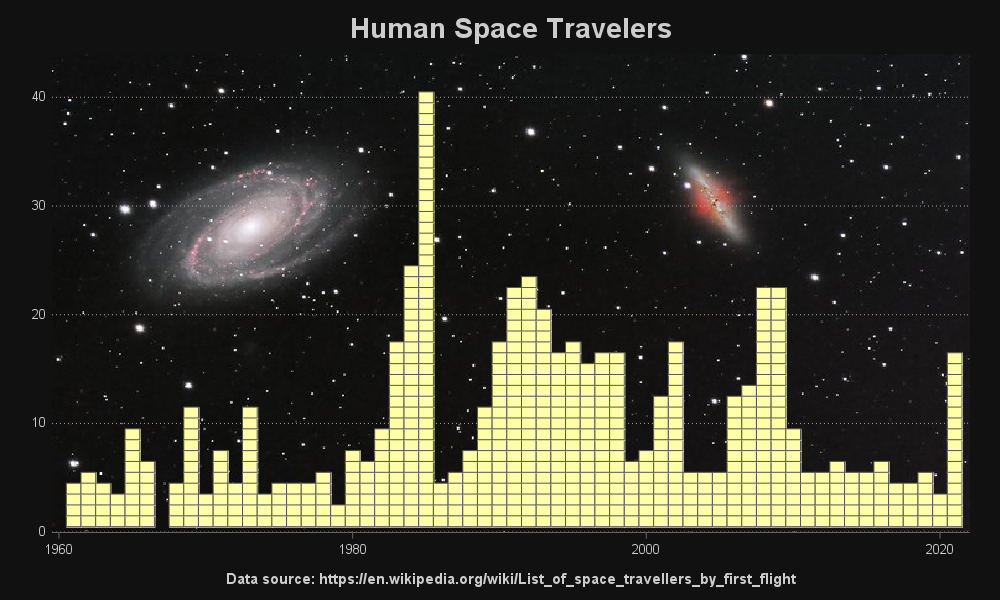
Recently, the news has been all abuzz about William Shatner traveling into space. This was a cool event because he's the oldest person who has traveled into space (at 90 years old) ... and he was also the iconic Captain Kirk from the original Star Trek television series. This got