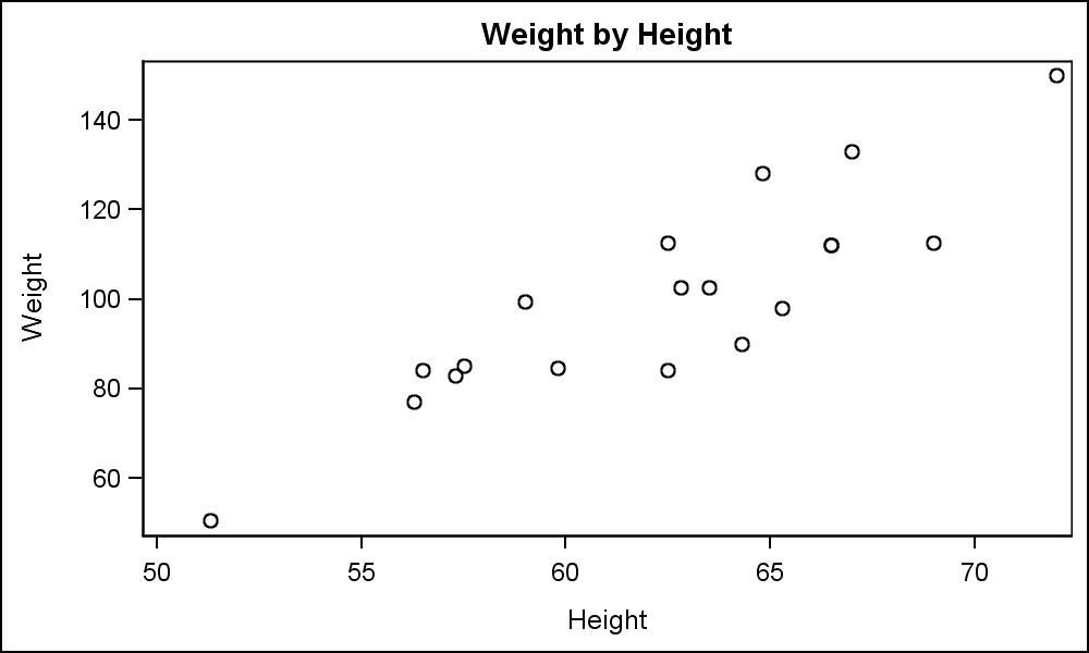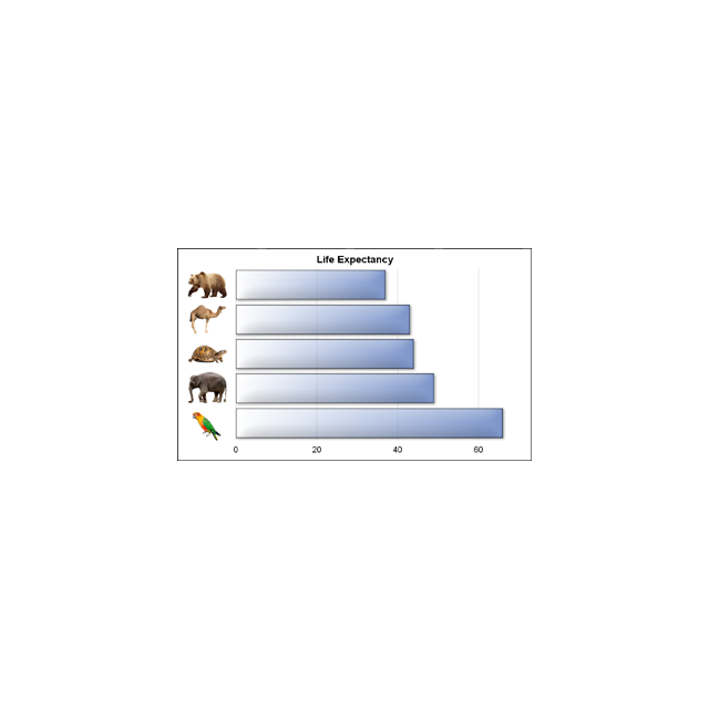
A graph with visual categories

We often say a picture (or graph) is worth a thousand words. So, recursively, this could apply to other text in the graph. I thought it would be interesting to see if we can create a graph with visual categories. Another benefit is that such visual categories are inherently meaningful