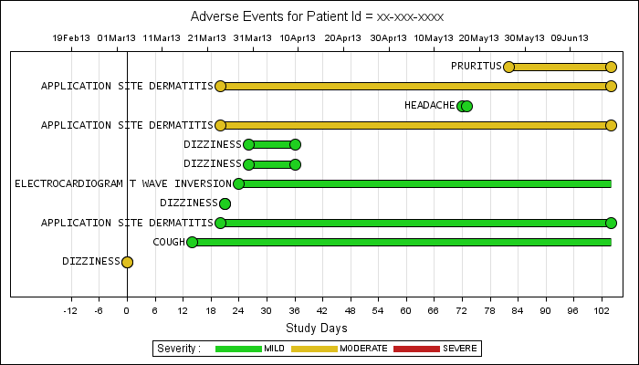
Back in February, I posted an article on creating Adverse Event Timeline Graph. In the SAS 9.2 version (first one), one item that was less than ideal was the way to position the AE names to the left of the event. The AE names are displayed using the scatter plot statement with the markerchar option. The string is displayed center justified at the (x, y) location for the scatter marker.
If the left end of the event is provided as the (x, y) location, the center of the label is placed there, with half the label to the left, and half to the right. The only way I could shift the label fully to the left is to compute a new x location that was offset to the left by half the character string. The character string is in pixels, and with proportional fonts one has to estimate the value of x in "date" coordinates not knowing exactly how much of the graph width is actually used for the x axis, so some approximation is inevitable.
Furthermore, when this method was used by some readers for their own data, the math did not always work out if the coordinates became negative (it did not happen for my use case, so I did not test that use case).
As mentioned in the same article above, SAS 9.3 makes it much easier to create the same graph using the new HighLow plot. But, if you must use SAS 9.2 to create this graph, here is some good news. Over the past few weeks, I have been experimenting with the use of non-breaking space, and have come up with an alternate way to solve this case more elegantly using the nbsp.
The new method avoids computing an approximate new x location for the center of the label all together. So we get away from all that kludgy code. The key to the method is as follows:
- Create a label string twice as long as the original one filled with blanks.
- Stuff the name in the left half of the string, leaving the right half empty.
- Replace all blanks with non-breaking blanks (so they will be retained).
- Use a non-proportional font to draw the names.
- Draw the string at the exact left end of the event (StartDay).
- Presto - the event name is drawn just to the left of the event start.
Here is the new graph:
Here is the full SAS 9.2 code: Full SAS Code_92


14 Comments
Thank you Sanjay for this post,
Currently, I am working on a similar Adverse Events timeline graph in SAS 9.3 and i tried keeping aedecod labels in the left side but i didn't get as you should it was DATALABEL option in sgplot but how to interpret postion(left/right/bottom/up) in datalabel option. can you elobrate the same thing in 9.3. One more thing how to control the keylegend in sgplot. if we have 1-5 saying mild, moderate, severe, Life-threatening, death and in my current data i don't have Life-threatening. i initialize color to all 5 with differnt colours and it displays all 5 colors in legend statment eventhough i don't have Life-threatening. how we can control this in keylegend.
Thanks
Harivardhan
With SAS 9.3, you can use the HIGHLOW plot version of this graph shown in this AE Timeline Graph When using a HighLow plot (with Y=var), only need ot set the HIGHLABEL or the LOWLABEL, and the label will go to the right location. Use TYPE=BAR.
If you only want to see the values present in the data, you need not initialize them at all. Then, only the severities that are present will show in the legend. However, they may not use the right style colors because of their position in the data. In that case, the right way with SAS 9.3 is to set up and use use a DATTRMAP. For info on how to use a DATTRMAP, see the last graph in: Discrete Attr Map
Thanks so much Sanjay,
I used Highlow and it's working now but still the labels are truncating from my left side as some of the AEDECOD labels are huge. what i need to do for this, again need to go for annotation or can we do it in Highlow statment itself? or any alternative approach.
One more intersting question is can i make a single bar for multiple AEDECOD. for example 'DIZZIENESS' is plotting 2 to 3 times in our graph, instead of that can i make all "DIZZIENESS' in single bar showing differnt times having small gaps between them. is it possible ?
by the way My legend problem was solved with DATTRMAP option.
Thanks
harivardhan
You may have set the x axis OFFSETMIN option n you code. This will override the internally computed offsets causing clipping. Try removing any OFFSETMIN value.
Should be possible to create a plot of the AE by name instead of by sequence. I will write up a blog article on this shortly.
Thanks sanjay and waiting for that article.
I got them in one line after plotting the plot by AETERM. now the thing is how can i control the labels which are appearing multiple times on the same bar.
ex: DIZZIENESS -------------------------------DIZZIENESS'----------------------------. so i don't want second DIZZIENESS' in the same bar.
How can we differnciate AE's and SAE's in the same graph . can we create differnet back ground for each of them.
See new blog post.
Thanks so much Sanjay for this new article
Dear Sanjay,
Can we include AE relationship and SAE(serious AE) also in the same graph 'AE by Name'. Now it is covering severity and onset dates. My plan is cover all Adverse events related information in one graph for single subject instead of multiple graphs.
Thanks
Harivardhan
Pingback: AE Timeline by Name - Graphically Speaking
Dear Sanjay,
Can we add AE relationship and seriousness(AE Serious YES or NO) to this graph. Now it is showing severity and onset dates. My plan is showing all AE related information in one graph instead of multiple figures.
Thanks
Harivardhan
I am sure you can extend my sample program to add the features you need.
Hi Sanjay,
Thanks for your presentaion!
I have the following graph..
grouped AE's vs study day..
i want grey line for event free days on x axis and arrows for continued AE.
Could you pls help on this.
RAGHU
It is hard to suggest without a visual of what you want. I suggest make events that cover the AE free duration, and add that to the graph.