Graphically Speaking
Data Visualization with a focus on SAS ODS Graphics
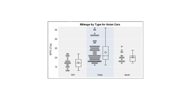
Previously, I discussed ways to create a Box Plot with Stat Table and Markers in the linked article. One of the graphs showed a Box Plot of Cholesterol by Death cause along with the display of the actual observations. The main goal for that article was display of statistics with

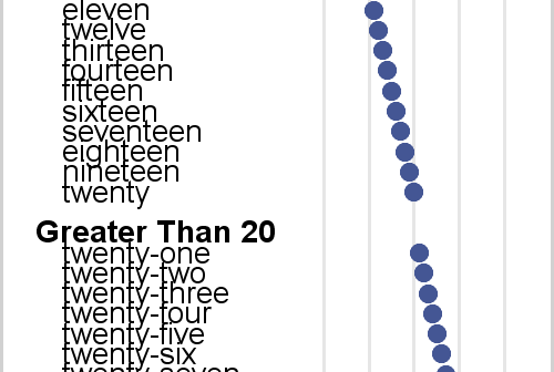
Axis tables enable you to combine tabular and graphical information into a single display. I love axis tables. My involvement with axis tables dates back over 30 years to their ancient predecessor, the table that contains an ASCII bar chart. In the mid 1980s, I created a table in PROC

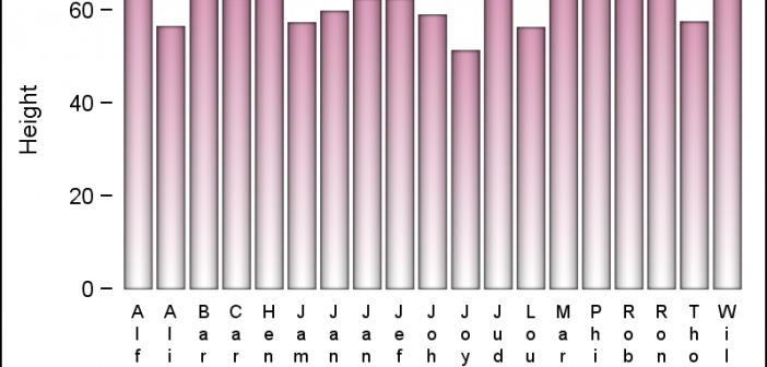
Yesterday, I published an article on Axis values display, where I mentioned the desire expressed by many users to get x-axis tick values in Hotel text orienttion. The name comes from the way many hotel signs are displayed as shown on the right. Such arrangement of text can also be very

