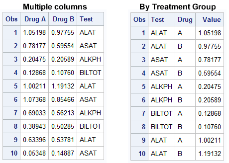
The graph showing the distribution of the maximum liver function test values by treatment for all participants in a study is commonly used for the analysis of safety data in clinical trials. The data is often structured in multiple columns (one per treatment) as below on the left, or grouped by the treatment as shown on the right:
When data is structured in multiple columns, we can create the graph showing the distribution of Max LFT values using overlaid box plots as follows:
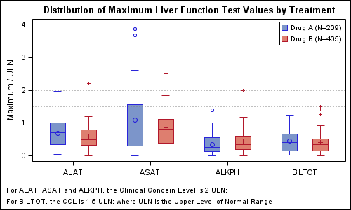
Here we have used an overlay of two box plots, one for each treatment group (column) with DISCRETEOFFSET to place the two treatments side by side. With SAS 9.2, we have to use GTL to create this graph. Here we have used filled boxes.
SAS 9.2 GTL Code Snippet:
proc template; define statgraph Max_LFT_By_TRT; begingraph; entrytitle 'Distribution of Maximum Liver Function Test Values by Treatment'; entryfootnote halign=left "For ALAT, ASAT and ALKPH, the Clinical Concern Level is 2 ULN;" / textattrs=(size=8); entryfootnote halign=left "For BILTOT, the CCL is 1.5 ULN: where ULN is the Upper Level of Normal Range" / textattrs=(size=8); layout overlay / cycleattrs=true yaxisopts=(label='Maximum / ULN') xaxisopts=(display=(ticks tickvalues line)); boxplot x=test y=a / discreteoffset=-0.2 boxwidth=0.2 display=(median mean outliers caps fill) outlineattrs=graphdata1(pattern=solid) meanattrs=graphdata1 medianattrs=graphdata1(pattern=solid) whiskerattrs=graphdata1(pattern=solid) outlierattrs=graphdata1 name='a' legendlabel='Drug A (N=209)'; boxplot x=test y=b / discreteoffset= 0.2 boxwidth=0.2 display=(median mean outliers caps fill) outlineattrs=graphdata2(pattern=solid) meanattrs=graphdata2 medianattrs=graphdata2(pattern=solid) whiskerattrs=graphdata2(pattern=solid) outlierattrs=graphdata2 name='b' legendlabel='Drug B (N=405)'; discretelegend 'a' 'b' / location=inside halign=right valign=top across=1; referenceline y=1 / lineattrs=(pattern=dot); referenceline y=1.5 / lineattrs=(pattern=dot); referenceline y=2 / lineattrs=(pattern=dot); endlayout; endgraph; end; run; |
Full SAS 9.2 GTL Program: Full SAS 92 GTL Code
SAS 9.3 supports box plots with cluster grouping. Provided the data is in the "Grouped by treatment" form shown on the right side above, we can use a single box plot statement, with GROUP=treatment and GROUPDISPLAY=CLUSTER. At SAS 9.3, you can either use GTL, or use SGPLOT procedure to create this graph. Here we have used unfilled boxes.
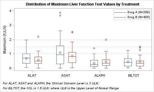
SAS 9.3 SGPLOT code snippet:
title h=10pt 'Distribution of Maximum Liver Function Test Values by Treatment'; footnote1 h=8pt j=left "For ALAT, ASAT and ALKPH, the Clinical Concern Level is 2 ULN;"; footnote2 h=8pt j=left "For BILTOT, the CCL is 1.5 ULN: where ULN is the Upper Level of Normal Range"; proc sgplot data=LFT_Group; format drug $drug.; /*--Use grouped box plot - default GroupDisplay is cluster--*/ vbox value / category=test group=drug nofill lineattrs=(pattern=solid) medianattrs=(pattern=solid); keylegend / location=inside position=topright across=1; refline 1 1.5 2 / lineattrs=(pattern=dot); xaxis discreteorder=data display=(nolabel); yaxis label='Maximum (/ULN)'; run; |
Full SAS 9.3 SGPLOT Program: Full SAS 93 SG Code


10 Comments
Very nice, and timely. From what i understand, the top and bottom of the whisker boxplot is 1.5*iqr. We need to appeal to GTL and boxplotparm statement to control the length of the boxplot. Indeed, I see nothing in SGPPLOT or the BOXPLOT statemet in GLT, similar to boxt10 or boxt5 in GPLOT. If I want to control the top and bottom of the boxplot, I need to compute these myself and use BOXPLOTPARM statement. Is this correct? If not, can you advise otherwise?
Thanks, great stuff.
You are right. The best way to get this into the pipeline for next release is to call in a request for this feature to SAS Tech Support.
Nice post Sanjay! Do you know if it's possible to use the GROUPDISPLAY=CLUSTER option on the y-axis if the y-axis is discrete? Or is there a work around please? I can not get it working for some reason.
Here is some example code from SAS:
proc sgplot data=sashelp.revhub2;
scatter x=hub y=revenue /
group=type groupdisplay=cluster clusterwidth=0.5;
xaxis type=discrete;
run;
In the code below, I have swapped the x and the y variables however it doesn't work how I expect.
proc sgplot data=sashelp.revhub2;
scatter y=hub x=revenue /
group=type groupdisplay=cluster clusterwidth=0.5;
yaxis type=discrete;
run;
Thanks in advance!
You are right, clustering on Y axis does not work for any XY plot (like Scatter) yet. Mainly because we could not get to it in V9.3. We have added it to V9.4, where if one of the two axes is discrete, clustering is done automatically on the discrete axis (if requested). Clustering can also be done on any interval axis by sepcifying ClusterAxis option.
Clustering on discrete Y axis is supported for other plot types that have an explicit category Y axis, or Orient option. One work around I can think of is using the BoxPlot or BoxPlotParm. If you have more then one obs per category+group combination, you could use BoxPlotParm to set up your markers as outliers, and maybe suppress the rest of the plot. I have not tried it yet. If you have only one obs per category+group, you could also use the BoxPlot itself. Let me know how it goes for you.
Thank you Sanjay. I was doing a forest plot but clustering wasn't absolutely essential, so I added extra categories instead. As you know with forest plots the factors are on the y axis and the odds or hazard ratios are on the x-axis so it wasn't natural to swap the axis around. The hline statement would have been suitable if it could independently specify the upper and lower limits. It seems that SAS 9.4 offers the solution though so that is a great!
Thanks.
Sanjay and Others:
One thing I would like to add to my boxplots is an key that shows what the elements of boxplts are. As some people are not familiar with them. Anyone has any idea how to have SAS do that - it will look kind of like the elements diagram in the SAS help but maybe a bit smaller and compressed
With SAS 9.3, you can insert a small key image in a corner of the graph using the SGANNO IMAGE function or a GTL DRAWIMAGE statement.
do you know how to control the boxplots itself? like the length of whisker,display or not display of outliers,etc?
thanks
Question, with the second example, is it possible to add values to the graph, like summary stats as the ones here:
http://support.sas.com/documentation/cdl/en/statug/63962/HTML/default/viewer.htm#statug_boxplot_sect026.htm
and if so, is it possible to also calculate the p-value? like for the ones on this page, the p-value between the two drugs at each test group?
thanks in advance
The answer is Yes. You have to compute the statistics you want to display with each box (with or without the group). Then use the Scatterplot with Markerchar (SAS 9.4) to add the values. Prior to SAS 9.4 you cannot use scatter plot with the box in SGPLOT. Then you will have to make the same plot using GTL. To start, just oputput the template from the SGPLOT procedure using TMPLOUT='filename' option. Then update the GTL template and add the scatterplot statement.