Bald eagles, the national bird of the United States, came perilously close to becoming extinct here, but are now making a comeback! Let's look at the data with a SAS map! When I was growing up in the 1970s & 80s here in North Carolina, I spent a lot of time
Author
As you travel around the world, do you know where English, French, Spanish, and Arabic are spoken? This blog will help you quickly answer that question, with some cool SAS maps! But first, here's a picture of my friend Joy posing beside an interesting sign during one of her international
Update: This blog has been updated with the 2016 map. You can use SAS for just about anything - that includes finding a great fireworks show to watch during the US Independence Day holiday! Here's a fireworks-locator map I created using SAS (see technical details below). The red dots represent
What is it that people like so much about motorcycles? The thrill/excitement/freedom of riding them, the 'biker image' portrayed in movies, or great songs such as Little Honda by the Hondells? I'm not a biker per say, but I do have a couple of motorcycles, and am a known associate
Greece has been in the news lately, trying to secure funds to repay 1.5 billion euros to the International Monetary Fund (IMF) by the end of the month. And as luck would have it, there is some data available and some graphs to be created ... I love this job!
Nope - we're not digging up mummies in pyramids and analyzing the gender - this blog is about population pyramid charts and "digging into data"! But since the title might have lured in some pyramid fans, here's a picture of my friend Angela posing beside a pyramid - pretty cool, eh?!?
Discovery Channel's Shark Week starts July 5, 2015 - and I've created a special SAS map & graph of shark attacks in North Carolina to get you in the mood for their week of shark education! But first, to get you in the mood for my blog, here's a picture
One of my earlier blogs on handling percent (%) values in SAS was very popular (it's been viewed over 34,000 times!), so I thought I'd write a similar blog on handling time (mm:ss.ss) values in SAS ... This past weekend I was in a dragonboat race (that's me in the
What cities have the most and least profitable public transportation services in the US? Perhaps you can find out in this graphical visualization of the data! The US data I'm analyzing here covers things like buses, vans, and rail ... but it might be even more interesting to analyze data from
A recent study by Bai & Anderson has found that some hospitals charge 10x (ie, 1000%) higher than the standard rates set by Medicare. Many news agencies have posted the list of the 50 US hospitals that have the highest markup. But I am more visually oriented, so of course I used SAS
Have you ever been bitten by a mosquito? What are the odds it carried the West Nile virus? ... Perhaps a lot higher than you thought! Here's a picture of a mosquito that kept 'bugging' me around my computer desk at home - good riddance, I say!
My previous blog was about popular first names ... now for a blog about popular surnames (ie, last/family names)! But before we get started, here's a little pop-quiz - what country is my friend Mr. Foley's surname from?
A couple of years ago, I blogged about the most popular baby names in the US over the past 100 years. This time, I focus on the most recent year, and take it to the state level! But before we get started, here's a picture of my friend Jennifer's daughter,
I guess most of us have a morbid curiosity about how we're going to die ... which is probably why Francis Boscoe's Causes of Death map went viral (no pun intended, of course!). This blog post shows how to create such a map... But first, to lighten up the mood a bit
A recent news report shows an unexpected spike in traffic fatalities here in the US in 2015. This got me wondering what the data shows ... for the past 100 years or so... Driving was a lot more dangerous in the early days. If you were in a wreck, you
I saw an interesting graph on dadaviz.com that claimed Italians had gone from drinking twice as much as Americans in 1970, to less than Americans in recent years. The data analyst in me just had to "independently verify" this factoid ... But before I get into the technical part of this
Mount St. Helens volcano here in the US had a big eruption 35 years ago this week! Do you know exactly where it is located? Perhaps this SAS map can help... As you might have guessed, I'm a big fan of the awesome power of nature (hurricanes, tornadoes, lightning, earthquakes, and
As a kid, I was always intrigued with UFO sightings and I guess I'm still a little that way ... therefore how could I not jump at the opportunity to explore some UFO sightings data! I guess "UFO" doesn't necessarily imply that something is an alien space ship - just
In recent releases of SAS, you can use Output Delivery System graphics or 'ODS graphics on' to produce nice graphical output for most of the analytic procedures. These default graphs are nice, but when you want your graphs to look "a certain way" SAS also lets you create your own custom graphs!
I was surprised to find that the size of the U.S. federal government is smaller today, than in the past many decades - let's graph it out, so it's easy to analyze... The way I got started on this little adventure was via Jishai's graph on dadaviz.com. Here's a snapshot
Did you ever wish you could master SAS/GRAPH, and create graphs and maps that were customized exactly like you wanted them? Then this free eBook is for you! Probably the most memorable book for me was the Necronomicon in the Army of Darkness movie. How many of you liked that
I've seen a lot of recent news articles purporting income inequality in the U.S. ("the rich get richer, and the poor get poorer") ... and I wondered if the graphs were a true/unbiased representation of the data. For example, I recently saw a couple of graphs in an article on the
Smoking is an addictive habit that can kill you - if you don't believe me, check out the infographic in this blog post. Recently a friend of mine was on the episode of the Dr. Phil show that focused on "quitting smoking." Here's a picture of Traci with Dr. Phil
Data about the monthly wait times at VA facilities in the US are now available, but it's a bit overwhelming to try to analyze them in tabular form - plotting the data on a map made it a lot easier!... Here in the US, when our soldiers finish their commitment in
Has this year's flu been better or worse than you thought it would be? There are a lot of factors that help determine whether or not you're likely to get the flu. Is there a bad strain going around? Did the flu vaccine target the right strain? Did you get
How simple is too simple, when it comes to analyzing data on a map? The KISS principle can be applied to many things, including graphs and maps. What is the KISS principle, you might ask? Well, it's not the rock band that my friend Patricia (pictured below) has been known
One of our customers asked if I could show him how to reproduce a stickman graph that David McCandless (ala, Information is Beautiful) had created - see screen capture below. I'm not sure that it's the best kind of graph for the occasion, but of course SAS can be used
Would you rather see a list of the world's 50 best roller coasters, or an interactive map? (... how about both!) Before we get started on this ride, here's a picture of my friend Jennifer's daughter, getting an early/young start on riding roller coasters (she's in the back, with her
The topic of fracking has been in the news a lot lately - this blog post explores some of the finer points of plotting opinion data related to fracking ... I recently saw the following graph on dadaviz.com. It showed some interesting data, and presented the data in a way
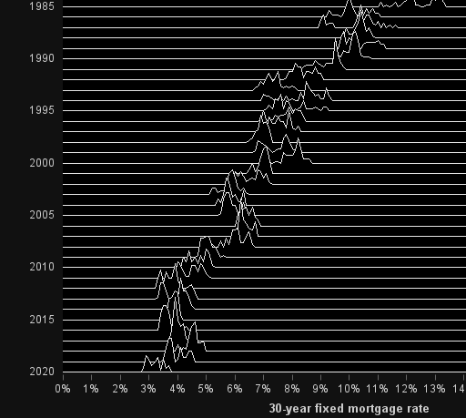
This blog post discusses the use of a black background in a graph. But before we get started, I invite you to have a listen to one of my favorite songs - "Paint it Black" by the Rolling Stones. Perhaps this song subliminally persuaded people to use black backgrounds in