How simple is too simple, when it comes to analyzing data on a map?
The KISS principle can be applied to many things, including graphs and maps. What is the KISS principle, you might ask? Well, it's not the rock band that my friend Patricia (pictured below) has been known to dress like. Instead, it is the principle of "Keep it Simple" (or one of the several variations of the wording). I think KISS is a good goal in general, but should it be applied to the actual geometry of a map? Let's experiment and find out...

I recently saw a map on dadaviz that represents each state in the US as equal-sized colored square. I thought it was an interesting approach (as it helps eliminate area size bias), and therefore I wanted to see if I could create a similar map with SAS. But as I was creating this simplified map, I noticed that many of the states were not in their proper position relative to other states (for example, Virginia was to the west of North Carolina instead of to the north, and South Dakota was to the east of North Dakota instead of to the south). And the states were also difficult to recognize, without their familiar shapes. Well, anyway, here's my SAS version of their map:
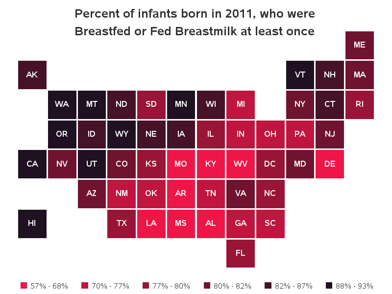
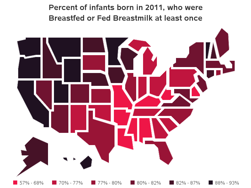
So, although their simplified map design is interesting, perhaps it takes KISS a bit too far? I wondered if it might be better to use a slightly less simplified map, such as the ones promoted by Mark Monmonier in his books How to Lie With Maps and Mapping It Out. So I created a custom US map where the states are shaped like Mark's map, and plotted the same data on it. In this map, the states are in the correct relative position, and the somewhat correct size, and therefore much easier to recognize than the squares in the previous map. But I still find it a bit difficult to recognize some of the states, and I wonder what is the benefit of the simplified shapes?
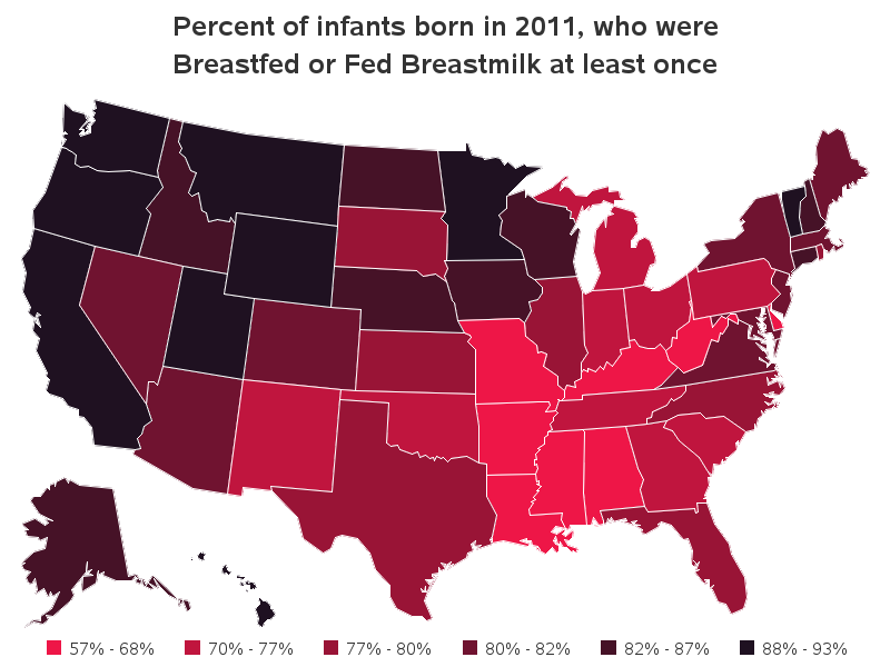
Finally, I plotted the data on a traditional US map. And personally, I prefer this one over the two simplified versions.
So, what's your opinion - which map do you prefer? What are the pros & cons of each map?

10 Comments
Another way to look at these data is with a linked micromap. There are two R packages, micromap micromapST, that can make linked micromaps and are described in the Journal of Statistical Software. Can SAS make linked micromaps?
I haven't seen R's "linked micro maps" specifically, so I'm not 100% sure what they entail, but here is an example of a grid of "micro maps" (or small multiples), that share common axes. Most anything can be done in SAS, but some things (like this) take a little work to set them up: http://www.robslink.com/SAS/democd42/mapgrid.htm
For examples of linked micromaps check out the book "Visualizing Data Patterns with Micromaps" by Dan Carr and Linda Pickle
I would almost like a ranking with the map, showing the states 1-50. Once you hover or click the state, then it shows the percentage. Then again what is the map trying to show you? Do you want to know the percentage of infants breast feed or Do you want to know the concentration per state?.
Good points! - I don't have any inside knowledge about the study itself, and what questions they were wanting to answer, etc. If I had more info about their goals, I might re-design things a bit to specifically answer those questions.
I think all the maps could be enhanced by a different color ramp. I'd like to see a variation on the third map adding annotated squares on the east coast for small states, and adding state abbreviations and percents as labels for states (or small squares). Of course, if the maps were HTML / Active X / Java you could add "hover text" which would add still more information. I frequently say less is more with maps, but I think the first two maps err on the side of too little.
Yep - if you view the html versions of the maps, they have the hover-text! :)
http://www.robslink.com/SAS/democd77/us_breastfeeding_2011.htm
I don't see any advantages of the first two maps over the third. The only problem I see actually pertains to all three, and that is the fact that the color shades are too similar across the various categories.
I agree - I think different colors would work better. But, for this blog example I left the colors in all 3 maps the same, so it would be easier to compare the effectiveness of the map geometry (block, simplified, and full map geometry).
Sorry, but there's room for improvent: since not many people can glance at it and say which color is which on the last two tiny squares, second and third are also bad, (and what's up with this general idea that shades of the same color are good, or elegant ? ) , I suggest:
1) make contrasting colors;
2) and add the percentuals inside each state - where there is no space for the percentual number, use the good old line and put the number outside. There is no need for extra legend, but if you add inside the maps, the legend at the bottom wont be so distracting.