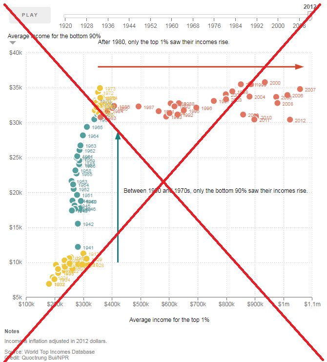
I've seen a lot of recent news articles purporting income inequality in the U.S. ("the rich get richer, and the poor get poorer") ... and I wondered if the graphs were a true/unbiased representation of the data.
For example, I recently saw a couple of graphs in an article on the NPR website (see screen captures below), and decided to track down the data and create my own version of the graphs. In doing so, I hoped to gain more insight into whether or not NPR's graphs represented the data fairly.

Thankfully the article had a link to the data source, and I was able to select & download the same data into an Excel spreadsheet and import into SAS.
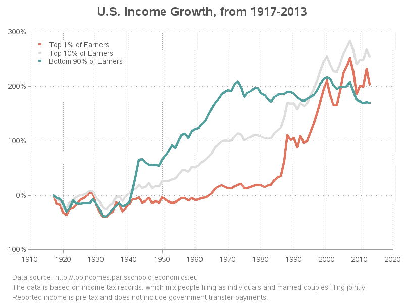
After a bit of experimentation, I came up with the following SAS imitation of the NPR graph. I made a few changes in the axes (used a 4-digit year instead of 2-digit, and showed the negative value at the bottom of the y-axis), and I added some footnotes to help explain the graph, but otherwise it is very similar to their graph.

One thing that immediately came to mind was that they are showing the bottom 90% and the top 1% ... but what about the rest of the top 10%? Is it possibly misleading to leave that group totally out of the graph? The data for top 10% was available, so I downloaded it and added it to the graph (as a gray line). I found it interesting that the top 10% had an even larger % increases in their income than the top 1%.
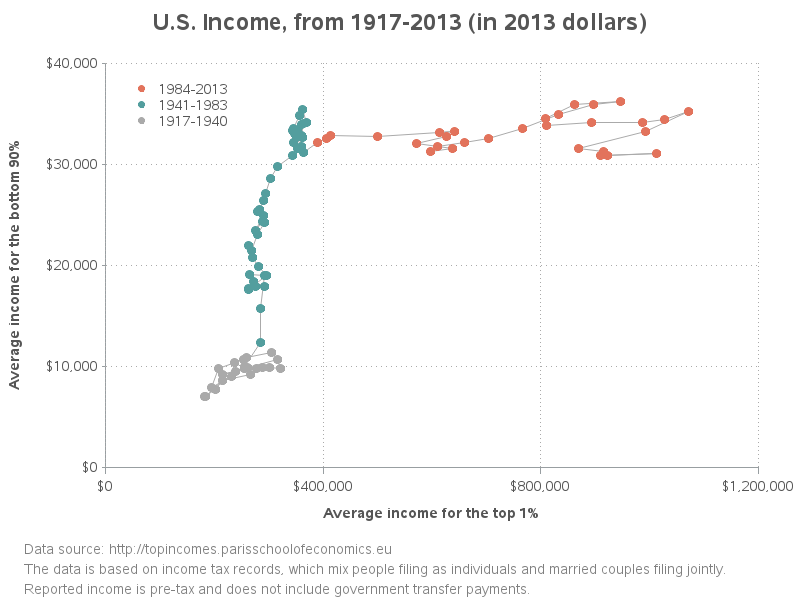
The next graph showed the average income of the bottom 90% plotted against the average income of the top 1% for about 100 years. Rather than labeling some of the years like NPR did, I chose to connect the dots with a line, so you can more easily tell the order of the data points through time. Here's my version of their plot:
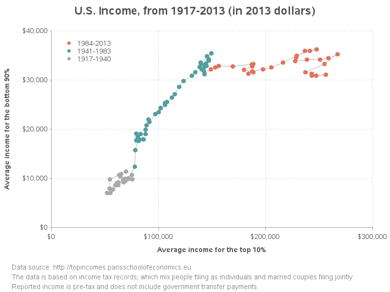
I also created a second version of the plot, which used the top 10% (rather than just the top 1%). This second version of the plot doesn't have as sharp of an 'elbow' (the data points are in more of a diagonal).
While I didn't find any "smoking guns" that made me say the NPR graphs were a misrepresentation of the data, I did find a few things that made me go "hmm..."
- The data download page also had a category called "Average Income - including Capital Gains" (which I suppose implies that the "Average Income" category used in the NPR plot doesn't include capital gains?). I wonder how big of a change that would make in the graphs?
- I noticed that the axes in both the X and Y direction were auto-scaled in the 2nd graph. This shows the maximum detail of the data, but it seems like the axes should be scaled the same in order to truly compare the values.
- The data does not distinguish between people filing their taxes as individuals and married couples filing jointly. I wonder if there has been a change in the likelihood of people filing jointly over the years, and how that might affect this average income data?
- This data of course doesn't include unreported income. I wonder if there is more, or less, unreported income these days (perhaps more, with online sales on sites like eBay, etc?)
- The data shows pre-tax income. Since we have a progressive tax system, and rich people are taxed at a much higher rate than poor people. And perhaps rich people are better at finding tax loopholes and don't actually pay more taxes? I wonder if these factors could skew the data?
- The income data does not include "government transfer payments" (which I assume includes things like welfare, food stamps, medicaid, etc). If these were included, would that raise the 'income' level of poor people?
- Perhaps the average income is not the best thing to plot? Perhaps the median income should be plotted, or the income should be split into more than just 2 categories (maybe quintiles)?
Now it's your turn! - What are your thoughts on these graphs, and what are some other factors that should be taken into consideration?