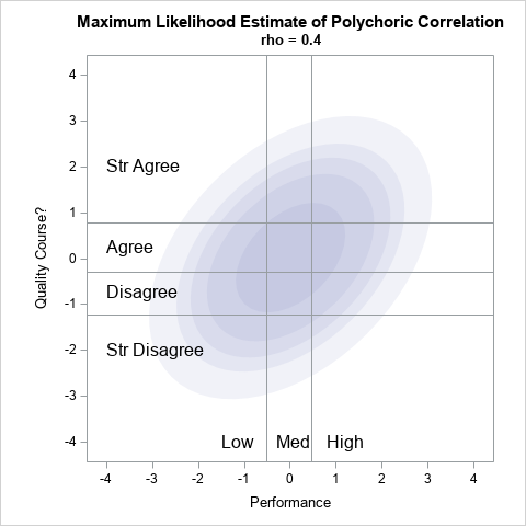
Simulate correlated continuous and discrete variables

Statistical software provides methods to simulate independent random variates from continuous and discrete distributions. For example, in the SAS DATA step, you can use the RAND function to simulate variates from continuous distributions (such as the normal or lognormal distributions) or from discrete distributions (such as the Bernoulli or Poisson).