A reader commented to me that he wants to use the HISTOGRAM statement of the SGPLOT procedure to overlay two histograms on a single plot. He could do it, but unfortunately SAS was choosing a large bin width for one of the variables and a small bin width for the other variable. "The figure looks odd because the bin widths vary so much," he wrote, "so I would like to [set]the width."
He asked me whether it is possible to control the bin width of a histogram from the HISTOGRAM statement. The answer is "not in SAS 9.2, but stay tuned for SAS 9.3!"
So what can you do in SAS 9.2? You can control the histogram bin width by using the Graph Template Language (GTL).
Defining a Template That Overlays Two Histograms
To illustrate this approach, I'll overlay histograms of the SEPALLENGTH and PETALLENGTH variables in the SASHELP.IRIS data set. Most of the statements for the following template are explained in the getting started example in the GTL documentation:
proc template;
define statgraph dualhist;
   begingraph;
   entrytitle "Petal and Sepal Lengths"; /** optional title **/
   layout overlay / xaxisopts=(label="Length");
      /** first plot: a histogram **/
      histogram PetalLength / name="PetalLength"
          binwidth=5;
      /** second plot: a semi-transparent histogram **/
      histogram SepalLength / name="SepalLength"
          binwidth=5 datatransparency=0.7
          fillattrs=(color=GraphData2:color);
      /** optional: add legend by specifying names **/
      discretelegend "PetalLength" "SepalLength";
   endlayout;
   endgraph;
end;
run; |
For this particular template:
- The LAYOUT OVERLAY statement specifies that the graph consists of two plots, one on top of the other, and a legend.
- The first HISTOGRAM statement specifies that the first plot is a histogram of the PETALLENGTH variable. The BINWIDTH= option specifies that the histogram should use a bin width of 5.
- The second HISTOGRAM statement specifies that the second plot is a histogram of the SEPALLENGTH variable. Again, the histogram should use a bin width of 5. Furthermore, the second histogram should have semi-transparent bars that are filled with a different color. Which color? The second color in a pre-defined list of colors.
- The DISCRETELEGEND statement adds a legend that associates the colors to the variables.
The RUN statement results in the template being compiled and stored in an output template named DUALHIST. The template is stored in the default template folder, but no graph is produced at this time.
In order to create (or "render") the graph, you need to call the SGRENDER procedure. You must provide PROC SGRENDER with the name of the data set and the name of the template, as follows:
proc sgrender data=sashelp.iris template=dualhist; run; |
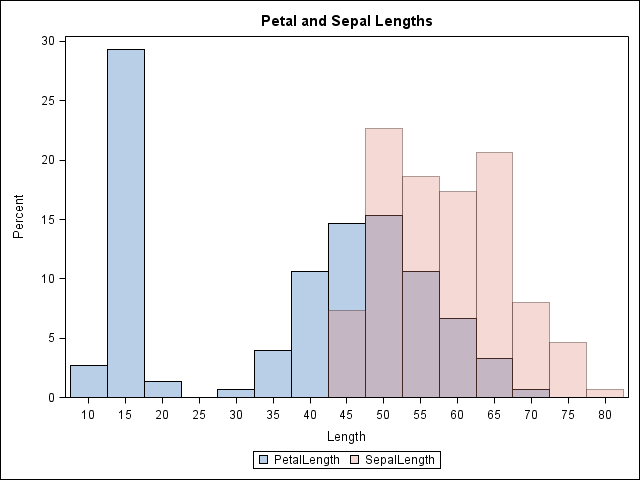
As shown in the image, the second histogram (pink color) is overlaid on the first. Because the second histogram is semi-transparent, you can see the first histogram underneath. Furthermore, where the two histograms intersect, the color is purple, which is an additive mixture of the blue and pink colors.
You can learn more about the Graph Template Language if you decide to write your own templates. I also recommend the book Statistical Graphics in SAS: An Introduction to the Graph Template Language and the Statistical Graphics Procedures by my colleague, Warren Kuhfeld.

8 Comments
Rick, this is a good example.
As you know, the same result can be achieved using the ODS Graphics Designer, and you don't have to write any code. The ODS Graphics Designer provides UI elements to control all of the aspects that your example provides via the GTL statements.
http://blogs.sas.com/sasdummy/index.php?/archives/245-Using-ODS-Graphics-Designer-with-SAS-Enterprise-Guide-4.3.html
That's great, many thanks!
Exactly what I was looking for - and so quick, I haven't even had time to send you some sample code.
Think I should read the GTL documentation some time...
As Chris Hemedinger commented, you can also create this using the ODS Graphics Designer, a GUI that requires no programming:
http://support.sas.com/documentation/cdl/en/grstatdesign/61690/HTML/default/viewer.htm
All,
How would one have them show but with a bit of offset, so the bars are not on top but side by side, this is useful for say comparing 3 groups
It sounds like you are describing side-by-side bar charts. For placing histograms side-by-side (or on top of one another), I suggest using PROC UNIVARIATE or PROC SGPANEL to create comparative histograms.
Pingback: Comparative histograms: Panel and overlay histograms in SAS - The DO Loop
Thanks, it helped a lot.
In addition, I tried to add a normal fitting curve to the 2 histograms in the template. I cannot achieve this.
Do you have a way to do this?
Use the DENSITYPLOT statement. You can ask questions like this at the SAS Support Communities.