
Each Sunday, my local paper has a starburst image on the front page that proclaims "Up to $169 in Coupons!" (The value changes from week to week.) One day I looked at the image and thought, "Does the paper hire someone to count the coupons? Is this claim a good estimate of the actual value of all coupons in the paper? What is the exact value of the coupons in today's paper?"
Furthermore, I wondered about which coupons the image refers to? I assumed that it refers to the contents of special inserts such as SmartSource™ Magazine, RedPlum.com™, and P&G BrandSaver. I call these inserts coupon circulars.
There are other interesting statistical questions that you can ask about Sunday coupons, such as "What is the distribution of the values of coupons? Are $0.50 coupons the most prevalent or are larger values the norm?"
Data Collection
To research these questions, I collected data about the coupons in coupon circulars for 12 Sundays in early 2011. I recorded three kinds of coupons:
- General coupons that can be redeemed at any store and that have a certain value (such as $0.50 or $1.00) when you buy one or more specified items.
- Coupons that reward you with a free item when you buy a certain number of like items at the regular price. These "buy one, get one" (BOGO) coupons do not have a fixed value, but depend on the store price of the item. The coupon is valid up to some specified maximum price.
- The coupon circulars also include a small number of store-specific coupons such as for Red Lobster, Boston Market, or Baskin Robbins. Because these coupons are part of the coupon circulars, I counted them as well.
I did not count coupons that were part of a store-specific ad, such as for Target or Walgreens.
You can download the data and a SAS program that analyzes the data.The Distribution of Coupon Values
As I recorded the values of coupons each week, it soon became clear that $1.00 coupons appear most frequently. The following graph (click to enlarge) shows the distribution of denominations of coupons in my Sunday newspaper:
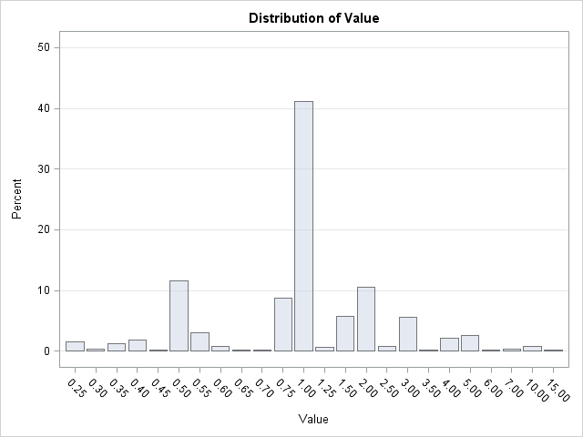
A few statistics are apparent:
- $1.00 coupons are the most prevalent, followed by $0.50 and $2.00 coupons.
- There are 24 unique denominations of coupons in the data, but the six most common denominations account for more than 80% of the coupons.
- Denominations increase by $0.05 between $0.25 and $0.75, although it is relatively rare to find a $0.70 coupon! Between $0.75 and $1.50, denominations increase by $0.25. Between $1.50 and $4.00, denominations increase by $0.50. Higher denominations are a multiple of $1.00.
Claim versus Reality: How Much Can You Really Save?
The following table sums up the total values of coupons in three categories: general coupons, BOGO coupons, and the store coupons that are intermingled with the other two categories.
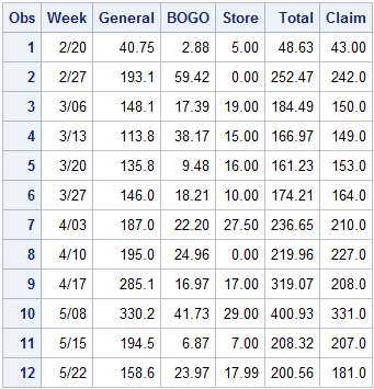
A few facts are apparent:
- Week 9 is an outlier in that the claimed value ($208) is much, much, less than the actual value of the coupons. Did the paper make a typographical error? Did they intend to print "Up to $280 in coupons" or "Up to $308 in coupons"? Another alternative: there were two coupon circulars that week, one with $204 worth of coupons and the other with $115. Did someone fail to tabulate the coupons in the second circular?
- Week 8 is the only week in which the total value of the coupons did not meet or exceed the advertised claim.
- For two weeks (Weeks 3, and 10), the "claimed value" is about the same as the values of coupons in the General category.
- For most weeks (Weeks 1, 2, 4, 6, 7, and 12), the "claimed value" is exceeded by the sum of the values of coupons in the General and BOGO categories. That is, you do not need to redeem store-specific coupons in order to meet or exceed the claimed value.
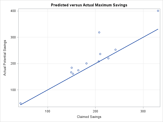
The following graph shows the actual maximum possible savings plotted again the claimed values. The line on the graph is the identity line. For eleven out of twelve weeks, the possible savings exceeded the claimed value. For two weeks, the actual values of the coupons far exceed the claimed value.
Predicting the Actual Coupons Values from the Advertised Claim
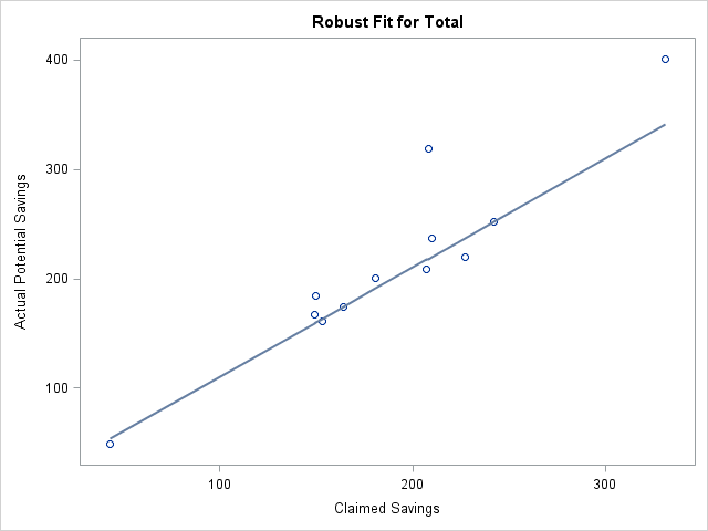
The previous graph indicates a linear relationship between the actual and the claimed values of the coupons. It is interesting to try to use linear regression to predict the total value of the coupons based on the claimed (starburst) values. However, the graph also shows two observations that have high-leverage values for the regression (Weeks 1 and 10) and one value that is an outlier (Week 9). Consequently, you might decide to use the ROBUSTREG procedure to fit a robust regression line to the data. (This is carried out in the downloadable program for least trimmed squares (LTS) regression.)
The LTS regression model (shown in the following graph) states that the expected value of the Sunday coupons is about $11 more than the advertised claim: predicted = $10.87 + claim. In other words, if the newspaper advertises "up to $181 in coupons," the model predicts $192 in coupons.
Summary
In summary:
- The value of coupons in my local Sunday newspaper over a 12-week period varied from $43 in one week to over $400 another week.
- The most frequent coupon denomination is $1.00.
- Although the newspaper claims a specific value for the coupons each Sunday, it is not clear how that number is obtained.
- The claimed value usually differs from the actual value by less than $20, but the claimed value twice underestimated the actual value by $70 or more.
- According to a robust regression model, the expected value of the actual coupon value is $11 more than the claimed value.
I'm sure there is much more that can be said about these data. Feel free to continue the analysis and let me know what you find!

9 Comments
The newspaper boasts these claims for a reason, presumably to increase circulation. What do suppose is the effect of of a dollar amount claim on circulation counts? Would a "$308 in savings!" claim sell significantly more newspapers than "$199 in savings!" ?
My guess is No, but that's just intuition and not science.
And how much money do you think you would have to spend to realize all of these savings? That number (amount spent) usually escapes my spouse's memory when she comes home telling me how much she just saved at the grocery store.
Probably a negligible effect on circulation from week to week, but probably a sizeable effect in terms of people not canceling their subscription. Even if you only redeem a few dollars' worth of coupons, the newspaper subscription pays for itself!
I'm guessing that many coupons are for 5%-25% of the item [hmmm, this suggests another analysis!], so your wife probably spends 5-10 times what she saves. Some serious Coupon Queens claim they save 33%-50% by using coupons!
Hi, could there be an error in the code? The second PROC SGPLOT call gives me an error - looks like the binwidth= option cannot be used in conjunction with HISTOGRAM. I have version 9.22 running here.
Oops! You are right: the SGPLOT code I had doesn't work in SAS 9.22. I accidentally revealed a SAS 9.3 feature!
I have replaced the SGPLOT call with a call to PROC UNIVARIATE that displays essentially the same graph. Thanks!
What a pity, because it so happens I would need this option right now.
I have created a figure showing two histograms in one plot using transparency= for one of the histograms. The figure looks odd because the bin widths vary so much between the two histograms, so I would like to fix the width. I cannot use HBARs instead because the HBAR statement doesn't permit relative frequencies and the sample sizes are quite different.
I would be delighted if you had any suggestions for a workaround. I'm sure it can be done with GLT and SGRENDER but my SAS/GRAPHS skills aren't good enough to figure out how.
Sounds interesting. If you send me some sample code, I'll see if I have any ideas or see if it's easy to use SGRENDER.
If you can modify your example to use a SASHELP data set (IRIS, CARS, HEART, etc) that will make it easier for me.
I have a theory.. because diff regions get diff values in coupons the inserts people probably just send a ballpark figure to all newspapers based on the region with the lowest values (and they dip a little lower just to cover their own behind-better safe than sorry approach). :oP
Pingback: Overlaying two histograms in SAS - The DO Loop
Pingback: Add a diagonal line to a scatter plot - The DO Loop