All Posts

Last week I wrote about how you can use the Discrete Attributes Map to ensure that group values with specific names are represented in the graph with specific colors or other visual attributes such as marker symbol or line pattern. This attributes map also supports a special keyword "OTHER" which can be used to


SAS software benefits from the high performance of solid state drives (SSD), whether it is in the form of flash memory cards or hard-drive form-factor SSDs. The following general points should be considered when planning SSD storage for SAS usage:
You created a graph of Response over Time by Severity where Severity has three levels, "Severe", "Moderate' and "Mild". How do you ensure that "Severe" is always red in your graph, regardless of the data order? Normally, when creating any graph with a GROUP role, the distinct group values are assigned the style


In a previous article, I described how to use Windows PowerShell to connect to a remote SAS Workspace, run a SAS program, and retrieve the results. In that example, the only results I retrieved were the SAS log and SAS listing (text) output, if any. When you run a SAS


The Data Scientist has been called the sexiest job of the 21st century. And, 2013 is the International Year of Statistics. With all this focus and attention, it’s no longer What NOT to wear at SAS Global Forum but WHAT DO YOU WEAR? Fashion trends for 2013 have been getting

This week's SAS tip is from Lauren Haworth, Cynthia L. Zender, and Michele Burlew's book Output Delivery System: The Basics and Beyond. This monumental guide is packed with a wide-array of techniques and examples. As SAS programmer Christine Iodice said, "This book is one-stop shopping for all your ODS needs!"

Don’t worry! This is not an excerpt from a romantic love letter. The title of this blog post is an allusion to my talk on "Missing Values", at the A2013 conference in June in London. There is not much time for emotions: dealing with missing values in analysis is not
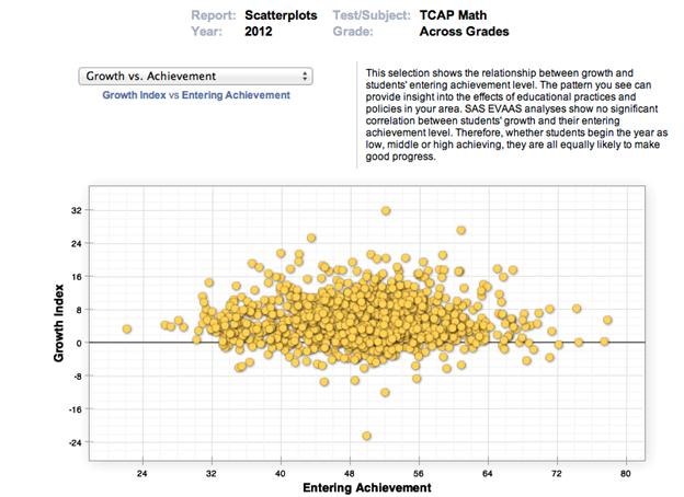

Welcome to Part 2 of the value-added Myth Busters blog series…have you heard this one before? Educators serving high-achieving students are often concerned that their students’ entering achievement level makes it more difficult for them to show growth. “How can my students show growth if they are already earning high

For many organizations, having traceability for members of staff accessing and leveraging customer data is a key requirement. There is the obvious security focus when leadership teams think about traceability, but there are additional uses for audit data within the organization: Using it to identify potentially broken work practices and
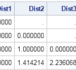

In statistics, distances between observations are used to form clusters, to identify outliers, and to estimate distributions. Distances are used in spatial statistics and in other application areas. There are many ways to define the distance between observations. I have previously written an article that explains Mahalanobis distance, which is

I thoroughly agree with Tricia Aanderud on what it takes to Create Engaging SAS Global Forum Presentations! Here are a few more tips based on my own experience: First, let's look at what it takes to publish, and present. Good title. Good abstract, written about five months in advance. Oh, the


Today is Diabetes Alert Day. The purpose of Diabetes Alert Day is to bring attention to the rising incidence of diabetes in the US and to alert folks to take action NOW to prevent or delay the onset of Type 2 diabetes. Preventing diabetes equates to blood glucose management which


“It’s not about how much money you make but to work on stuff that matters," according to Tim O’Reilly, founder of O'Reilly Media. At the recent Tools of Change conference, Tim O’Reilly mentioned during his keynote that writers tend to be motivated to work on “stuff that matters.” Through SAS
Are you a new SAS user who isn't sure where to begin? Have no fear, because you're not alone. Here at SAS, we often receive questions from people who need help getting started with the software. Getting Started with SAS is the topic of a SAS Talks session that I
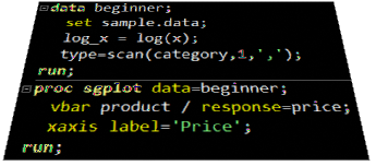
A frequent question we get from users is how to create a box plot with custom whiskers lengths. Some want to plot the 10th and 90th percentile, while other want the 5th and 95th percentiles. The VBOX statement in the SGPLOT procedure does not provide for custom whiskers. Also, unlike GTL,