All Posts


I usually create very technical maps, to display data spatially - and they usually have a certain look. They're clear, crisp, and to the point. I typically only use color to represent the data, and I choose a font that is simple and easy to read (such as arial). But


Did you know that January is Human Trafficking Awareness Month in the United States? If not, you may not know that researchers estimate that human trafficking is a global industry with revenues from $51 to $99 billion annually, up from $32 billion just a few years ago. In this case,


You have all seen, or perhaps even created, some really bad graphics: Cluttered, confusing, too small, incomprehensible. Or worse, the author may have committed one of the three unforgivable sins of data visualization by deceptively distorting a map, truncating the axis so as to misrepresent the data, or used double

PROC SGPLOT writes a graph template and uses it to create a graph. You can edit the template and then create a modified graph.


Recently, SAS shipped the fourth maintenance of SAS 9.4. Building on this foundation, SAS Studio reached a new milestone, its 3.6 release. All editions have been upgraded, including Personal, Basic and Enterprise. In this blog post, I want to highlight the new features that have been introduced. In subsequent posts
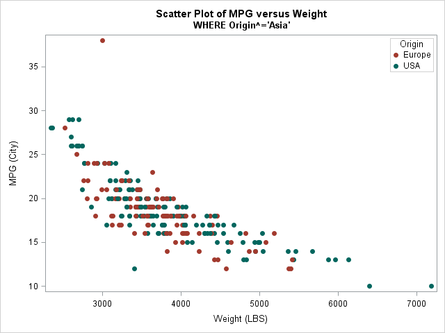

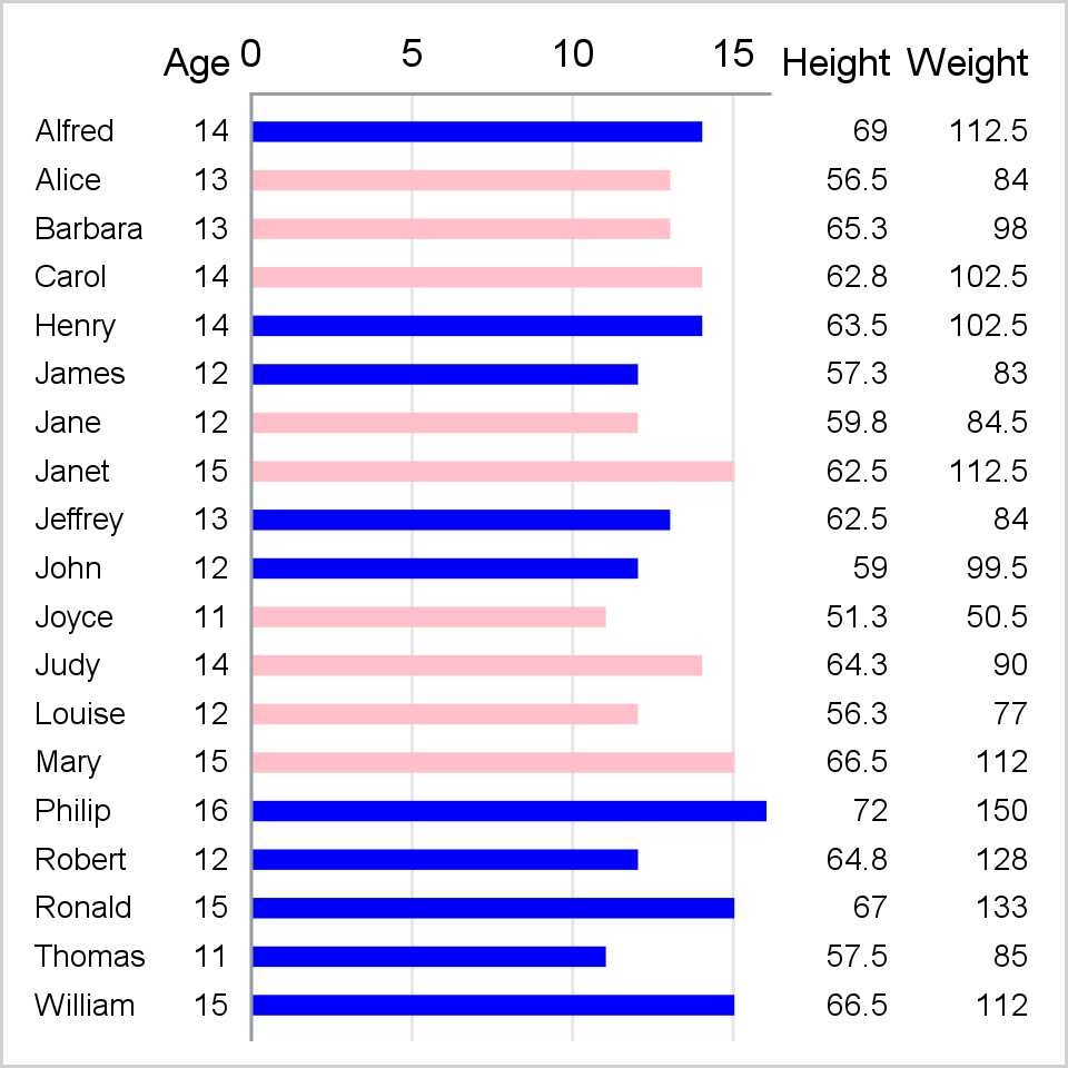
If you are a SAS programmer and use the GROUP= option in PROC SGPLOT, you might have encountered a thorny issue: if you use a WHERE clause to omit certain observations, then the marker colors for groups might change from one plot to another. This happens because the marker colors


I’ve had several meetings lately on data management, and especially integration, where the ability to explore alternatives has been critical. And the findings from our internet of things (IoT) early adopters survey confirms that the ecosystem nature of data sources in IoT deployments means we need to expand the traditional


In my last post I described "4 adaptability attributes for analytical success," and in the past I've discussed the strategic role analytics play in helping organizations succeed now and into the future. Now I'd like to discuss three attributes that define a powerful analytics environment: Speed Accuracy Scalability [NOTE: Any


Throughout life we are bound to grieve many things but often may not realize when we are grieving. I am not referring to the grief felt after the death of a loved one. This post is not meant to equate these losses to the experience of the death of a


Actualmente es muy común escuchar conversaciones relacionadas a la necesidad de transformar el negocio para competir en el nuevo entorno digital, incluso algunas organizaciones están diseñando sus planes para llevar a cabo esta transformación. Los principales cambios que se están planteando en las organizaciones están relacionados con la necesidad de


I've been working on a pilot project recently with a client to test out some new NoSQL database frameworks (graph databases in particular). Our goal is to see how a different storage model, representation and presentation can enhance the usability and ease of integration for master data indexes and entity


SAS® Viya™ 3.1 represents the third generation of high performance computing from SAS. Our journey started a long time ago and, along the way, we have introduced a number of high performance technologies into the SAS software platform: In-Database processing where SAS data quality and analytical processing occur within the
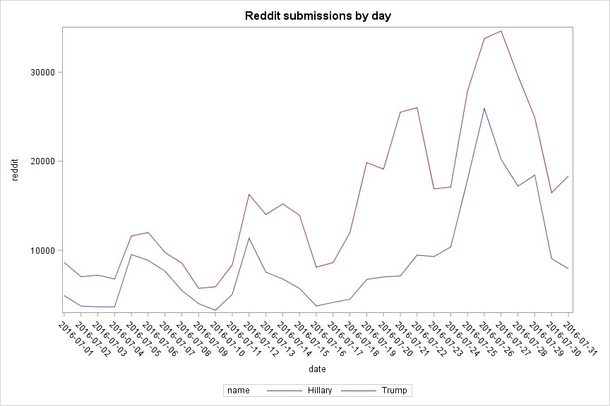

Recently a colleague told me Google had published new, interesting data sets at BigQuery. I found a lot of Reddit data as well, so I quickly tried running BigQuery with these text data to see what I could produce. After getting some pretty interesting results, I wanted to see if


Tell me if you’ve heard this before: Your company hired (or re-titled) a talented data scientist and they have great skills and no data. Or they're marginalized by IT because they're misunderstood. They're offered “cleansed” data that will fit into the hardware provisioned. What they want is “all” relevant data

Are you one of those people who get easily bored at amusement parks? Would you like something to do while your friends/family are waiting in line for a ride? Perhaps I have an alternate idea, to keep you busy - survey markers! When surveyors are measuring and marking areas for