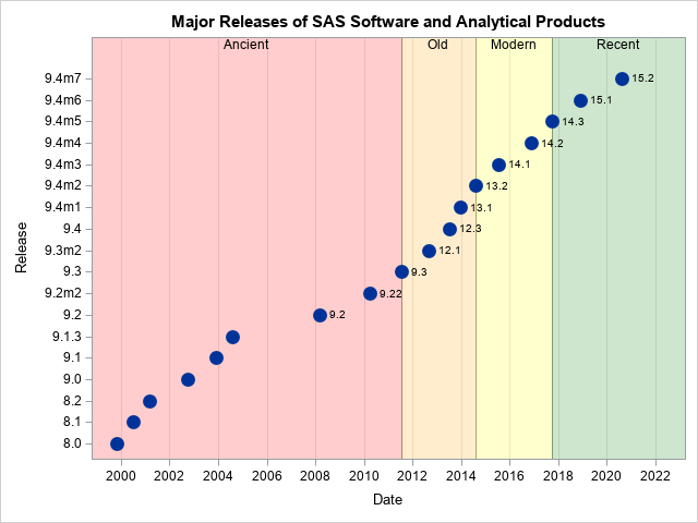
Search Results: sgplot (958)

Data Visualization
Sanjay Matange 0
Attribute Maps - 1

You created a graph of Response over Time by Severity where Severity has three levels, "Severe", "Moderate' and "Mild".  How do you ensure that "Severe" is always red in your graph, regardless of the data order? Normally, when creating any graph with a GROUP role, the distinct group values are assigned the style

Rick Wicklin 0
How to plot a discontinuous function

It is easy to use the SGPLOT procedure in SAS to plot the graph of a well-behaved continuous function: just create a data set of the (x,y) values on some domain and use the SERIES statement to connect the points. However, to plot the graph of a discontinuous function correctly

Data Visualization
Sanjay Matange 0
Custom Box Plots

A frequent question we get from users is how to create a box plot with custom whiskers lengths.  Some want to plot the 10th and 90th percentile, while other want the 5th and 95th percentiles.  The VBOX statement in the SGPLOT  procedure does not provide for custom whiskers.  Also, unlike GTL,

Data Visualization
Sanjay Matange 0
Box with Scatter Overlay

A common request we have been often hearing is for display of the distribution of data as a box plot, along with some detailed information overlaid.  For example, one may have ratings data of all the hospitals in a region by different specialty, and you want to view this distribution

Data Visualization
Sanjay Matange 0
Parametric Bar Charts

A parametric bar chart in SG Procedure and GTL parlance is a simplified version of the regular bar chart, where the data is assumed to be summarized prior to its usage inside the SG procedures or GTL.  So, multiple occurrences of the same category and / or group combination is

Chris Hemedinger 0
Mathematical squiggles in SAS

John D. Cook shared a picture of "pretty squiggles" on his blog, as well as a prose description of the mathematics behind it. I'm more of a programmer than a mathematician, but I've attempted to transcribe his description into a SAS program. I used DATA step to generate the point

Data Visualization
Sanjay Matange 0
Percent VBar

Recently a reader chimed in with a question on the Do Loop article by Rick Wicklin on how to create a bar chart with percent statistics.  Rick used SAS 9.3  and the reader wanted to do the same with SAS 9.2. For the basic (non-grouped) bar chart, the process is the

Data Visualization
Sanjay Matange 0
AE Timeline by Name

In my previous article on Adverse Event Timeline Graph, I wrote about how to create the AE timeline using SAS 9.2 code, using VECTOR plot and the MARKERCHAR option in SCATTER plot.  I  described a better way to place the labels at the lower end of the vectors. SAS 9.3 provides an easier way

Data Visualization
Sanjay Matange 0
Unicode Tick Values using GTL

Often it is desirable to use special Unicode characters for the tick value names on the axes.  However, SG procedures and GTL do not support Unicode strings in SAS data sets. With SAS 9.3, the SGPLOT procedure supports annotation which does support Unicode strings.  You can create an annotation data set

Rick Wicklin 0
A fractal Christmas tree in SAS

In my previous post, I described how to implement an iterated function system (IFS) in the SAS/IML language to draw fractals. I used the famous Barnsley fern example to illustrate the technique. At the end of the article I issued a challenge: can you construct an IFS whose fractal attractor

Data Visualization
Sanjay Matange 0
Naomi's Graph Makeover Contest

Naomi Robbins has posted a contest, part 1 of which is to submit alternative representations for the following graph: Clearly, usage of two pie charts to represent the share of the B2B and B2C referrals will invite many responses.  To create the graph, I took the data shown in the Pie Charts themselves, so we are using percent

Rick Wicklin 0
Remove or keep: Which is faster?

In a recent article on efficient simulation from a truncated distribution, I wrote some SAS/IML code that used the LOC function to find and exclude observations that satisfy some criterion. Some readers came up with an alternative algorithm that uses the REMOVE function instead of subscripts. I remarked in a

Data Visualization
Sanjay Matange 0
Report from SCSUG 2012

Last week I attended my first SCSUG conference, this one in Houston.  Houston, the fourth most populous city in USA, is the world's capitol of the Oil and Gas industry.  So it was no surprise I met many attendees from local oil and gas related companies.  But, I also met many

1 26 27 28 29 30 32