I was recently asked how to compute the difference between two density estimates in SAS. The person who asked the question sent me a link to a paper from The Review of Economics and Statistics that contains several examples of this technique (for example, see Figure 3 on p. 16 and Figure 4 on p. 17). The author of the paper uses the technique to demonstrate that the wage of a Mexican citizen influences his decision to emigrate to the US. Briefly, the paper plots a kernel density estimate of the income distribution of Mexicans who emigrated and those who did not, and shows that the incomes of those who decided to emigrate tend to be less than for those who decided to stay.
In SAS, you can form the difference between two density estimates by doing the following:
- Use PROC KDE to compute kernel density estimates of the two groups. Use the GRIDL= and GRIDU= options so that the two kernel densities are evaluated on the same grid of points. Use the OUT= option on the UNIVAR statement to write the density estimates to a SAS data set.
- Form the difference of the densities by subtracting one from the other.
- Use the SGPLOT procedure to plot the difference.
However, just because you can do something doesn't mean that you should do it! After I produce some graphs, I present some questions about the technique.
The difference of densities for subpopulations
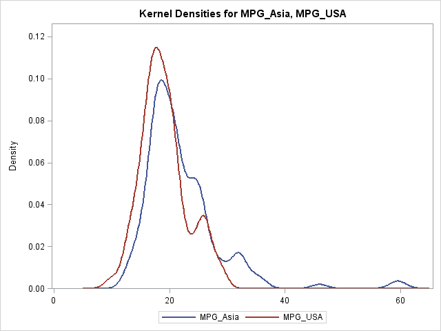
For the sake of an example, I will use data in the Sashelp.Cars data set. I will compare the MPG_CITY for cars that are manufactured in the USA with the MPG_CITY for cars that are manufactured in Asia. The cars from the USA tend to get fewer miles per gallon than the cars from Asia, so these data are a convenient proxy for the Mexican incomes that are shown in the paper.
The following DATA step creates two MPG variables. The call to PROC KDE overlays both densities on a single plot and writes the kernel density estimates to the KerOut data set.
/* create example data: MPG_City for cars built in USA vs. Asia */ data cars; keep MPG_Asia MPG_USA; merge sashelp.cars(where=(origin="Asia") rename=(MPG_City=MPG_Asia)) sashelp.cars(where=(origin="USA") rename=(MPG_City=MPG_USA)); run; /* optional: use BWM= option to adjust kernel bandwidth */ proc kde data=cars; univar MPG_Asia MPG_USA / plots=DensityOverlay out=KerOut GridL=5 GridU=65; run; |
The GRIDL= and GRIDU= options are necessary. Without them, the density estimate would not be evaluated at a common set of points. Then you would need to use an interpolation scheme to obtain the KDEs at a common set of locations. I have previously shown how to use SAS/IML functions for linear interpolation of data.
However, because we used the GRIDL= and GRIDU= options, no interpolation is necessary. You can just use the DATA step to merge the two KDEs and to compute the difference:
data Diff(drop=Var Count); merge KerOut(where=(Var="MPG_Asia") rename=(Density=Density_Asia)) KerOut(where=(Var="MPG_USA") rename=(Density=Density_USA)); by Value; Diff_Density = Density_USA - Density_Asia; run; /* display difference of group densities */ proc sgplot data=Diff; title "Difference between Densitites"; series x=Value y=Diff_Density; refline 0 / axis=y; xaxis grid values=(5 to 65 by 5) label="MPG (City)"; yaxis label="Difference in Density Estimates (USA - Asia)"; run; |
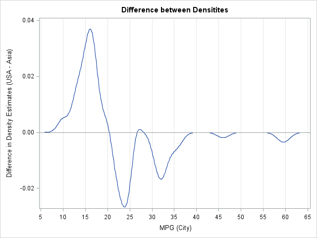
You can interpret the graph as follows. Given that a vehicle was made in the USA, its fuel efficiency is generally less than for vehicles that were manufactured in Asia. The "difference plot" shows the extent of the difference in densities for the two subpopulations. This plot is interesting because American cars that get approximately 27 mpg seem to be an exception to the general rule.
Notice that the difference of densities is not itself a density. Rather, the difference plot is a way to visualize when the density of one distribution is greater than for a second distribution.
A critique of this method
I have never seen this "difference in density" technique before, and I have some questions about it. I am not familiar with a theoretical reference, so my criticisms are based on ignorance rather than on a careful study of the method.
One concern I have is that the scale of the "density difference plot" is clearly important, but the method seems to ignore it. Suppose that I have two normal populations, N(0, 1) and N(ε, 1). When I compute the difference in densities, the difference plot will look like the following plot.
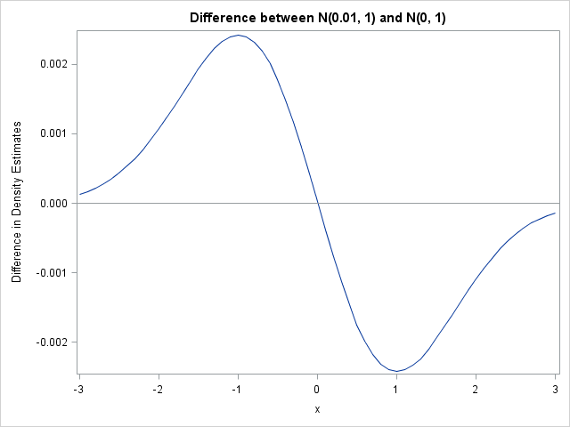
The difference plot shows that the N(0, 1) distribution is to the left of the other distribution, but the plot doesn't warn the reader that the two distributions are essentially identical. No matter how small ε is, the difference plot will look similar...except for the scale of the vertical axis. Can the method can be extended to provide confidence limits? I don't know. Perhaps the integral of the absolute value of the difference (or the square of the difference) is an appropriate measure for how close the densities are.
Another concern I have is that kernel density estimation requires choosing a bandwidth parameter. There are various ways to choose a bandwidth when the goal is to estimate the density. However, it is not clear to me that the bandwidth that best estimates the density is also the bandwidth that best estimates the difference between the densities of two subpopulations.
The authors of the paper acknowledge some of these concerns (p. 17 and the bottom of p. 16), and they perform a nonparametric test, such as can be computed by using PROC NPAR1WAY. Nevertheless, I wonder when it makes sense to display the difference between two densities.
How would you analyze data like these? How would you visualize the results?

3 Comments
Why aren't they doing a K/S test on the empirical CDF's?
Interesting stuff.
I am not too familiar with this area, but there are other methods, see e.g. Handcock & Morris, Relative Distribution Methods in the Social Sciences http://www.amazon.com/Relative-Distribution-Sciences-Statistics-Behavioral/dp/0387987789/ref=sr_1_1?ie=UTF8&qid=1365001258&sr=8-1&keywords=relative+distribution+methods , although it's old.
Rick,
This is related to Mallows Distance (avg(x_i - y_i)^p)^(1/p), which has been used (p=2) to measure the distance between an observed sample and a reference sample (e.g. a normal distribution) with the same descriptors (median, mean, ...) I first came across it in Diaconis' article on "theories of data analysis". It is also related to Wasserstein or Earth Mover's distance in multiple dimensions.
Bill