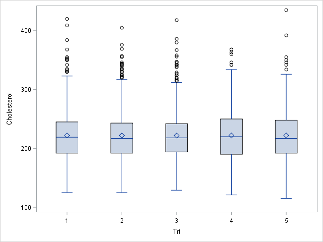
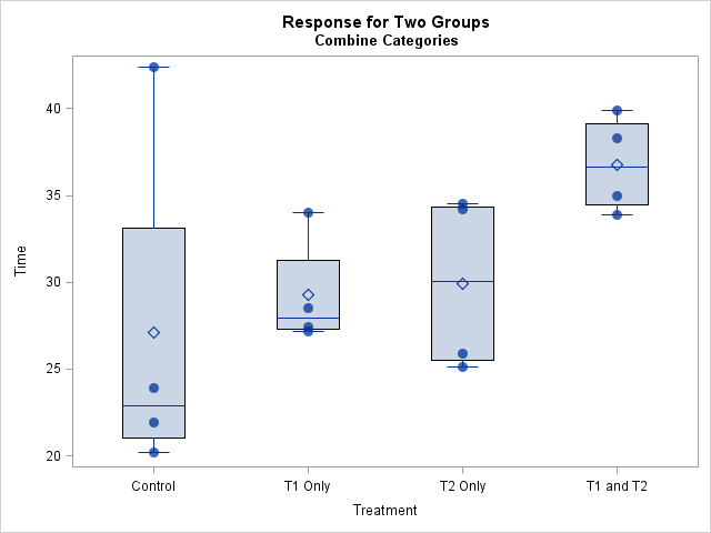
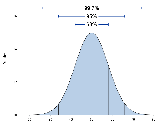
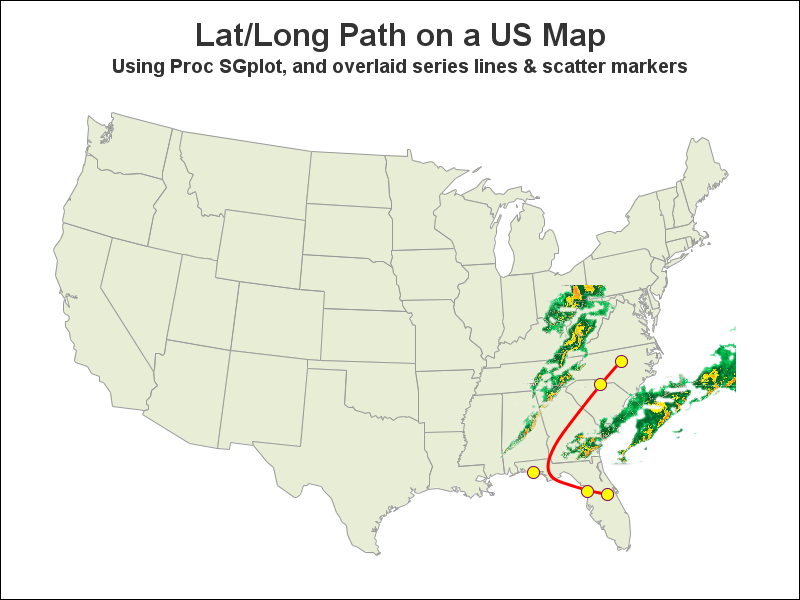
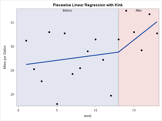
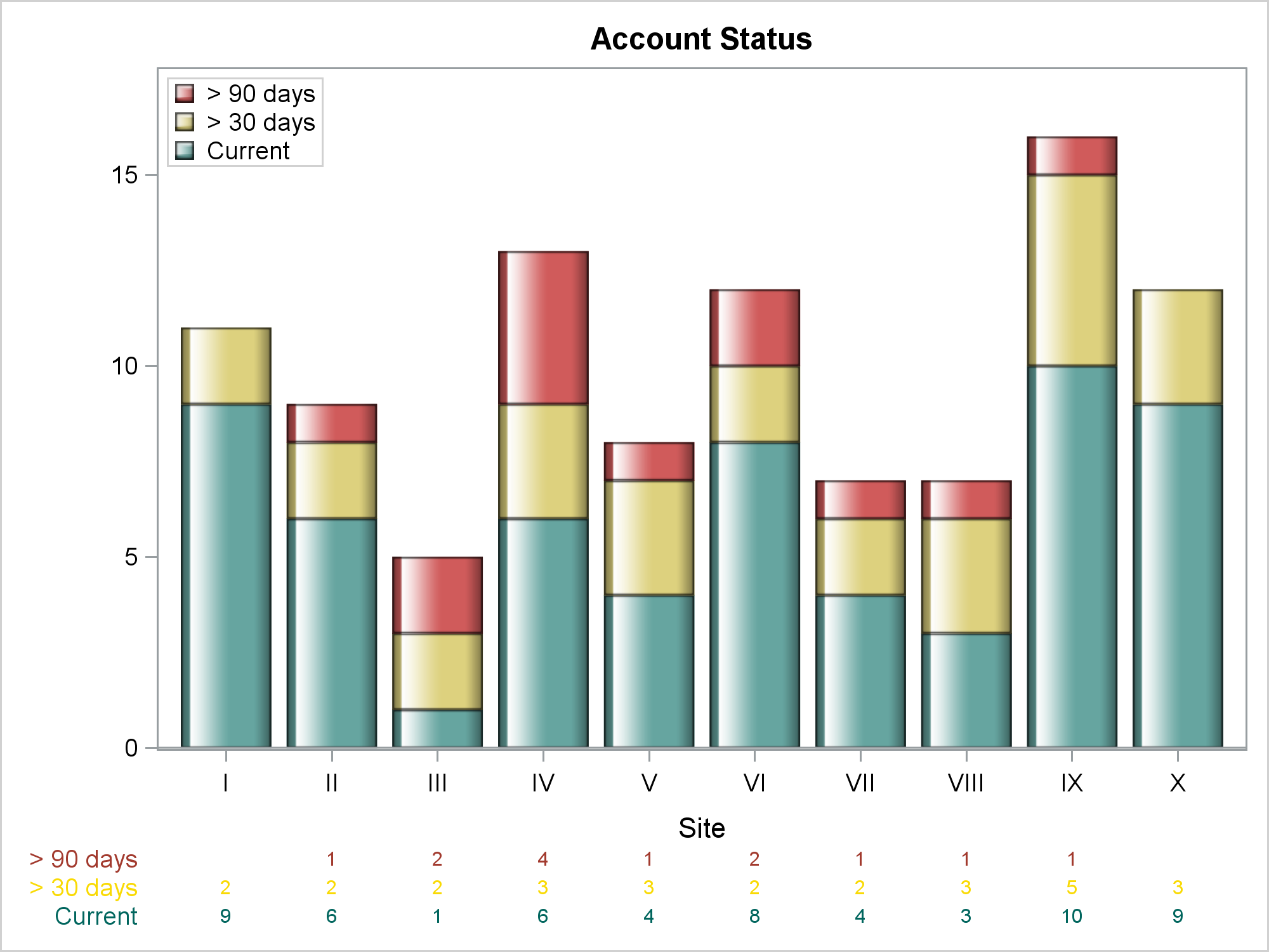
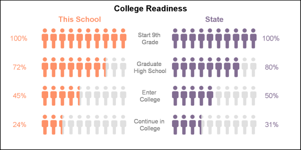
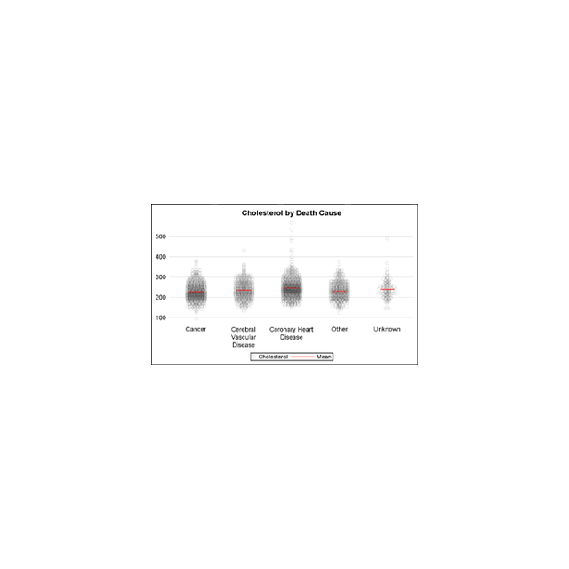
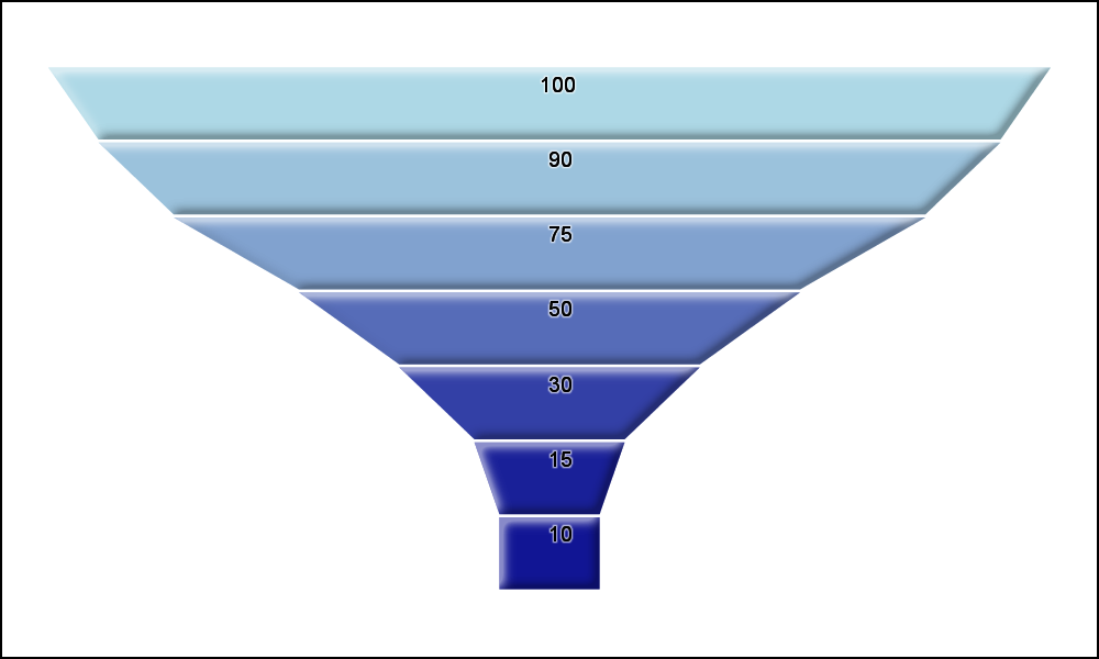
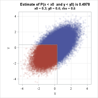
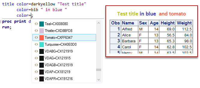
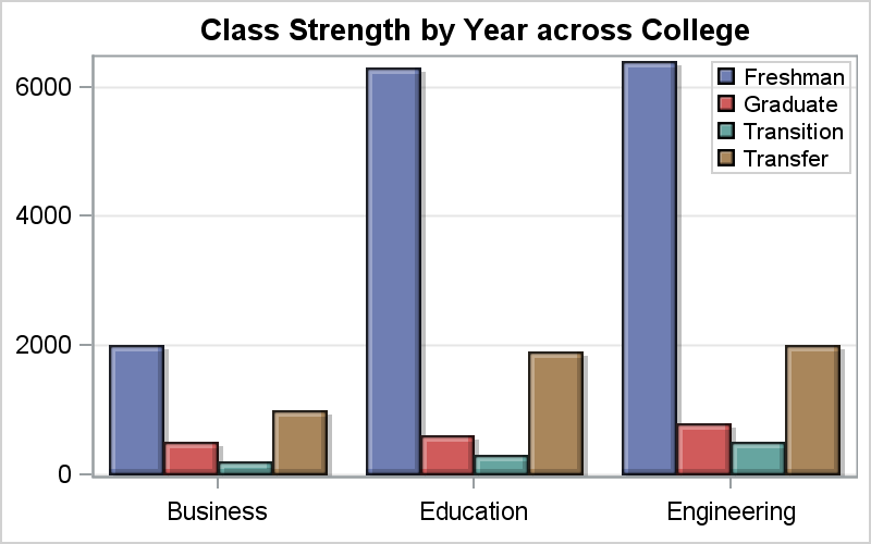
Search Results: sgplot (958)

Data Visualization
Sanjay Matange 0
Category highlighting

When presenting information in form of a graph we show the data and let the reader draw the inferences.  However, often one may want to draw the attention of the reader towards some aspect of the graph or data.  For one such case, a user asked how to highlight one

Learn SAS | Programming Tips
Rick Wicklin 0
Simulate lognormal data in SAS

A SAS customer asked how to simulate data from a three-parameter lognormal distribution as specified in the PROC UNIVARIATE documentation. In particular, he wanted to incorporate a threshold parameter into the simulation. Simulating lognormal data is easy if you remember an important fact: if X is lognormally distributed, then Y=log(X)

Data Visualization
Sanjay Matange 0
Should we move to Ireland?

Recently, while browsing health care data, I came across the graph shown below.  The graph includes the healthy life expectancy at birth by countries in the EU, along with the associated per capita expenditure.  The graph also shows estimate of potential gain in life expectancy by increasing expenditure efficiency. The

Data Visualization
Rick Wicklin 0
Perceptions of probability

If a financial analyst says it is "likely" that a company will be profitable next year, what probability would you ascribe to that statement? If an intelligence report claims that there is "little chance" of a terrorist attack against an embassy, should the ambassador interpret this as a one-in-a-hundred chance,

Data Visualization
Sanjay Matange 0
Diagonal tick values

Fitting of long category values on a x-axis is usually a challenge.  With SAS 9.4, the SGPLOT procedure tries to fit the values by first splitting the values at white space to see if the values will fit in the space available.  This normally works well for a small number

Data Visualization
Sanjay Matange 0
Box plot legend

A grouped box plot created by SGPLOT VBOX / HBOX statement or GTL BOXPLOT statement will display groups within categories using group colors and puts the color swatches representing the group values in the legend.  This works well for a color graph created as shown below. title 'Distribution of Cholesterol

Data Visualization
Sanjay Matange 0
Funnel Graphs

Funnel graphs are useful to track the number of visitors passing through various pages of a website or the number of patients in a study.  The graph shows visually the retention of users or subjects in a study across levels of a marketing cycle or the study. One common representation

1 16 17 18 19 20 32