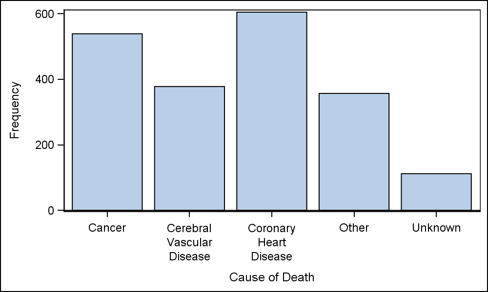
Fitting of long category values on a x-axis is usually a challenge. With SAS 9.4, the SGPLOT procedure tries to fit the values by first splitting the values at white space to see if the values will fit in the space available. This normally works well for a small number of categories with long labels as shown below.
proc sgplot data=sashelp.heart; vbar deathcause; run; |
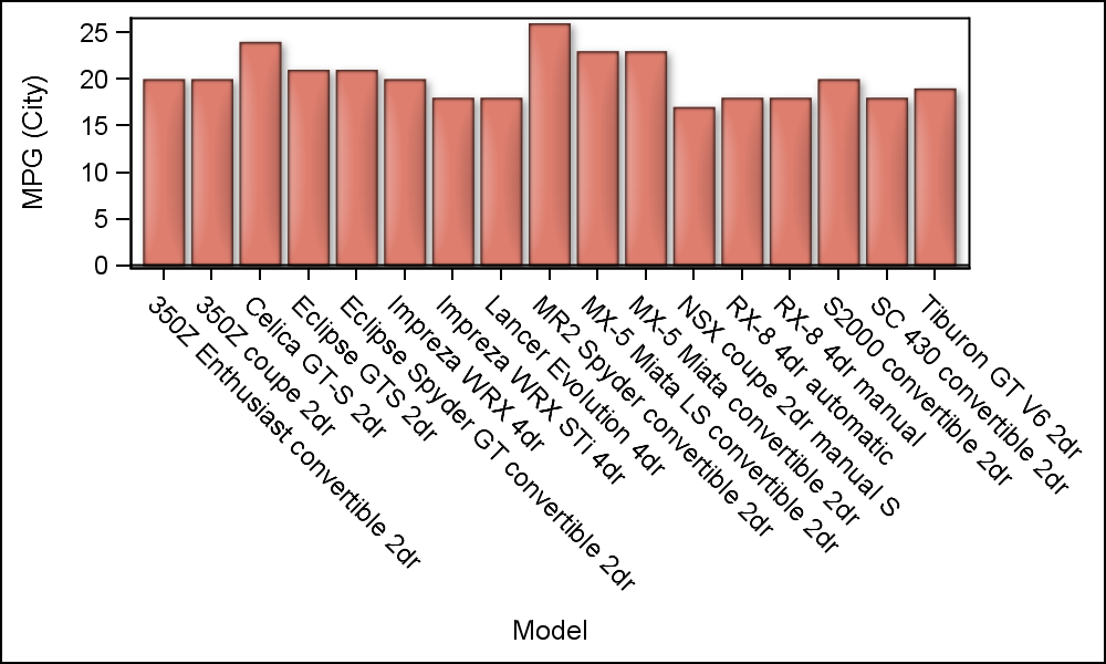
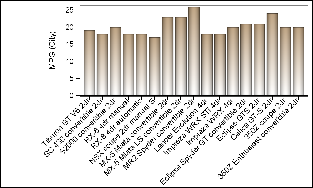
 Personally, I prefer this layout for the values when space is available as it is easier to read. If the split values will not fit in the space per value, then the values are rotated. Prior to SAS 9.4, the splitting of tick values was not supported, and the only option for long category values was to rotate the values at a 45 degree angle as shown below. In the program, "Carssubset" is a reduced data set for Asian Sports cars as you can see in the linked SAS program.
proc sgplot data=carssubset;
vbar model / response=mpg_city dataskin=matte fillattrs=graphdata2;
run;
The SGPLOT procedure now supports a VALUESROTATE option that supports Diagonal, for the above result and Vertical that rotates the values 90 degrees, in the same orientation as the y-axis label. However, there is no option to rotate the values in the other diagonal direction, bottom-left to top-right (Diagonal2).
As user requests started coming in for the ability to rotate the tick values in the Diagonal2 direction, we added this value to the VALUESROTATE option and this will be available with SAS 9.40M5 release later this year. Also, a FITPOLICY=STACKED was added that will result in the values displayed in the "Hotel Text" orientation. This is useful in some cases, especially with many Asian languages.
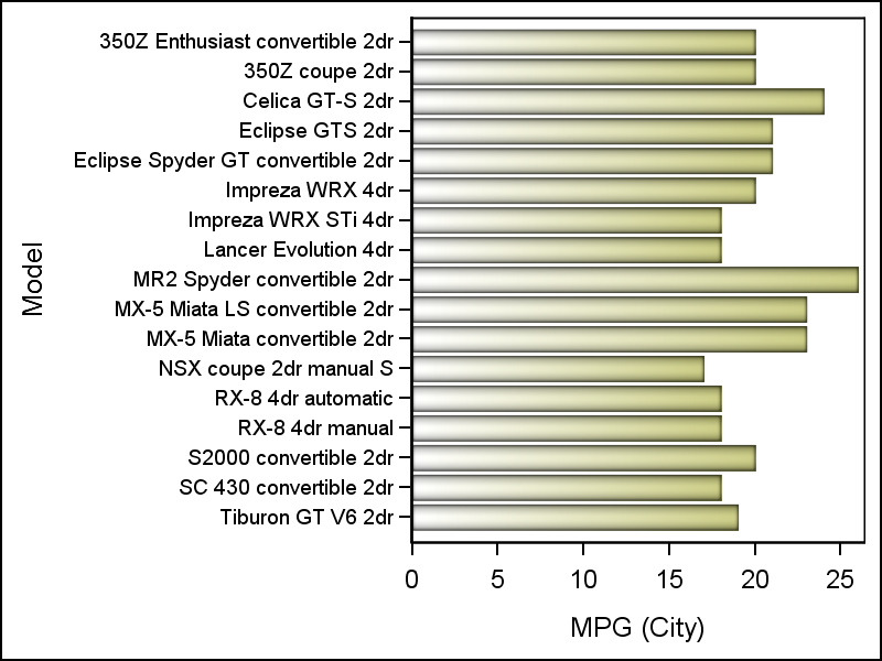
Recently, a user chimed in about the Diagonal2 placement, wanting to know what we could do for him today. Also, a colleague from Europe chimed in with the information that in addition to Excel (which orients the labels like this), this is also the preferred orientation in many parts of Europe. Given that, it would be useful if we could come up (in the interim, prior to SAS 9.40M5) with a way to achieve this without too much pain, as shown below.
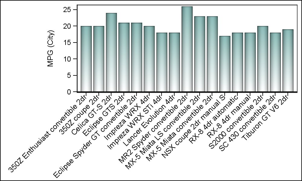
To create the graph above, we have to use SG Annotation. When rendering a complex graph, my preference is to layer multiple plots to get the results. This works well because all plots work together with the axes, and everything gets scaled and placed correctly. But when one needs to do some customization outside the data area (like in this case with the x-axis values) one needs to use SG Annotation.
Now, the process is simple once you understand the basics, and code needed is just a few lines. What we need to do is to find all the category values, and then add them to the annotation data set with a 45 degree rotation placed with the y coordinate just below the x-axis. The x coordinate will be the category value itself, and SGPLOT will do the rest of the work.
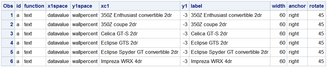
The annotation code and a few observations from the data set are shown below. In this case all values for "model" are unique, but this will work for multiple occurences too.
data anno;
  set carssubset(keep=model);
  by model;
  if first.model then do;
    id='a'; function='text'; x1space='datavalue'; y1space='wallpercent'; label=model;
    xc1=model; y1=-3; anchor='right'; width=60; rotate=45; output;
  end;
run;
One obervation is created for each category value. The Function is "Text" and the Label is the text string to be drawn. The x coordinate (XC1) is the category value itself in data space (X1Space = "DataValue"). XC1 is used instead of X1 because the value is character. The y coordinate (Y1) is 3% below the wall (Y1Space = "WallPercent"). The text is anchored on the right with a rotation of 45 degrees.
proc sgplot data=carssubset sganno=anno pad=(bottom=45pct left=25pct); vbar model / response=mpg_city dataskin=pressed filltype=gradient fillattrs=graphdata3; xaxis display=(novalues nolabel); run; |
In the program code, the x-axis tick values are suppressed, and padding is added to bottom and left to make space for the new values. The category values in the data set need not be in any particular order. They just have to be there, with the x-value of the category variable. The procedure will automatically put them where they need to go. You can even rename some of the labels if you want. If you change the order of the x-axis in the code, the same annotation data set can still be used, and the procedure will map the values to the right place as shown below. For completeness, we may need to add back the x-axis label using annotation
Having shown you how to get the Diagonal2 orientation with SAS 9.40M3 version, I would be remiss to not say that for long category labels, one should also consider using a HBAR, which may also give good results.
Full SAS 9.40M3 code: Diagonal2_Values


4 Comments
Another great tip. Thanks Sanjay.
Pingback: Basic ODS Graphics: Axis Options - Graphically Speaking
Hi, thank you for this interesting blog and post, but my problem is that if I want to display the label is overlapping the x-axis label diagonal using annotation,
for example how you can put a label below all
this this x-axis label diagonal , for example the word 'Model'?
I'm not sure of your question. Are you asking how to make the axis label to be diagonal as well using annotation?