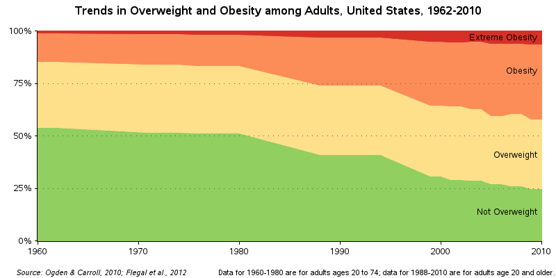
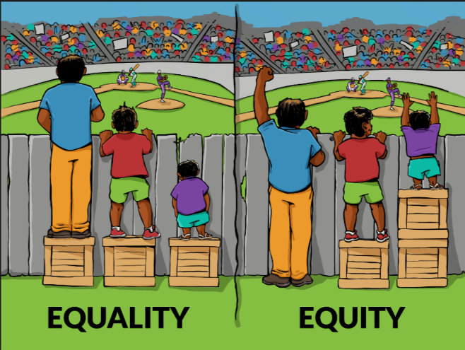
Two colleagues and I, all former educators, have dealt with education equity gaps both as children and professionally. This is the second post in a series about our experiences. I encourage you to read the first entry, Equity in education: I was a statistic. Many people think of education equity
Search Results: stacked (138)
As a kid who grew up in the 60s & 70s, I was a big fan of the original Star Trek TV series. And in the years since, I have seen lots of the Star Trek “technology” become a reality: cellphones, portable tablet computers, talking computers (Alexa/Siri), etc. But I
To stack the deck means to cheat or to fix something so a desired outcome is achieved. This term originated in card games, but can also be applied to other things. And here, I apply it (both metaphorically and literally) to creating a better graph! I recently saw the following
Fitting of long category values on a x-axis is usually a challenge. With SAS 9.4, the SGPLOT procedure tries to fit the values by first splitting the values at white space to see if the values will fit in the space available. This normally works well for a small number
When we send spacecraft from Earth to Mars, do the Martians consider them to be UFOs? I might not be able to answer that question definitively ... but I do have some really cool graphs showing the data for all those missions to Mars! You might remember a previous blog
The NC Scholastic Chess Championship is coming up this weekend, and my buddy Michael Thomas asked if I might could create a few graphs to help analyze the event data. How could I pass up an opportunity like that?!?! Read along, and find out what graphs I created, and the
Are your friends passing around clever memes (supposedly) featuring something your favorite actor said, or sharing news articles that you think might be "fake news"? If there's even a hint of data analyst in you, then you probably check the actual data, and confirm or disprove the supposed facts yourself. I
Are you a visualization & graphing expert? Can you identify which tool (R, Excel, Tableau, SPSS, Matlab, JS, Python, or SAS) was used to create each of these graphs? No cheating! I recently read Tim Matteson's blog where he presented 18 graphs, and had his readers try to guess which
"Two weeks to go," Santa said to himself, with millions of toys stacked up on the shelves. Each year worry hit at the same time – "How do I get the right toy to the right child without losing my mind?" Though Old St. Nick didn't have a computer science degree, deep down
This is the 2nd installment of the "Getting Started" series, and the audience is the user who is new to the SG Procedures. It is quite possible that an experienced users may also find some useful nuggets here. One of the most popular and useful graph types is the Bar
Does it seem like there just aren't enough daylight hours to get things done these days? It might not be that you've got more to do - it might be that we actually have fewer daylight hours in the winter (here in the northern hemisphere). And since "seeing is believing,"
Brings relief to feet, legs and spine. Relaxes the nervous system and cultivates sleep. Legs Up the Wall (Sanskrit: Viparita Karani)
The recent releases of SAS 9.4 have featured major enhancements to the ODS statistical graphics procedures such as PROC SGPLOT. In fact, PROC SGPLOT (and the underlying Graph Template Language (GTL)) are so versatile and powerful that you might forget to consider whether you can create a graph automatically by
If you use SAS® software to create a report that contains multiple graphs, you know that each graph appears on a separate page by default. But now you want to really impress your audience by putting multiple graphs on a page. Keep reading because this blog post describes how to
Reference lines on a visualization are used to help identify goals or targets, acceptable or unacceptable ranges, etc; basically any metric that puts a frame of reference around the values on the visualization. The Percent of Total of a metric is used to help identify a part-to-whole relationship. It answers
The way your graph looks can make all the difference ... two people can graph the exact same data in essentially the same way, but one of the two graphs can be perceived as much better than the other. Hopefully reading my blogs will help you create the better graph!
As often is the case, this article is prompted by a recent post on the SAS/GRAPH and ODS Graphics page communities page. A user wanted to create a Graph Table showing a bar chart with tabular data for each of the category values along the x-axis. The user was creatively using
When you work out, you probably have a routine set of exercises that you do. But if you read health-and-fitness websites or talk to a personal trainer, you know that for optimal fitness, you should vary your workout routine. Not only does adding variety to your fitness regime help you
Last week I posted an article on displaying polar graph using SAS. When the measured data (R, Theta) are in the polar coordinates as radius and angle, then this data can be easily transformed into the XY space using the simple transform shown below. x=r*cos(theta * PI / 180); y=r*sin(theta * PI
In recent years, more and more people have been registering as independent voters in the US, rather than Democrat or Republican - the independents now control well over 1/3 of the votes. Will they likely vote for the Democrat or Republican candidates in the upcoming election? Let's break down some numbers
Here in the US, our July 4th Independence Day holiday is coming up. It's a festive holiday with lots of fun & fireworks, but you also need to also be careful ... and I've got the graphs to prove it! Last year, I wrote a blog post about a SAS
I recently read an article that claims 35% of men, and 40% of women in the US are now obese. Yikes! I wondered when this happened, and whether it had been a gradual or sudden change. If I only had some graphs ... which the article didn't provide. I did some
I’ve been giving presentations about SAS® ViyaTM for a couple of months now, and the reactions have been positive. I’m part of a much bigger cast of speakers at SAS who talk about the new analytics platform with key customers and analysts. While some presenters focus on the overarching benefits or the
When I read Robert Allison's article about the cost of a taxi ride in New York City, I was struck by the scatter plot (shown at right; click to enlarge) that plots the tip amount against the total bill for 12 million taxi rides. The graph clearly reveals diagonal and
For a long time, Starbucks represented to me as the good coffee cup, with me paying upwards of $4 for a Latte. But on a recent visit to San Francisco, my son introduced me to a few other options. Philz crafts a great cup of java, with the barista making
Last weekend was the 2016 NCAA Division I wrestling tournament. In collegiate wrestling there are ten weight classes. The top eight wrestlers in each weight class are awarded the title "All-American" to acknowledge that they are the best wrestlers in the country. I saw a blog post on the InterMat
You can use histograms to visualize the distribution of data. A comparative histogram enables you to compare two or more distributions, which usually represent subpopulations in the data. Common subpopulations include males versus females or a control group versus an experimental group. There are two common ways to construct a
Have you ever found a graph of some interesting information, but the graph was difficult to understand (or even misleading). I strive to fix those graphs - this time it's a graph of US immigration data... I found the following immigration graph on the flowingdata website - it's a screen-capture of
With the upcoming appointment of a new Supreme Court Justice, I wondered just how liberal and conservative previous justices have been. I found some data, and tried my hand at creating a graph to help visualize it... In my quest for data, I came upon an article on the NYTimes
In the previous article on managing legends, I described the way to include items in a legend that may not exist in the data. This is done by defining a Discrete Attribute Map, and then requesting that all the values defined in the map should be displayed in the legend. In