Get the right information, with visual impact, to the people who need it
Add reference lines to a bar chart in SAS

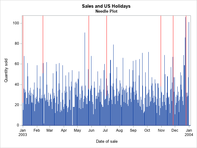
A SAS programmer asked whether it is possible to add reference lines to the categorical axis of a bar chart. The answer is yes. You can use the VBAR statement, but I prefer to use the VBARBASIC (or VBARPARM) statement, which enables you to overlay a wide variety of graphs