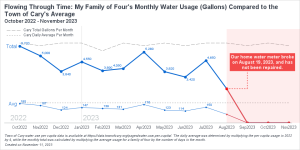
Have you ever been curious about your monthly water consumption and how it compares to others in your community? Recently, I had this question and decided to get ahold of my family's water usage data for analysis. Harnessing the power of data visualization, I compared my family of four's monthly
Tag: visualization
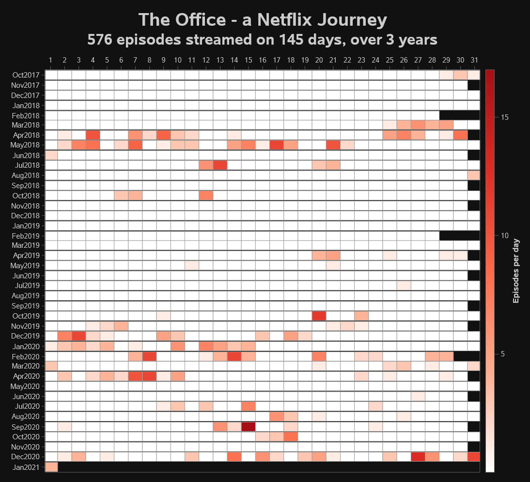
Over 57 billion minutes of The Office was streamed in 2020. My family bears some responsibility. Here's our activity visualized -- using SAS.
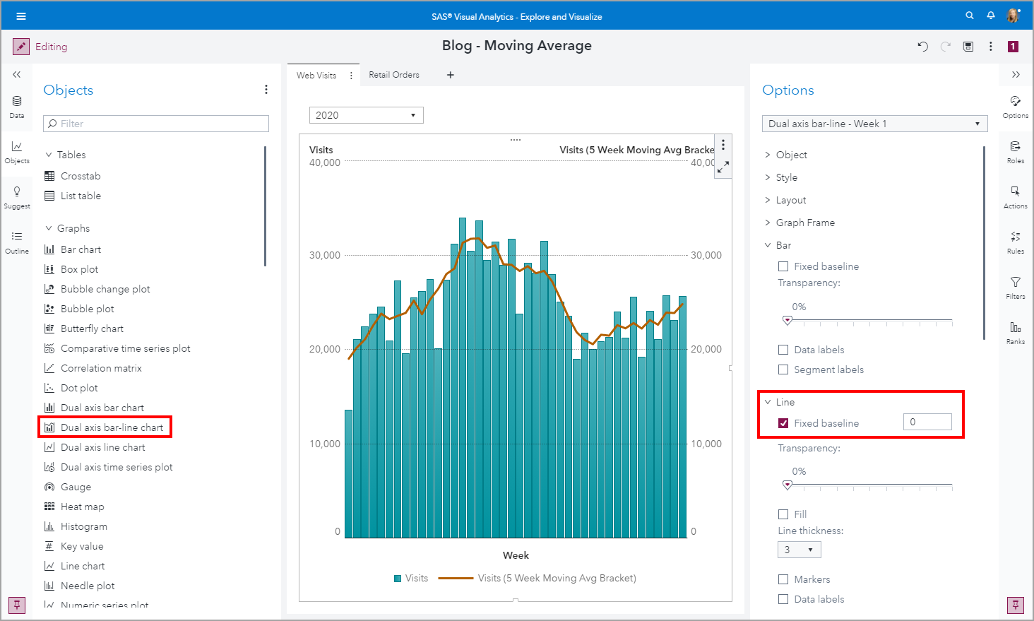
Data visualization has never been more widespread and consumed by a global audience as it has been this year with the Coronavirus pandemic. One visualization that is commonly used to display metrics of Coronavirus is a bar line chart where the bars display the actual values and the line is a moving average metric.
Common filters are filters that can be shared between objects in your reports. Common filter benefits include 1) Easy to assign the same filter conditions to other report objects, 2) When you edit a common filter, it is updated everywhere that the common filter is used, and 3) A common filter is available for the entire report, across pages.
Introduced in the SAS Visual Analytics 8.4 release is the ability to control the layout position of these prompts. Using my example report, let’s change the placement of these prompts.
SAS Visual Analytics on SAS Viya(以降VA)の最新版8.4に搭載されている新機能の中から、以下5つの機能に関してダイジェストでご紹介します。 1.AIストーリーテラー機能 2.レポート編集&表示切替の利便性向上 3.閲覧時レポートカスタマイズ&制御 4.分析用ビジュアル候補提示 5.カスタムグループ作成の容易化 6.Visual Analytics SDK 1.AIストーリーテラー(自動分析&解説)機能 VA8.3から搭載されていた機能やUIが拡張されています。 AIストーリーテラー(自動分析&解説)機能では、分析対象の変数(ターゲット)を指定するだけで、その変数に影響を与えているその他の変数の特定や、変数ごとにどのような条件の組み合わせがターゲット変数に依存しているのかを「文章(条件文)」で表現して教えてくれます。 この例で使用するデータ「HMEQJ」は、ローンの審査を題材にしたもので、顧客ごとに1行の横持ちのデータです。このデータ内にある「延滞フラグ」が予測対象の項目(ターゲット変数)で、0(延滞なし)、1(延滞あり)の値が含まれています。 データリスト内の「延滞フラグ」を右クリックし、「説明」>「現在のページで説明」を選ぶだけで、「延滞フラグ」をターゲット変数に、その他の変数の組み合わせを説明変数とした複数の決定木(ディシジョンツリー)が実行され、 以下のような結果が表示され、見つけ出された有用な洞察を説明してくれます。 分析結果画面内説明: ① 予測対象値(0:延滞なし、1:延滞あり)の切り替えが可能です。この例では、「1:延滞あり」を選択し、「延滞する」顧客に関して分析しています。 ② 全体サマリーとして、すべての顧客の内、延滞実績のある顧客は19.95%(5,960件中の1,189件)であることが示されています。 ③ 「延滞する」ことに関して影響を与えている変数の重要度を視覚的に確認することができます。最も影響度の高い変数(今回は「資産に対する負債の割合」)の重要度を1として、1を基準値にした相対重要度が算出され、横棒グラフで表示されます。従来版に比べて、変数ごとの影響度合いの違いを明確に捉えることができます。 ④ 「高」タブには、「延滞する」可能性が高いトップ3のグループ(条件の組み合わせ)が文章で示され、「低」タブには、「延滞する」可能性が低いトップ3のグループ(条件の組み合わせ)が文章で示されます。この例では、③で「資産価値」が選択され、「資産価値」に基づき、延滞する可能性の高い/低いグループのトップ3が表示され、「資産価値」に関する条件部分がハイライトしています。 ⑤ この例では、③で「資産価値」が選択され、これに応じて「0:延滞なし、1:延滞あり」別の顧客の分布状況がヒストグラムで表示されています。選択された変数が数値属性の場合は、ヒストグラムで、カテゴリ属性の場合は積み上げ棒グラフで表示されます。チャートの下端では、チャートから読み取れる内容を文章で解説しています。 以下は、カテゴリ属性の変数を選択した場合の表示例です。 以上のように、分析スキルレベルの高くないビジネスユーザーでも、簡単かつ容易に、そして分かり易くデータから有効な知見を得ることができます。 ※AIストーリーテラー機能に関しては、SAS Viya特設サイトのビジュアライゼーションセクションで動画でもご覧いただけます。 2.レポート編集&表示切替の利便性向上 従来のVAでは、編集モードで作成したレポートを表示モードで確認する際には、メニューから「レポートを開く」を選択し、レポートが表示されるのを少し待つ必要がありました。また、レポート表示モードから編集モードに戻るにもメニューから「編集」を選択する必要がありました。 VA8.4では、編集モードと表示モード切替の利便性が改善され、画面左上のペンシルアイコンをクリックするだけで、編集画面<->表示画面間を瞬時に切り替えられるので作業効率が向上します。 また、ご覧の通り、編集画面と表示画面のレイアウトも統一されています。 3.閲覧時レポートカスタマイズ&制御 一般的にBIツールでは、対象ユーザーを3つの層(管理者、レポート作成者(デザイナ)、レポート閲覧者(コンシューマ))に分類し、それぞれに最適なインターフェースを提供しています。しかし、レポート閲覧者の中には、「基本的には誰かが作成したレポートを見るだけでいいんだけど、自分好みに変更できたらもっといいのにな…」という声も多くあります。このレポートカスタマイズ者層に答えられないために、彼らは、レポートを開き、そのデータをダウンロードし、Excelに取り込んで好みのレポートを作成しようとするのです。 VA8.4では、レポートカスタマイズ者層向けに、作成済みレポートを開いて閲覧中に、簡単操作で好みに合うようにレポートをカスタマイズすることができるようになりました。 以下は、レポート閲覧中に「円グラフ」を他のチャートタイプに変更するメニューが表示されている例です。 また、レポート作成者は、レポートカスタマイズ者向けに、カスタマイズ可能な機能範囲を3段階で制御することが可能です。 これで、レポート作成者の負担も軽減され、レポート閲覧者の痒いところに手が届きそうですね。 4.分析用ビジュアル候補提示 レポート作成の元となるデータソースを選択すると、そのデータソース内の項目に基づき、「こんな分析が有効じゃないの…」と、分析画面の候補を自動的に提示してくれる機能です。 画面左端から電球マークの「候補」アイコンをクリックすると、分析候補がいくつか表示され、提示された分析画面をドラッグ操作でレポートに挿入することができます。 より素早く、効果的な情報を含むレポートを作成することができそうですね。これも一つの自動分析機能です。 5.カスタムグループ作成の容易化 従来版のVAでは、カスタムグループを作成する際には、カスタムグループ作成専用の画面内で、グループに含める要素の選択と、グループ名称を設定し、OKをクリックしてチャートに反映させる必要がありましたが、VA8.4では、チャート上でグループ化対象の要素を選択し、そのグループに名称を設定して、素早くカスタムグループを作成することができるようになりました。 6. Visual Analytics SDK
If you're good at games like Wheel of Fortune, Scrabble, or Words with Friends, you've probably figured out that certain letters appear more often than others. But do you have a cool way to figure out which letters appear most & least frequently? How about using a computer to plot
Poverty. It's a bit difficult to define who lives in poverty - I guess it's a relative thing, and depends on the standard of living of the people around you. Today we're going to take a look at the child poverty rates in several 'rich' countries (such as the United
Being the Graph Guy, I wanted to know about all the "data visualization" presentations at the upcoming SAS Global Forum 2018 conference. I tried going through the official interface to search for such sessions, but it was difficult (impossible?) to know that I had found them all. Therefore I created
2017年11月にリリース予定の「SAS Visual Analytics 8.2」に搭載予定の新機能概要をご紹介します。 【SAS Visual Analytics 8.2 新機能概要】 サードパーティ・ビジュアライゼーション D3.jsやC3、あるいはGoogleチャートの機能を活用し、VAに標準装備のチャートタイプでは表現できない、より柔軟で洗練されたチャートを描画し、レポートに組み込むことが可能です。 新規追加ビジュアライゼーション バブルチェンジプロット、平行座標プロット、スケジュールチャート、など、新たに9種類のチャートオブジェクトが追加されます。 オブジェクト間の自動リンク&フィルタ設定 レポート内の全てのオブジェクトを自動的に連係させることで、効果的でインタラクティブなレポートを簡単に作成可能です。その際、一方向のフィルタなのか双方向のフィルタなのかを指定することができます。 レポート自動保存&復元 作成中のレポートは定期的に自動保存されます。これによって、仮に保存し忘れてログオフしたとしても、再ログオン時に前の状態を復元することができます。 カスタム領域塗りつぶし VA7.4と同様に、地図上にカスタムで指定した領域を塗りつぶして描画することが可能です。 地図機能拡張 Esri地図データとの連係機能が拡張され、デモグラフィック情報の活用が可能になります。例えば地図上に表示されている自店舗群を選択し、周辺住民の平均年収や年齢などの情報を把握でき、より効果的なロケーションアナリティクスが可能になります。
Carbon Dioxide ... CO2. Humans breathe out 2.3 pounds of it per day. It's also produced when we burn organic materials & fossil fuels (such as coal, oil, and natural gas). Plants use it for photosynthesis, which in turn produces oxygen. It is also a greenhouse gas, which many claim
例年、SAS Global Forumでは2日目の朝は、最新のSASテクノロジーを紹介する『Technology Connection』というセッションで始まりますが、今年は、そのセッションが少し変わった形式になりました。最新のテクノロジーを紹介するだけでなく、その開発を支える社員にフォーカスをあて、どのようにそのテクノロジーが開発されたのかを紹介しながら進められました。 各プレゼンターごとに流された紹介ビデオの中で、今年のTechnology Connectionのメインテーマである、『生涯学習』について語られました。Chief Technology Officerのオリバー・シャーベンバーガーは、もともとCTOになるつもりはありませんでした。実際、彼は林業で博士号を取得しています。しかし統計学への熱意が彼を大学の世界からソフトウェア開発の世界に導き、ハイパフォーマンス・コンピューティング、アナリティクス・プラットフォーム、人工知能そして他の先進技術に携わることになりました。『私は毎日が勉強です。皆さんもそうだと思います。SASも常に革新を続けて新しい製品を生み出し続けています』と彼は、機械が我々の生活を豊かにする象徴としてセグウェイに乗りながら、聴衆に語りかけました。 次世代のテクノロジー - SAS Graphics Accelerator プレゼンターの一人、エド・サマーズは、10歳で網膜色素の異常と診断され徐々に視力を失いました。彼は現在法的盲であり、チャートやグラフを14年間見たことがありません(でも、「ビジョン」を持っています)。彼は、SAS Graphics Accelerator を使用して、データビジュアライゼーションとアナリティクスを視覚障害者にも利用可能にした非常に重要な彼の仕事をデモンストレーションしました。このテクノロジーは、SASのアナリティクス・ビジュアライゼーションを話し言葉と音に変換します。結果は、データを音で表現することで、視覚障害者がデータの様子を『見る』ことができるようになっています。聴衆みんなで目を閉じて、確かにデータが上昇トレンドにあることを確認しました。単にデータの値を読み上げるだけでなく、グラフの右肩上がり具合を音階で表現されることで、まさに『耳で見る』ことができるようになりました。『私たちは皆、それぞれ自分なりの世の中への貢献の仕方があります。データビジュアライゼーションを誰にでも利用可能にすることが、私の役目です』とサマーズは締めくくりました。筆者はこの数日後、SAS本社のCaryの彼の勤務するオフィスのカフェテリアでばったり出会い、しばし歓談しました。やはり、このプレゼンはとても緊張したらしいです。 SASは従来より、このような『ユーザー補助機能』をソフトウェア機能として提供してきています。グラフ上の数字の読み上げ機能なども数年前から実装されています。現在どのような製品でどのような対応がされているかはこちら「Accessibility at SAS」にまとまっているのでご参照ください。今後は、コグニティブ技術+アナリティクスという領域でさらなる進化をしていくことが考えられています。 「エッジ・アナリティクス」 - SAS Event Stream Processing R&Dのシニアディレクターである、ジェリーは、Event Stream ProcessingとInternet of Things の担当であり、彼の車のナンバープレートを、「ESP&IOT」にしてしまうくらい(ビデオにも写っています)彼にとって、ESPは彼の一部であり、ライフワークです。彼は壇上で、自動車業界においてESPがどのように中央のサーバー上や、エッジアナリティクスといわれるデータの発生源で、イベントストリームデータを分析するかをデモンストレーションしました。彼は、コネクテッド・カーに関するユースケースを取り上げ、実際に道路温度が0度以下になったポイントで警告を表示することができることを示しました。彼曰く、『ストリーミングアナリティクスは単に効率を上げるだけではなく、世の中をより安全な場所に変えることができるのです』 Enterprise GuideでDATA Stepデバッガーを使用することで、生産性を向上する ケイシー・スミスはEnterprise Guideの新機能である、DATA Stepデバッガーについて紹介しました。スミスの母親は30年以上もノースカロライナ州立大学でSASを教える教授であり、スミスは幼い頃母親からSASを教わっています。プログラムのバグを修正することはとても時間のかかることであり、またイライラする作業でもあります。そのデバッグ作業をとても簡単にできることを彼はデモンストレーションで披露しました。この機能を開発した理由を彼は次のように述べています。『現実の顧客は、現実の課題を解決している。我々はそれをサポートしたい。』 データ分析においてなによりも大事なのは探索やモデリングのためのデータ準備のフェーズです。特に昨今、正規化された基幹システムからのデータだけではなく、様々な非定型のデータを効率的に正確に結合・整形する必要性が高まっています。そのようなデータに対して(異なる目的のために考案された)SQL一辺倒の利用では非常に非効率です。様々なプログラミング言語を経験した筆者の意見としては、そのようなデータ準備には専用に考案されたSASのData Stepの利用は最も優れた選択の一つだと感じています。それでも細かなデータ加工には複雑なIF条件文のネストなどにおける困難さはつきものです。そのようなデータ加工をステップ・バイ・ステップでデバッグできる、このData Stepデバッガーはとても便利ですので、是非、試してみてください。 FCAAバスケットボールのデータを使用しFactorization Machineで試合結果を予測する ジョージ・シルバは、統計家かつソフトウェア開発者であり、彼は機械学習に携わる自分の仕事を(顧客が価値を出すまでは)まるで赤ちゃんのようだと表現しています。シルバのプレゼンはアマゾン社のインテリジェントなパーソナルアシスタントである、Alexaで行われました。シルバが用意したデモを使用して、CTOのシャーベンバーガーが音声で命令をAlexaに出し、NCAAバスケットボールのデータを探索する様子を披露しました。シルバは試合結果を予測するのにファクタライゼーションモデルという機械学習手法を使用しました。ファクタライゼーション・マシンについては、SGF2017のこちらのセッションが参考になると思います。「Factorization Machines: A New Tool for Sparse Data」
While attending SAS Global Forum, a user asked me about creating a map with a zoomed inset map. This is a topic many users might be interested in, so I decided to create an example and share it. But first, I had to decide which map to use. I thought
In the aftermath of a natural disaster, most people want to help by donating supplies, money, etc. And then it becomes a matter of logistics - getting all those donations to the people who need them. We recently had several days of rain and flooding in North Carolina, and I
Have you ever seen a map that just didn't look right to you? Perhaps the map area seemed squished or stretched? Perhaps this was because they used a different map projection than you were accustomed to. Or maybe the map coordinates weren't projected at all. In this blog post I
With the advent of things like car GPS & Google Maps, and a steady supply of nice maps from certain news sources (such as the New York Times), people have finally embraced the idea that mapping data can be very useful. And if you are into data visualization, you have
If you're into data visualization, here's something that might interest you - a free eBook showing several ways to use SAS to visually analyze your data. (Did I mention it's FREE?!?!) We've picked juicy chapters from several books and upcoming books (and a few other sources), to show you what
Here in the US, it's the nationwide men's college basketball tournament season! Therefore let's use some data from the previous years' tournaments to sharpen our analytics & visualization skills... But before we get started, I must mention (brag?) that my alma mater, NC State University, won this tournament in 1983.
Are you ready for the supermoon on December 14? This will actually be the 3rd supermoon in 2016! With these big-looking full moons we're having this year, I got to wondering exactly how big is the moon compared to Earth? This seems like a good question to answer with some
How often does a graph change the world? In 1854, Doctor John Snow produced a map to plotter cholera cases by drawing on a London map a bar for each reported death. Until then, it was believed that cholera was spread by miasma in the air, however, transmission method has
With the recent vote for the United Kingdom to leave the European Union being all over the news, I was a bit embarrassed to realize I didn't know exactly what areas are (and aren't) considered part of the UK. After a few Google searches, I found the following map on the
A honey bee can live for 8 years ... but a black garden ant can live even 20 years longer than that! Learn more details, and other interesting trivia, in this blog on "the longevity of things." I recently found The Animal Ageing and Longevity Database, and was fascinated by
With over 1,000,000 words in the English language, why is it that we tend to use the same words over & over? This blog shows a hierarchical approach to help you branch out and choose more descriptive words. But first, to get you into the mood for a blog about
The Rule of Three is a writing principle that suggests that things that come in threes are inherently funnier, more satisfying, or more effective than other numbers of things – Wikipedia. 3 Ps of success, Blind Mice, Little Pigs, Stooges, Musketeers, The Matrix, The Lord of the Rings, rings, pairs
As a linguist, I am fascinated with words, their meanings and use. So when I recently saw the words “learning analytics” in a conference paper title, I started thinking about the prevalence of the word “analytics” itself. In the last decade, we have preceded “analytics” with many modifiers referring to
I saw the dress photo as blue & black. If you're a female, even if we perceived the exact same color, you might might not have said 'blue & black'. That's because women have a larger color vocabulary than men, and you might have elaborated on exactly which blue and
After doing some recent research with IDC®, I got to thinking again about the reasons that organizations of all sizes in all industries are so slow at adopting analytics as part of their ‘business as usual’ operations. While I have no hard statistics on who is and who isn’t adopting
In 2013, Rick Wicklin blogged about visualizing matrices as heat maps using SAS/IML. That post reminded me that we had done a similar thing for the coefficient matrices in our optimization problems. In particular, we have developed some SAS macros to visualize the input data sets for the OPTLP (linear
What cities have the most and least profitable public transportation services in the US? Perhaps you can find out in this graphical visualization of the data! The US data I'm analyzing here covers things like buses, vans, and rail ... but it might be even more interesting to analyze data from
On his SAS and R blog, Ken K. recently posted an example of a visualization technique called "small multiples". In this exercise, Ken shows the programming technique for replicating a particular series of pie charts in R as well as in SAS. It's a useful exercise to learn from, but