While attending SAS Global Forum, a user asked me about creating a map with a zoomed inset map. This is a topic many users might be interested in, so I decided to create an example and share it.
But first, I had to decide which map to use. I thought about maybe choosing Peru, Costa Rica, or Cuba (since I have been to those countries), but then another location came to mind - Panama! My nephew Eli is a Peace Corps volunteer in a remote village in Panama. One of Eli's big projects is to try to get special wood-burning eco-stoves for the families in the area. These stoves will reduce firewood consumption by about 70%. Here's a link to his stove project page, if you'd like more info. Here's a picture of Eli 'hanging out' with his host family - literally.

I had been wondering exactly where my nephew was working, and I decided this would be a great excuse to do a little digging, and map it out! Here's how I created that map...
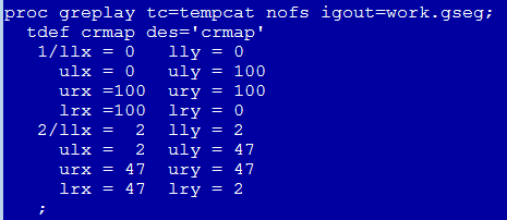
In SAS/Graph, we have a special proc that allows you to define multiple rectangular areas on the screen, and then display graphs into those areas. I used the following Proc GReplay code to define a template with two rectangular areas - one large area covering the whole screen, and then a smaller area about 1/4 the size.
![]()
Next, I used Proc GMap to draw a map of North and South America. We ship a world map, and maps of each continent, but we don't ship a map of North and South America ... therefore I simply combined mapsgfk.namerica and mapsgfk.samerica to create this custom map. Notice that I have made Panama a different color so it will stand out.
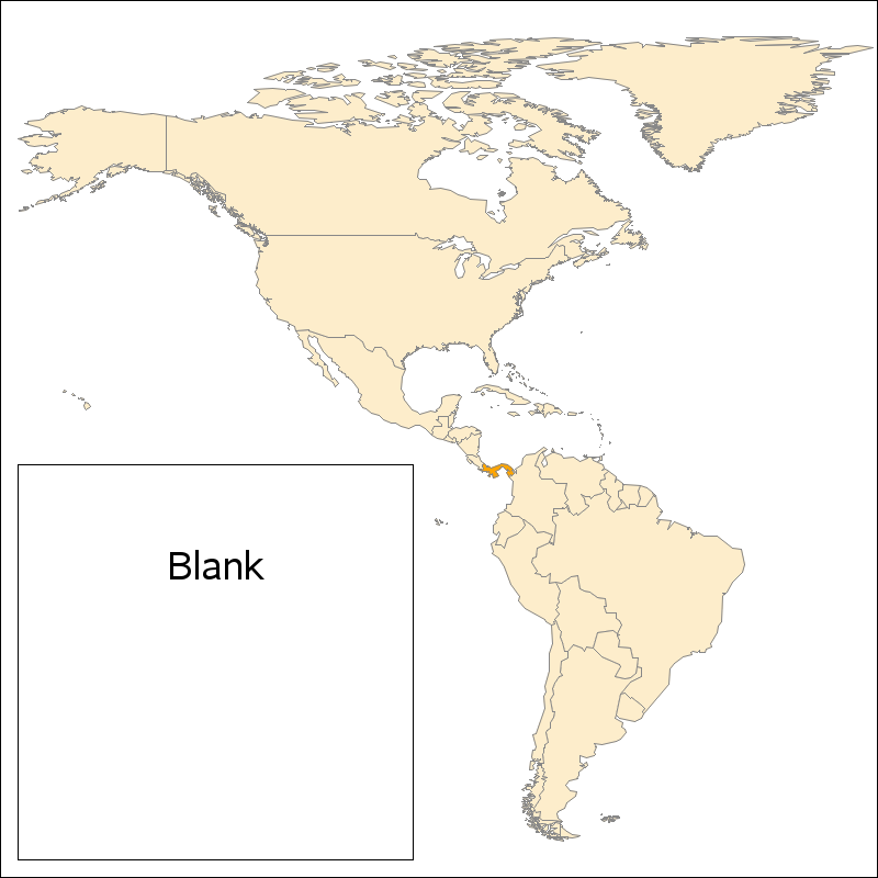
Although you can see Panama in the Americas map, it is pretty small relative to the other countries, and therefore difficult to see much detail. That makes this a perfect candidate for a zoomed inset map! For the inset, I combined Panama, Costa Rica, and Colombia, and then used Proc GProject to 'clip' out a rectangular region (by specifying longmin, longmax, latmin, and latmax values). I even annotated a yellow dot on the inset map, showing the exact area Eli is working in. Here's a link to all the code, if you'd like to download it and experiment.
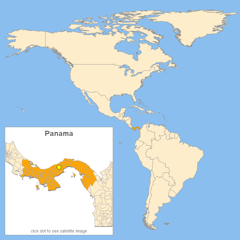
Proc GReplay is very flexible, and one big benefit over simply using an image editor to overlay an inset image is that GReplay also preserves the html mouse-over text and drill-downs! Click the image above to see the interactive version, and you can hover your mouse over all the land areas to see the names, and click the yellow dot-marker to drill-down to a Google satellite map of the area my nephew is working in. Pretty cool, eh!
Just curious - have any of you worked for the Peace Corps? If so, what was the most memorable thing about it?


1 Comment
That's another great idea. Going way back on your web site (Robert Allison's SAS/GRAPH GMAP Examples #1), I've always liked this idea of how to show an area of a map exploded in an inset ... http://robslink.com/SAS/democd1/explod.htm