With the advent of things like car GPS & Google Maps, and a steady supply of nice maps from certain news sources (such as the New York Times), people have finally embraced the idea that mapping data can be very useful. And if you are into data visualization, you have probably noticed that simple default maps are no longer good enough - the bar has been raised! SAS/Graph provides several tools that allow you to take your mapping to the next level and meet higher those standards, and in this blog post I share my first tip.
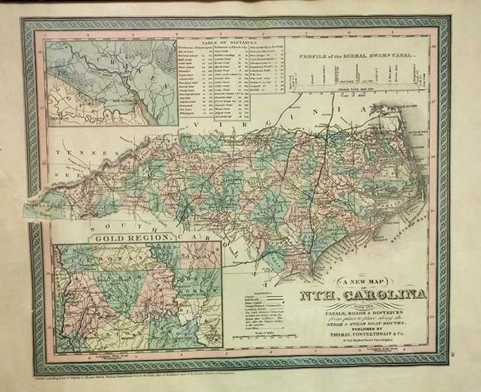
But first, to get you into the mapping mood, here's a cool map photo from my old college buddy Rich. He works with a lot of maps in his job, and he's got an "eye" for good maps. Believe it or not, he found this map at a yard sale! I especially like that it has an inset showing the "Gold Region" of North Carolina. They certainly did squeeze a lot of details into their maps back in the day, eh?!?
Reducing Border Complexity
For my first tip, I'll start with an easy one - reducing border complexity. Before you plot a map, it starts out as a dataset with a bunch of X/Y coordinates describing the points along the borders of the map areas. The more points you have, the more detail you can show along those borders ... but depending on how big of a page (or screen area) you're drawing the map on, there might be "too much" detail. Sometimes there are so many X/Y points that the pixels on your computer screen start blending in together, and the borders look bad.
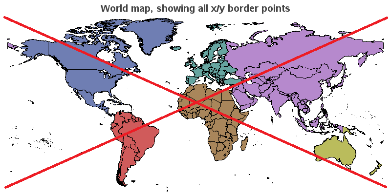
Here's an example using all 240,235 X/Y border points of the mapsgfk.world dataset, Notice that the borders look a bit crowded and 'fuzzy'.
In most of the SAS map datasets, there is a variable called density, and you can subset the map based on that variable's values to produce a map with less complex borders. I typically prefer my maps to be drawn with density<=3 (or sometimes even as low as 2 or 1). If your map doesn't have a density variable, you can use Proc Greduce to add one.
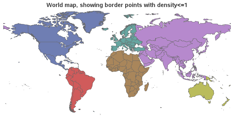
Below is the world map again, only using the X/Y border coordinates with a density value <=1 (that's using only 19,801 data points instead of the full 240,235). In combination with using fewer points, I also specified a gray border rather than the default black. These changes make the borders look much less crowded, producing a map that is more visually pleasing. Also, the borders don't compete with the interior colors for your visual attention. (Note that you can also use Proc GMap's density= option to specify a lower density, but I prefer to actually subset the data, because that has extra benefits such as using less cpu time when you process the map dataset.)
Here's the code, in case you'd like to experiment with it:
goptions xpixels=800 ypixels=400;
data my_map; set mapsgfk.world (where=(idname^='Antarctica' and density<=1) drop=resolution);
run;
title1 "World map, showing border points with density<=1";
proc gmap data=my_map map=my_map;
id id;
choro cont / discrete nolegend coutline=gray66;
run;
So, do you understand this tip, and know how to apply it to your maps? ... Or are you still daydreaming about finding gold in North Carolina? ;-)
Click here to see all my tips about mapping tools!


