If you're good at games like Wheel of Fortune, Scrabble, or Words with Friends, you've probably figured out that certain letters appear more often than others. But do you have a cool way to figure out which letters appear most & least frequently? How about using a computer to plot this data on a simulated keyboard!
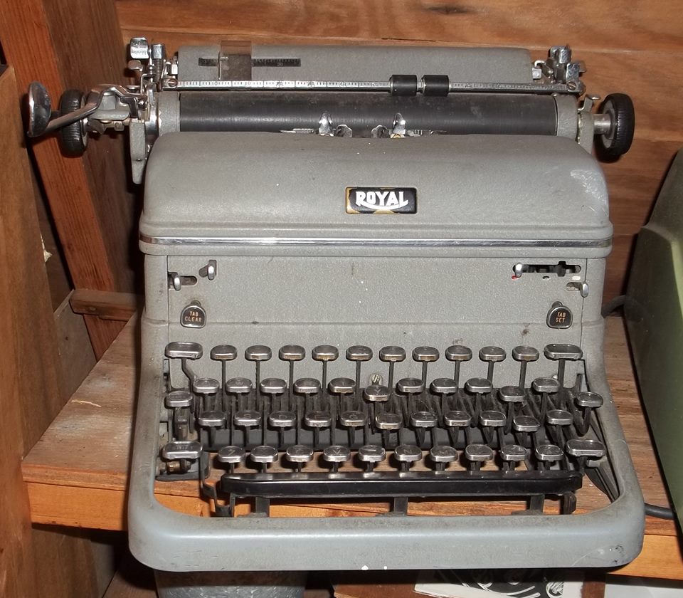
But before we get started, here's a picture of a good ol' manual typewriter, found by my friend Sara. This reminds me of the one I used in typing class in high school (they didn't have enough electric typewriters to go around, so they made us males use the old manual ones!) Have you ever used a manual typewriter? By the way, if you're ever on a scavenger hunt, you'll want Sara on your team - she can find anything - thanks Sara!
Now, let's find out which letters (or keys on the keyboard) I use the most...
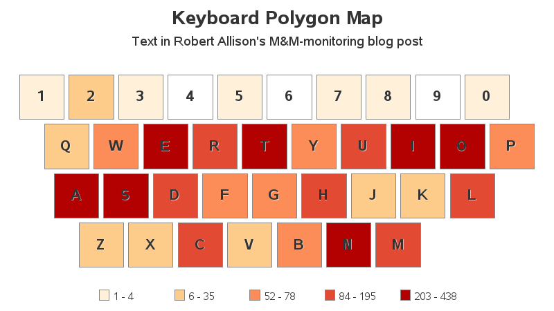
Key Count of a blog post
For a simple first-test, I copy-n-pasted the text from my most recent blog post (the one about monitoring the number of M&Ms in our break room) into a text file, and wrote some code to import the text into SAS and count how many times each character (or number) was used. I then plotted that data on a simulated keyboard, and shaded each key based on the number of times that letter appeared in the text. Now you can easily see which letters I used most frequently.
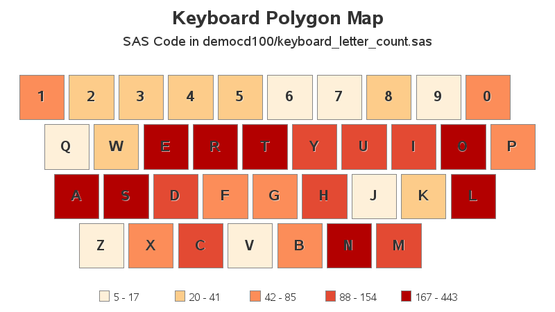
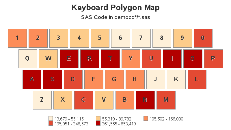
Key Count of a SAS program
I write a lot of blog posts ... but I probably write even more SAS programs. So I used a SAS program as the text, and plotted it on the virtual keyboard. I was a bit surprised that it shaded the keyboard pretty similar to the blog text!
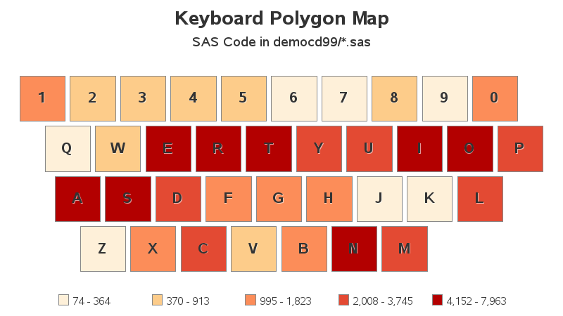
Perhaps that was a fluke(?) I tried another test, using all the SAS jobs in my democd99 folder (that was 19 SAS jobs). The shading on the virtual keyboard looks very similar to the one for the single SAS job.
What if I analyzed all the SAS jobs from all my democd's? (that's about 1,900 SAS jobs) Surely that would look different(?) Nope - the coloring is very similar to the previous ones! So it seems I consistently use certain keys more frequently than others. And what was my most frequently-used key? ... the letter 'T'.
What Good Is It?
This analysis was fun, but what good is it? Could you do anything useful with this information? Here are some possibilities:
- Well, for my personal benefit, it might tell me which letters are more likely to be more useful in word-games.
- Perhaps a keyboard manufacturer could use it to predict which keys will likely get more usage than others, and therefore use more heavy-duty materials/springs in those keys.
- Or, for the greater good, perhaps this type of analysis could be used to help detect fraudulent text (insurance fraud, fake comments generated by bots, etc).
What other uses can you think of? (feel free to discuss in comments)
How'd He Do That?!?
This next section is for the curious programmers out there (and the lifetime learners who just want to expand their knowledge). Here's this nitty-gritty on the technique I used to create this custom keyboard visualization...
I plotted the key summary counts on a choropleth map, where each key was a polygon. If you're not sure what a choropleth/polygon map is, think of a US map, where each state is a polygon. But whereas it's easy to find a polygon map for the US states, you'd be hard-pressed to find a polygon map designed to look like a keyboard. So I created my own.
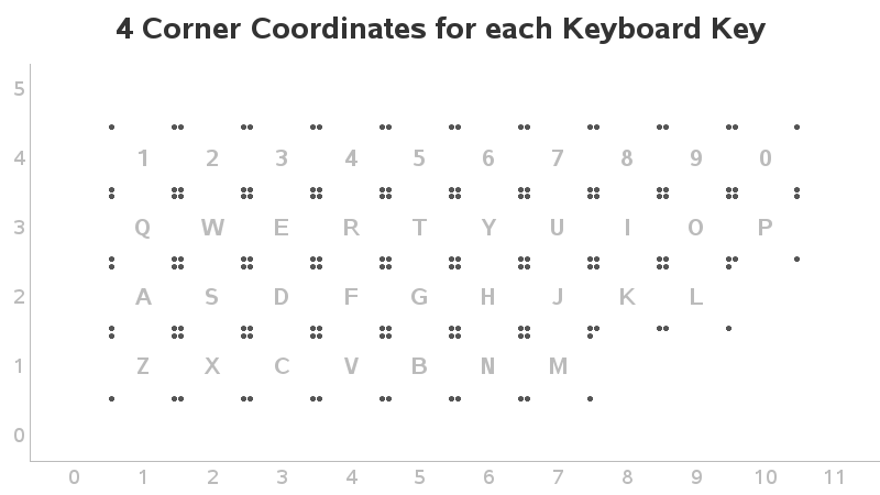
First, I created a dataset where I assigned a row and column for the center of each key I wanted in my keyboard.
I then created 4 coordinates for each key, using x/y offsets (left/right/up/down) for each key. These 4 coordinates create a rectangle around the center of each key. I've added the character for each key so you can better see how the layout is shaping up.
Now that I have 4 coordinates forming a rectangle for each key, I can treat them as map polygons, and draw them using Proc GMap. Below is the keyboard map, with the letters annotated on each key.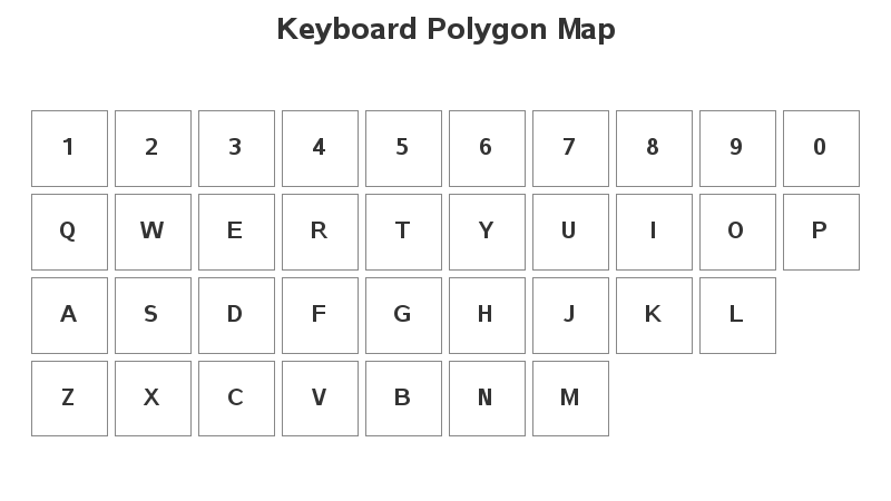
The above would be an acceptable representation of a keyboard map, but the keys aren't really positioned like they are in my keyboard. I therefore used trial-and-error, and added a little bit of x-offset to each row of keys, and this produced the final map layout. If it looks more like a keyboard layout, hopefully people will more easily get that it represents a keyboard.
 If you'd like to see the SAS code I used to create this example, here's a link.
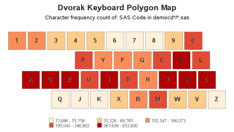
Update: Kevin Smith suggested it might be interesting to see the data plotted on a Dvorak keyboard layout. And here it is! :)

18 Comments
Lots of great comments & suggestions from many industry experts - lots of synergy here!
mines is wasd
Your analyses will be easier to compare if you use relative proportions (proportion of each key in the input text) instead of absolute frequencies. Then you can easily compare documents of different lengths. Also, you can compare whether the letters that are common when writing English text (E, T, A, O, I, etc) have similar proportions when used in computer programs. For more on the proportion/frequency of letters in the English language, see "The frequency of letters in an English corpus."
I guess I'm doing something 'in between' by using Gmap's quantile binning. I use 5 quantile bins, therefore ~20% of the keys get assigned to each color bin. But yes - relative proportion numbers would probably be more obvious/intuitive for making comparisons. :)
backspace.
Bwahaha! - The most-frequently-used key on my keyboard, hands down! :)
Robert, you left out the punctuation keys! If analyzing your SAS programs, you should expect to find a decent frequency of semicolons, parentheses, periods, commas, and mathematical operators...right?
Hmm ... could do that. But a lot of the punctuation characters are 2-characters per key, so then I have to decide whether I want to represent the number of times the key is pressed, or the number of times that character is used ... and then explain to the user which way I decided to go, etc. (That's why I just stuck with the simple letters and numbers - the K.I.S.S. principle!) :)
KISS is good. But you could split each “key” in half horizontally, put the shifted characters on top, and map them separately. That would also allow you to distinguish upper and lower case letters, so you can see whether you yell a lot.
And you left out “blank” :-)
And upper-case blank ... for when you want to yell that space! ;)
Similar to Bill I was thinking of the letter that no longer appear on my keyboard and worn out ones. "m" and "n" keys are blank and "e","o" and "l" have almost disappeared. Thankfully, I self-taught myself to touch-type on a manual typewriter as a child during a summer vacation.
I was intrigued to learn how you did the graphing! Thanks for sharing and with regards to other uses - perhaps for accessibility purposes/research, password pattern analysis. The mind wanders...
Ooh - cool ideas of other things to do with it!
I'd be interested in seeing the frequencies applied to a Dvorak layout. The purpose of that layout is to put the most common keys on the home row. It should be very evident if that is the case.
Hmm ... I might give that a try!
This is the center row of my Dvorak Spanish variation keyboard: AOEUIDRTNS.
If you compare it with the image all the red and two orange keys are in there. I think Dvorak did an excellent research on keyboard use and after a couple of years using its distributions I can attest they really reduce muscular fatigue.
Here's the analysis run with a Dvorak keyboard layout:
http://robslink.com/SAS/democd100/dvorak_letter_count.htm
Based on the keys on my keyboard that have had the key's letter worn away, my favorite keys appears to be:
's', 'l', 'c', 'n', & 'm'
Interesting - the 'direct' approach! :) ... I wonder if those keys are more frequently used, or is those fingers are better suited to press the keys harder?