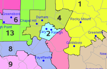
North Carolina recently re-drew the congressional district boundaries for the upcoming 2020 election. Here's a copy of the new map, from the ncleg.gov website: A couple of years ago, I created an enhanced version of the 2016/18 map, and I thought I'd do the same for the new 2020 map...
Tag: politics
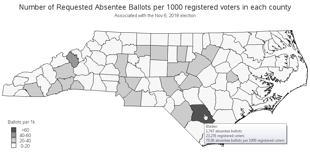
Certain North Carolina counties have been in the news lately, for suspected election fraud involving absentee ballots in the 2018 election. Let's analyze the voter registration and absentee ballot data, to see if we can detect anything suspicious! In order to definitively determine whether fraud & illegal activity occurred, investigators
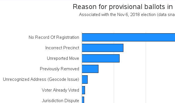
There has been a lot of controversy surrounding this year's midterm election, when it comes to counting the ballots ... and I kept hearing the term provisional ballots in the news. But I'm embarrassed to say that I didn't really know much about provisional ballots. I decided to do a
The US 'midterm' elections have finally started to wind down, and we finally have some (mostly) finalized results to study. But what's the best way to visualize who won the US congressional seats in each of the 435 districts? Let's dive into this topic!... Preparation For starters, I couldn't find
With the recent midterm elections here in the US, I frequently saw congressional district maps popping up in the news. And being a GraphGuy, I wanted to fully understand these maps, to see if I might could improve them. If you're interested in congressional district maps, follow along as I
With today being an election day here in the US, I see a lot of people wearing the 'I Voted' sticker. This got me wondering if I could create my own sticker ... using SAS software and simple graphics primitives. :-) So I started by using Proc Gslide to create
Have you noticed a lot of graphs popping up lately, about politicians, voters, and elections? ... Well of course - it's an election year! If you follow my blog posts, then you're probably a bit "smarter than the average bear" when it comes to scrutinizing graphs. And election graphs election
Why do people donate money to politicians and political parties? Sometimes it's because they agree with the platform, but sometimes it might be for potential financial benefits. When it comes to large donations from Fortune 500 companies, I suspect the latter! And since politics has been in the news a
Can felons vote? This seemed like a simple question, but I realized that I wasn't 100% sure of the answer. Therefore I looked into the data ... and apparently "it depends". Follow along and see how I created a map to help answer this question. But before we take the
The first time I voted (back in the 1980s), I was very surprised that I didn't have to show any kind of identification. I assumed it was because I lived in a small North Carolina town of 300 people where "everybody knew everybody" ... but they told me that nobody
Since Trump became the US president, many people have noticed that he posts a lot of tweets. While some people choose to analyze and critique the content of those tweets, I was more curious about something a little less controversial - the timing and frequency. Follow along as I dig into
Does your data just look like a bunch of dots? Would you like to bring those dots to life so they can tell their story? This example shows how to make some voter-registration dots a bit more lifelike, so you can see what they're saying. You can apply the same
A topic that's been in the news a lot lately is the presidential power to grant pardons, commutations, and such. But all the articles I've seen just quoted numeric totals - I haven't seen a graph of the data anywhere! So I set out to find the data and graph
Parents are always proud of their kids, and think their kids are better than all the other kids. I guess it might be a little bit that way with mapping software ... but I really do think I've got a pretty compelling example to show that SAS maps are better
Recently, my fellow SAS blogger Rick Wicklin wrote a post showing how to graph the ages of all the US presidents. And Chris Hemedinger showed how to create a bar chart showing the number of presidents having each of the 12 zodiac signs. Both are interesting graphs, but I wanted to
How is it that 91% of the US didn't vote for either Hillary or Trump in the primary, but yet they're still the final two candidates in the presidential election? Let's break it down with a simple graph! I recently saw a really cool slideshow on the nytimes website, that answered
I usually try to avoid political or religious debates ... but as an impartial data analyst, it is possible to analyze data about something, without entering into the debate. In this blog post, I try to walk that fine line, and analyze data about the political leanings of religious groups in the US.
In recent years, more and more people have been registering as independent voters in the US, rather than Democrat or Republican - the independents now control well over 1/3 of the votes. Will they likely vote for the Democrat or Republican candidates in the upcoming election? Let's break down some numbers
With the upcoming appointment of a new Supreme Court Justice, I wondered just how liberal and conservative previous justices have been. I found some data, and tried my hand at creating a graph to help visualize it... In my quest for data, I came upon an article on the NYTimes
With a major election coming next year, I was wondering if there have been any shifts & changes in the voters in my state. This seems like an interesting opportunity for some data analysis, eh!?! To get you into the spirit of elections, here's an "I Voted" sticker from my friend
In the U.S. we have a presidential election every 4 years - and as luck would have it, 2012 is an election year! I see a lot of election maps & graphs in the news, and I'm always subconsciously critiquing them in my mind and thinking to myself, "How would I graph this