Recently, my fellow SAS blogger Rick Wicklin wrote a post showing how to graph the ages of all the US presidents. And Chris Hemedinger showed how to create a bar chart showing the number of presidents having each of the 12 zodiac signs. Both are interesting graphs, but I wanted to take a slightly different (more traditional) graphical look at the data - something more along the lines of a histogram. This would let me view the age distribution of all the presidents, and confirm whether or not Donald Trump is the oldest.
For me, creating a graph is an iterative process. I start simple, and then add little changes & enhancements (wash, rinse, repeat), until I have a visualization I'm happy with. Rather than just showing you the final graph, I'm going to walk you through my entire though process this time ...
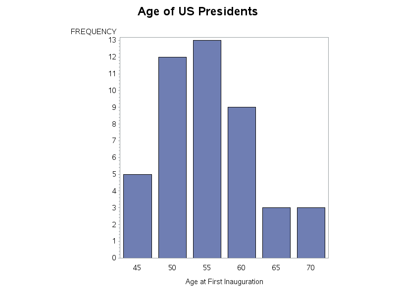
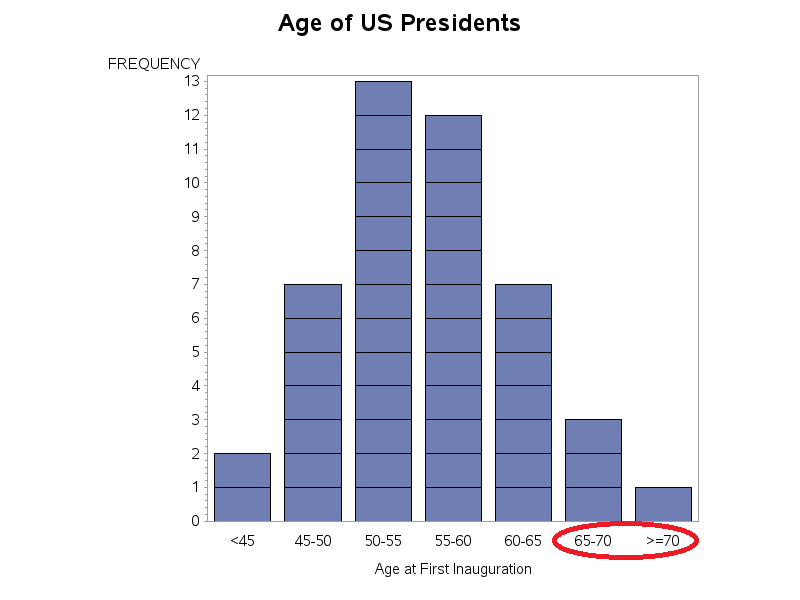
I started with a simple Proc Gchart bar chart, using all the defaults. It produced a fine histogram, showing the number of presidents grouped by age, and I could see that 3 presidents were in the '70' age group. I knew Trump was 70, and I had heard he is going to be our oldest president ... but there appear to be two other presidents in the 'age 70' bar in this graph. I think I need to dig a little deeper...
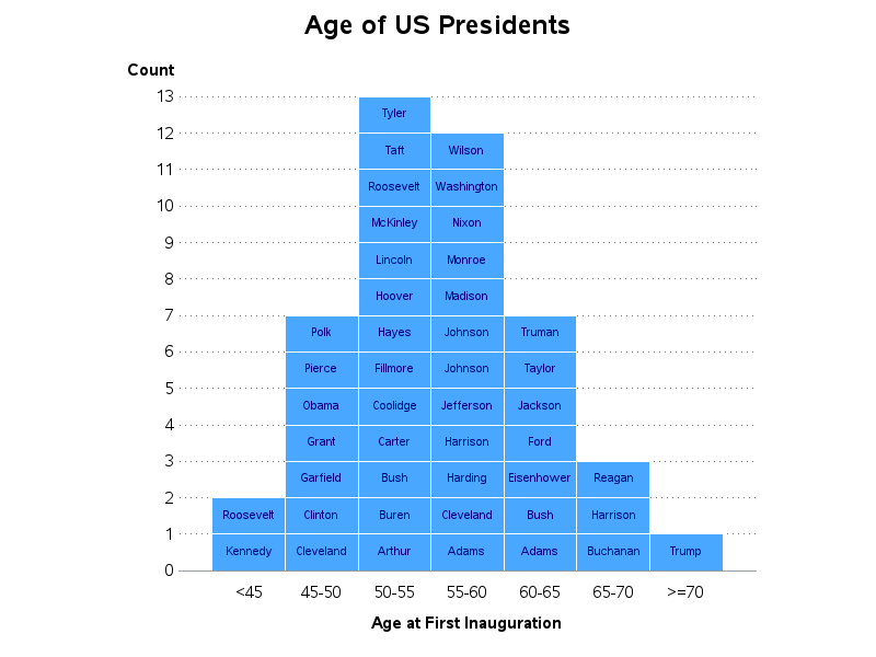
I used the subgroup option, to create a separate colored bar segment for each president, to determine who the other two were. In theory, I could match the colors in the bars with the colors in the legend and determine who the other two presidents' names ... but it was really a chore to try and distinguish all those colors. To save you a bit of time, I've used a drawing package and circled the legend items that correspond to the colors in the '70' bar (Trump, Reagan, and Harrison).
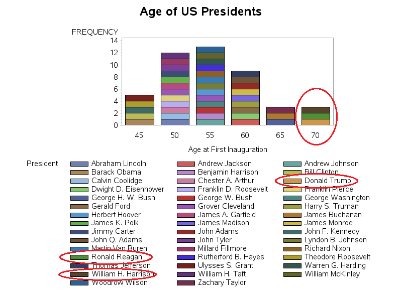
44 is a few too many colors for a legend - no, actually it's a ridiculous number of colors. Therefore I used a pattern statement to repeat a single color for all the bar segments. Then I used Gchart's 'html=' option to enable html mouse-over text. With that enhancement, I could hover my mouse over each bar segment and easily see not only the name of each president, but also their age at inauguration.
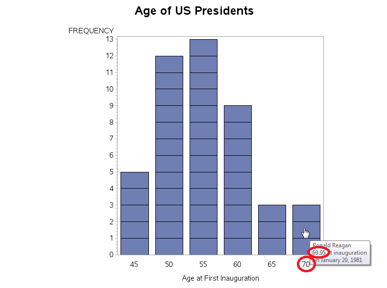
With the mouse-over text, I found that the other two presidents in the '70' bar were both slightly less than 70. Gchart bars of numeric values show the midpoint of each bar in the label, by default. In order to show the range of values in each bar (min-to-max), you must specify the 'range' option. With that change, it was much more clear that the last bar didn't show the presidents who were 70 when they were inaugurated, but rather the ones who were >=68.
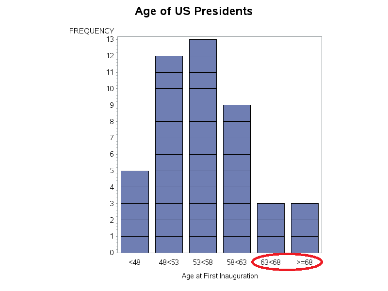
These automatically chosen ranges were nice and evenly-spaced, but they weren't really the ranges that I would have picked ... therefore I decided to go totally custom, and do my own binning. I used a data step and 'if' statements to check each president's age, and assign them to 7 bins, representing age ranges that start and end on even multiples of 5. I then created a user-defined-format so that those ranges (1-7) would show up as the text representation of the ranges (such as '>=70'). The resulting graph clearly showed that Trump was the only president >=70!
Now that I had the layout the way I wanted, I shifted my focus to the cosmetic details. I made the bars a prettier shade of blue, cleaned up the axes, added some reference lines, and annotated the presidents' names on each bar segment (here's the final code). The results might not be perfect, but it's what I would call a blue-ribbon graph! Click the image below to see the interactive version, with html mouse-over text and drill-downs.
Quick quiz:
Which last names are repeated multiple times in the graph?
What's the youngest and oldest ages allowed to run for president in the US?


6 Comments
I believe there isn't an oldest age to run for President in the US, but there is a minimum age: 35.
Nice, but I would tweak a few names: "J Adams", "JQ Adams" "T Roosevelt", "FD Roosevelt", "GHW Bush", and "GW Bush". Yes, that info's in the mouse-overs, but one shouldn't have to mouse-over to disambiguate names.
Nitpicks: IWBNI the columns were sorted by age, not descending name, and if the dates in the mouse-overs didn't have leading zeroes ("March 04, 1881"). I also think ages rounded down to a "69 years, 11 months" format would look better than "69.95", even if you lose a little precision.
Good suggestions!
Ageing, postponing ageing among the US Presidents Graphs - nice ! Ewa Frątczak
Interesting! I like the custom binning and annotation steps - definitely blue-ribbon!
Thanks! - We might make a SAS fan out of you yet, eh!?! ;)