With the recent midterm elections here in the US, I frequently saw congressional district maps popping up in the news. And being a GraphGuy, I wanted to fully understand these maps, to see if I might could improve them. If you're interested in congressional district maps, follow along as I explore this topic ... one layer at a time.
Background
Here in the US, we have 435 congressional seats, and allocated to the 50 states based on the census population numbers every 10 years. Based on the 2010 Census, the average number of people for each congressman was 710,767, and North Carolina got 13 of the 435 congressional seats (whereas we only had 12 in 1990, and 11 in 1980). And therefore NC currently has 13 congressional districts.
As the number of congressional seats changes, or if the population moves around the state, the borders of the congressional districts must be redrawn. The main rules for drawing the congressional district boundaries are to follow county borders as much as possible, and for the borders not to be drawn based on race. And they are currently debating whether or not the borders can be drawn based on party registration (a debate which will probably be decided by the Supreme Court).
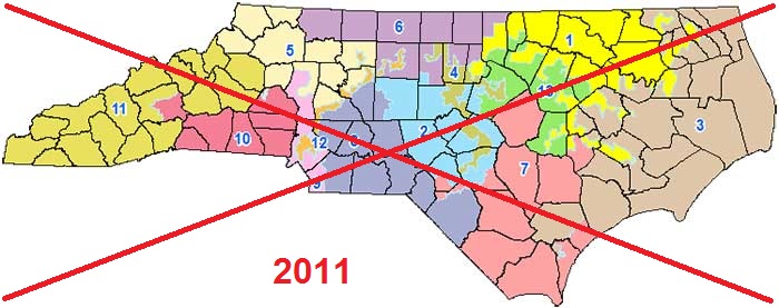
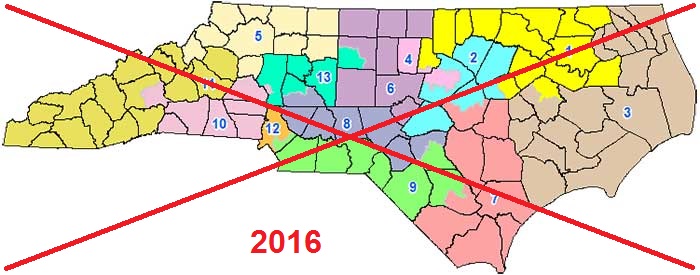
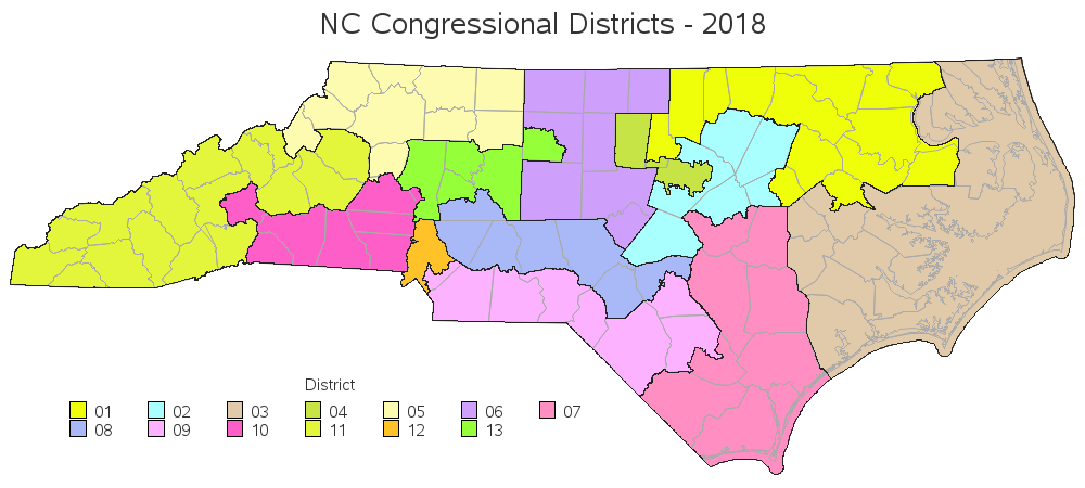
Any time congressional districts are redrawn, that tends to be a controversial endeavor and the term gerrymandering (manipulate the boundaries of so as to favor one party or class) comes up. Favoring a certain political party is referred to as partisan gerrymandering. Here are the NC congressional maps created in 2002, 2011, and 2016 - each of these maps has been accused of gerrymandering in one form or another. If you'd like to learn more about these past maps, here's a link to a nice article I recommend.

Creating a Better Map
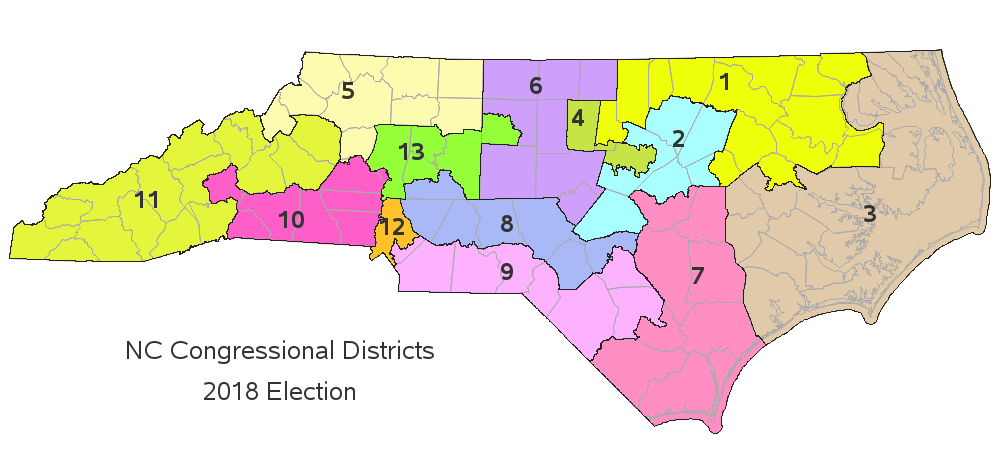
As a GraphGuy, I notice several problems in the maps above (aside from the gerrymandering, which is beyond the scope of me 'fixing' it). Here are the main problems I notice.
- With the dark county borders, the main emphasis of the maps above seems to be counties, rather than the congressional districts.
- There are no 'reference points' such as cities, to help the user get oriented.
- There was no title for the maps (I manually added the year labels - they weren't in the maps as I found them).
- There are no borders along the beaches of the coastal counties.
- There is no mouse-over text.
It's poor form to complain about a map without trying to create a better one, therefore I set out to do just that. First I had to find the boundaries of the districts. I did a bit of Google searching, and found that I could download the shapefile for all the US congressional districts from the data.gov page. I used Proc MapImport to import the shapefile into SAS, and then generated a simple scatter plot (below). The map included a few non-state areas (which will be easy enough to get rid of when I subset our NC), and I was pleased to see that the coordinates are in unprojected latitude/longitude degrees (that way I don't have to worry about unprojecting the coordinates).

I used a data step and a where clause to get just the congressional districts in NC, projected the subset, and then used Proc GMap to plot the polygons. I didn't really like the colors used in the maps above, therefore I used the colors from this other version I found in a news article - they're a little brighter and easier to distinguish. Here's my first/simple map - it's a bit too simple, but a good starting point.
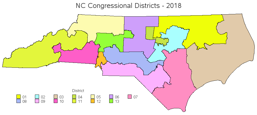
This simple map definitely puts more emphasis on the congressional district borders ... but it would also be nice to show the county borders, since people recognize county borders and preserving county borders is one of the goals of the congressional districts. Proc GMap doesn't allow two levels of borders to be specified, therefore I used annotate to add another layer to the map containing simple polygons to outline the counties (with the poly/polycont annotate functions). I used a light gray color for the county borders, so they would have less visual emphasis than the black congressional district (cd) borders.
But alas, since the county and cd borders are often in the exact same location (which is one of the goals of defining good districts), the light gray county border layer often obscures the darker cd borders in the map. This is not the effect I was striving for!
Therefore I added another layer - this time annotating the cd borders on top of the county borders. Now you can see the light gray county borders (for reference), and but the major visual emphasis is on the darker cd borders.
Now let's work on that legend! ... With 13 items in the legend, it's very difficult to match up all the colors and shaded in the legend, with the colors and shades in the map. Therefore I decided to get rid of the legend, and label the districts (like they did in the original maps). I thought about using the %centroid macro to determine the positions for the labels, but I decided to take total control and place the labels at specific lat/long coordinates of my choosing. I added these labels as another layer in the map, using the annotate label function. I also moved the title text to the space formerly occupied by the legend, to make better use of the empty space, and I think the title looks better there than at the top of the map.
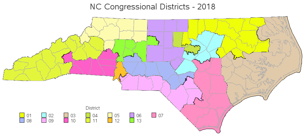
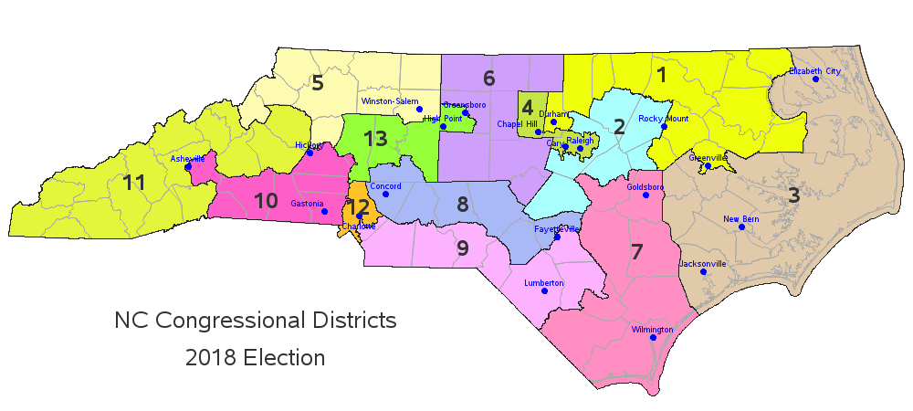
Since I grew up in NC, I'm familiar with the shapes of several counties - but not all 100 of them. Therefore I needed a few more reference points to help me better understand what areas were (and weren't) in these congressional districts. Therefore I added one more layer - cities! I created a list of the larger cities I thought people might recognize, and then looked up the lat/long coordinates in the mapsgfk.uscity dataset. I projected them using the same parameters as were used to project the map, and then created an annotate layer to annotate the city name and a dot/pie marker. I admit, these city labels do make the map look a little more cluttered - but it's useful clutter.
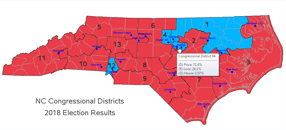
There's one more helpful feature I added - mouse-over text! Although the large district numbers probably suffice for a simple cd map (above), it's nice to also have HTML mouse-over text capabilities for showing additional information such as election results. I used a data step with a 'by' statement and a 'retain' statement to cleverly loop through the data an build up multi-line mouse-over text for each congressional district, and then specified that variable using Proc GMap's html= option. Below is an example of the mouse-over text (click the image below to see the interactive version of the map, with the HTML mouse-over text for all the NC congressional districts).
What other ideas have you got, for an improved version of the congressional district map?


3 Comments
We need a map like that for state legislative districts here in Florida - which, after 20 years or so of 1 party rule, have been outrageously gerrymandered!
Hi Robert,
Great maps! More transparency like this might help erode the gerrymandering debacle in the US.
Would be able to share your code please?
Dave
Thanks! I'm happy to share the code - here's a link to it: http://robslink.com/SAS/democd101/nc_congressional_districts_2018_info.htm