Does your data just look like a bunch of dots? Would you like to bring those dots to life so they can tell their story? This example shows how to make some voter-registration dots a bit more lifelike, so you can see what they're saying. You can apply the same techniques to your data dots as well!
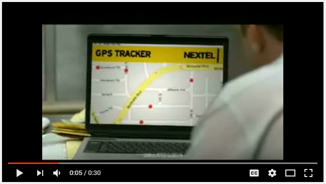
Do you remember the old Nextel commercial for their flip phones with the walkie-talkie feature? A distribution center was tracking their delivery people as dots on a map, and their phones let them talk to the dots ... and the dots could actually talk back?!? That was one of my all-time favorite commercials! ("Don't agitate my dots!")
Well in this example I don't make my dots literally talk, but some clever visual analytics helps my dots tell their story...
Recently, my friend Julianna gave me a heads-up that the North Carolina State Board of Elections (ncsbe) had made the voter registration data available on their website. I downloaded the data file (ncvoterStatewide.zip) and unzipped it, creating ncvoter_Statewide.txt. The text file contained tab-delimited values, with each value (character and numeric) enclosed in quotes:
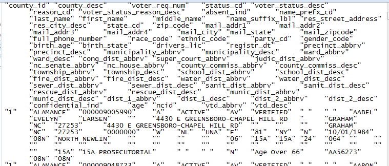
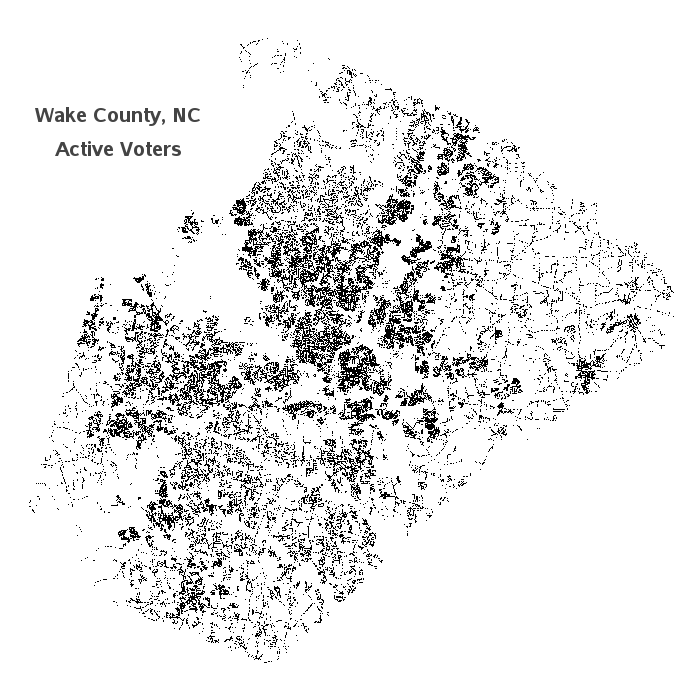
It's really difficult to do much data analysis looking at the values in their text format, therefore I wrote some SAS code to import the text file into a SAS dataset. I then got the Wake county voters subset of the data (790,642 voters), and used SAS/Graph's Proc Geocode to estimate a latitude/longitude coordinate for each voter's street address. I further subset the data to just the active voters, and as a sanity check I plotted the locations as tiny dots. Here's what the geographical distribution looks like - I can kind of make out the shape of Wake county, which means I'm on the right track so far!
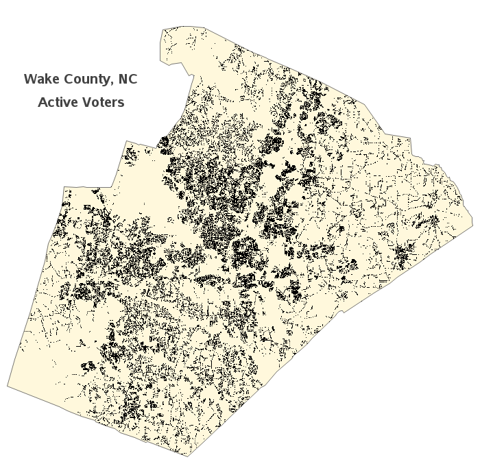
Next I combined my dots with a geographical map of Wake county. It's interesting to see that the dots are clustered in certain areas, and then there are empty gaps in other areas. Since I know Wake county pretty well, I'm pretty sure the areas with no dots are lakes, state parks, roads, airports, etc. It's interesting to see the distribution of voters, but as Julianna pointed out, it's basically just a population distribution map (since there are voters pretty much everywhere there are people).
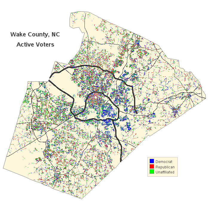
There's much more information in the data than just the street addresses - let's add some additional information to the map so the dots can say more! I was curious to know the distribution of the political parties around the county, so I color-coded the dots by party. If the parties are randomly distributed in an area, then that area will have a random-looking mixture of colored dots. But if there's an area that visually appears a certain color, then a higher percentage of voters in that area are from a certain party. A fairly large area just to the right of the middle jumps out at me as looking much more blue than the rest of the map, so that appears to be mostly democrats.

But exactly what area of Wake county is this group of blue dots in? Is it downtown Raleigh? Is it inside the beltline (ITB)? We need some additional visual cues to help determine exactly which area it is. We could plot the dots on a zip code boundary map, or a Census block map ... but those areas probably aren't something most people can readily identify. The reference points that most people can recognize are major roads! And if you remember my previous blog post, I showed you how to add roads to a map, and promised I would show how to combine roads with demographic data ... well this is where I make good on that promise!
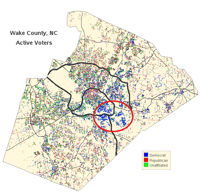
Now that there are roads on the map, it is much easier to tell that the concentration of blue dots (ie, predominantly Democrats) occupies the right half of the inside the beltline area, as well as areas to the east and southeast of the beltline (see areas circled in red below).
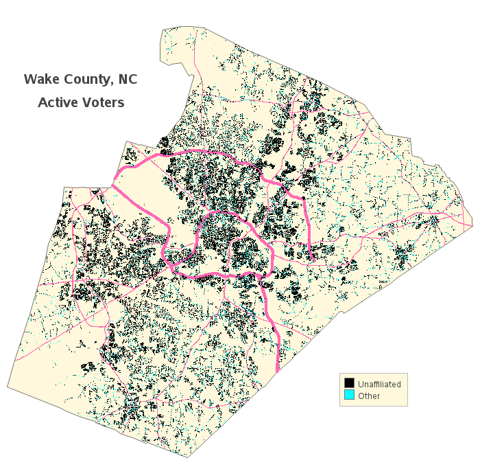
An alternate way of saying that this area has mostly Democrats would be to say it has fewer voters of the other political parties. I was curious whether this area had fewer Republicans or fewer Unaffiliated voters? I plotted the Unaffiliated voters (as black dots) versus all other parties (cyan dots), and the distribution of Unaffiliated voters seemed to be fairly consistent across the whole county.
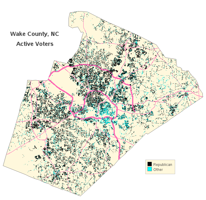
I then plotted Republican voters (as black dots) versus all other voters (cyan dots), and there definitely seems to be a lack of Republican voters in the area with a high concentration of Democratic voters.
Hopefully you have now learned a few tricks for plotting voter data (or other people-related data) as dots on a map. Your data dots have something to say, and using these tricks (geocoding, coloring, and adding roads) gives your dots a voice!

6 Comments
This is really neat. Is it possible to see the SAS code that did all this?
Certainly... http://robslink.com/SAS/democd91/ncvoter_party_wake_info.htm
Thanks! Can you also overlay the Republican-drawn election districts for state legislators on this!!
Do you think fair districts should follow the natural party groupings, or split them? Which way would be more fair? :)
Very nice, with LOTS of valuable "tricks" added in.
Thanks Louise! - I know you'll put these tricks to good use! :)