Graphically Speaking
Data Visualization with a focus on SAS ODS Graphics
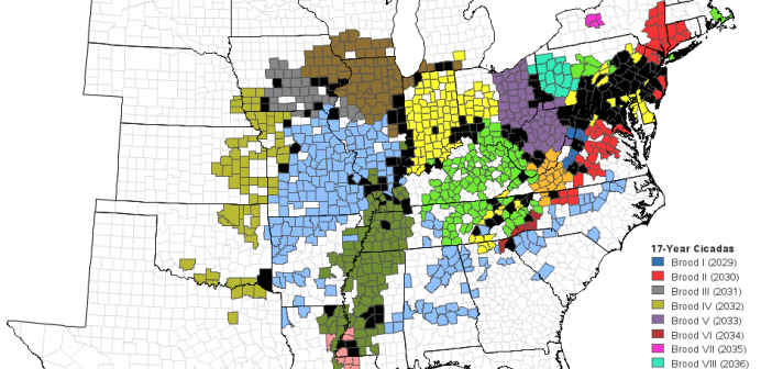
I hope you're all doing well, in this year of plagues and locusts! I'm sure I don't even need to mention which plague I'm talking about. But what about the locusts? Are you up on your entomological studies? Follow along, and see if you really know what locusts are... Locusts

Having earned the Eagle Scout rank in Boy Scouts, I am of course very conservation-minded, and against polluting. I'm also an avid boat paddler and fisherman, and therefore I'm especially concerned about pollution in our rivers, lakes, and oceans. I even volunteered for a week to help survey coral reefs

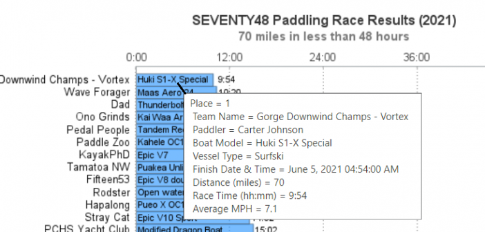
I've got this buddy, Carter Johnson - he's a little bit crazy, but a lot of fun to follow... He holds/held several different long-distance paddling world records, and was one of the coaches for the group that paddled kayaks from Cuba to the US (see my blog post). A few
