If you have plotted data on a map, you have probably tried to estimate the geographical (or visual) 'center' of map areas, to place labels there. But have you ever given any thought to the "center of population"? This is one of the myriad of statistics the US Census Bureau tracks, and I think it's fun/interesting to see how these centers move over time.
What made me think of this topic most recently? I saw the following map on Reddit. The title (separate from the graph) was "Population centers of each US state from 1900-2010 (blue dot is 1900, red dot is 2010)."
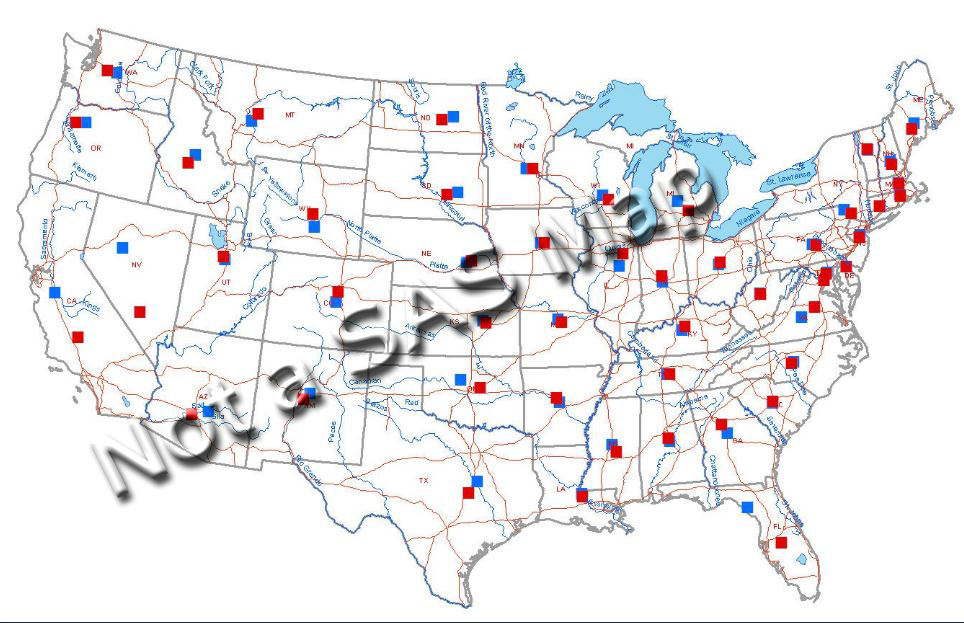
It was an interesting topic, and I wanted to like their map ... but it was just too difficult to read. In addition to the red and blue population center markers, it also showed lakes, rivers, and highways. These landmarks might add a bit of context to people who are familiar with the area, but they just obscured the data for me. There's just too much clutter and distraction in this map. I decided to create my own map, and see if I could do better!
The Data
There are probably multiple sources for this data, but the first one I found was this Census page, so I went with it. Unfortunately, rather than a nice csv file or Excel spreadsheet containing all the data, this page only lets you select a year, and then they show you a table of that year's data (hint, hint ... Census, it would be really handy if each of your report pages had a link to download the raw data in an easily-imported format!).
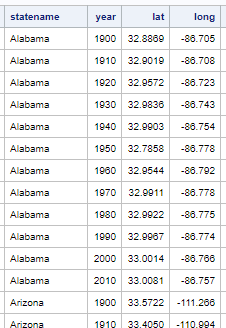
I used a clever macro Rick Langston wrote, and 'scraped' the data from the table for each decade snapshot, and then combined the decades into a single dataset. I converted the degree/minute/second centroid coordinates into simple decimal degrees. Here's an example of what the data looks like:
Preliminary Map
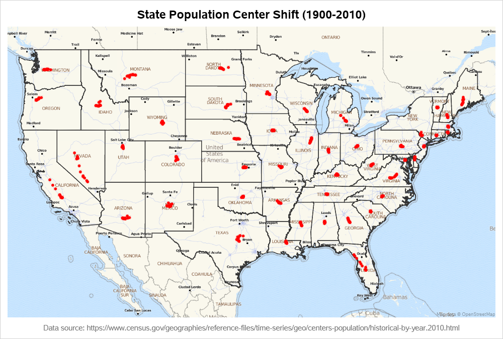
With very minimal code, I was able to plot the lat/long centers on a map, with choromap borders of the states.
proc sgmap mapdata=my_map_cont plotdata=my_data_cont noautolegend;
openstreetmap;
choromap / discrete mapid=statecode lineattrs=(color=gray33 thickness=1px);
scatter x=long y=lat / markerattrs=(color=red symbol=circlefilled size=6px);
run;
Refining The Map
Plotting this data on a streetmap was useful for verifying that I converted the lat/long coordinates to decimal degrees correctly, but the (above) map isn't any better than the original map (ie, this map also has too much clutter and distraction).
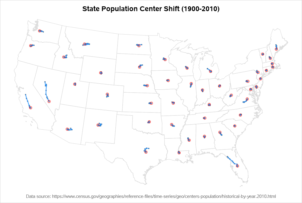
For my final map, I decided to use just the choropleth state outlines (with no streetmap behind them). And to get the shape of the map to look good, I projected it (using Proc Gproject). Note that when you project a map, you must also project the point-data using the same projection parameters, so their projected X/Y will line up correctly with the map. And a special caveat for plotting projected maps with Proc SGmap - you have to drop the lat/long variables to have SGmap use the X/Y variables (if lat/long variables are found in the mapdata dataset, then they will be used rather than X/Y).
For the final map, I plot markers (scatter) at each point, and also draw a line (series) from the first to the last data point for each state (this allows you to 'see' how the data changed over time). I create an extra x/y variable for the 2010 data point, and overlay a circle at that coordinate. I make the choropleth state outlines very light, so the lines & markers (ie, the data) stands out as the most important thing in the map.
proc sgmap mapdata=my_map_cont (drop=lat long) plotdata=my_data_cont (drop=lat long) noautolegend;
choromap / discrete mapid=statecode lineattrs=(color=graydd thickness=1px) tip=none;
scatter x=x y=y / markerattrs=(color=gray33 symbol=circlefilled size=4px) tip=(statename year);
series x=x y=y / group=statename lineattrs=(pattern=solid color=dodgerblue thickness=2px) tip=none;
scatter x=x_2010 y=y_2010 / markerattrs=(color=red symbol=circle size=10px) tip=none;
run;
The Rest Of The Story
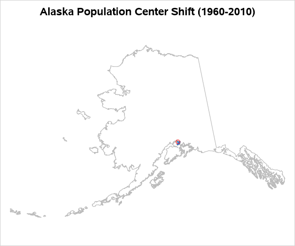
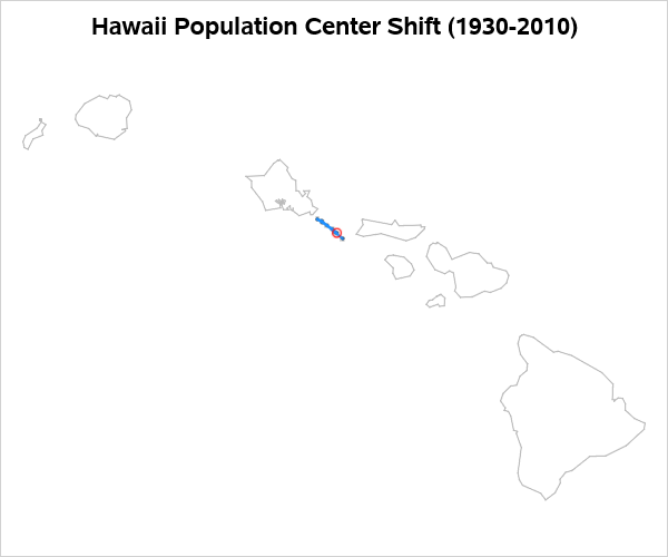
You might notice that I left out Alaska and Hawaii ... Well, if I left them in their actual position, they wouldn't fit on the page very well with the rest of the US. And if I project/moved/resized them to fit in the bottom/left corner of the map, I would have to also similarly project/move/resize the point data ... which is a bit cumbersome code-wise (and I'm trying to create examples users can easily re-use). Excuses, excuses...
And my final/best excuse ... since Alaska and Hawaii didn't become states until 1959, we don't have population centroids for them going back to 1900. So there! 🙂 But, I did decide it would be interesting to create separate maps for them, and plot what data was available ...
The Code
Here's a link to my mapping SAS code, if you'd like to try running (and modifying) it. And here's the macro I used to scrape the data from the Census page. You will need SAS 9.4m7 in order to use all these options (remember - Proc SGmap is very new!)


