When an election is on the horizon, I always feel compelled to plot some data! And this time I'm plotting North Carolina's voter registration data!
State Data
For this graph, I downloaded several of the data snapshots from the NC State Board of Elections' website, and plotted a line showing the number of registered voters in each of NC's main political parties. I chose data snapshots at monthly intervals, basically the earliest snapshot of each month.
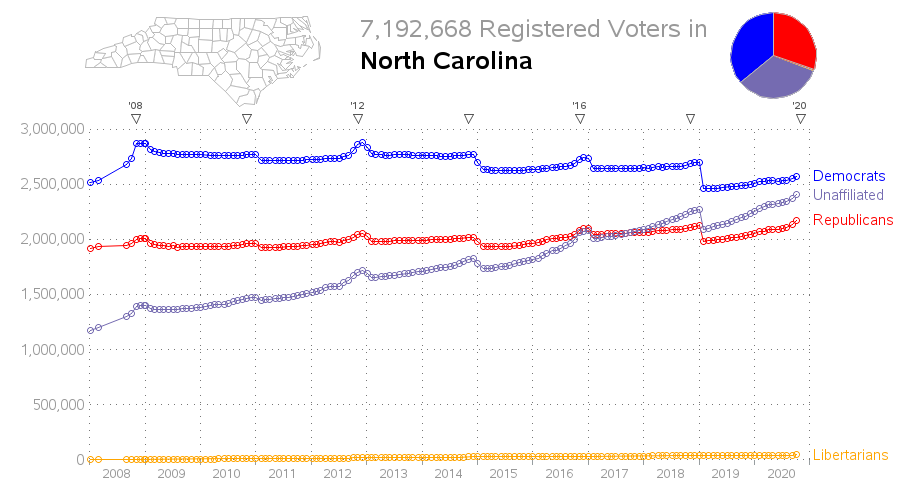
The graph (above) shows that there are more registered Democrats than Republicans in NC, but the numbers are fairly close - with about 1/3 Democrat, 1/3 Republican, and 1/3 Unaffiliated (you can get a feel for that in the pie chart of the most recent values). In the past few months, it appears the Republicans have had a bigger increase in registered voters than the Democrats, but looking at the long-term trend it appears NC will soon have more Unaffiliated voters than either Democrats or Republicans.
You might also notice a decrease in the number of registered voters at certain points in time. These dips show when they clean up the voter rolls and 'unregister' people who haven't voted or responded in many years, etc. Note that I added little triangles above the graph to show when the elections took place (I added the 2-digit year above the triangles for the presidential elections).
County Data
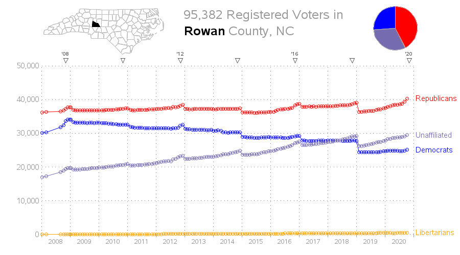
Viewing the state level graph is interesting, but there's another level of detail available - this data actually goes down to the county level. Therefore I set up an interactive version of the graph, so you can click on the counties in the little map at the top/left of the graph and it will drill-down and show you a graph for that county. Or, if you prefer, you can scroll up/down on the page to see all the counties. For example, here's the graph for Rowan county, where I grew up and first registered to vote many years ago:
Rather than adding images of all 100 county graphs in the blog here, I have set up an online/interactive version, which I invite you to try!
Observations
Do these graphs show anything important? Of course, the "elephant in the room" (or should I say donkey in this case?) is that the counties with the big population centers (such as Mecklenburg and Wake) have way more Democrats than Republicans. And the number of Republicans seems to be holding steady, while the number of Democrats and Unaffiliated in those counties are growing. (I suppose a good question would be whether the Unaffiliated lean Democrat or Republican - since the elections are secret ballot, there's no way to know for sure.)
One of the things I find interesting in the county graphs is when the parties 'flip'. During the time period covered in the graphs (2008-2020), the following 20 of NC's 100 counties have flipped from more Democrats to more Republicans: Alleghany, Brunswick, Burke, Camden, Cleveland, Craven, Currituck, Dare, Harnett, Haywood, Johnston, McDowell, New Hanover, Onslow, Pamlico, Pender, Rockingham, Rutherford, Surry, and Yancey (Beaufort and Sampson look like they will flip soon). Here's Camden, for example:
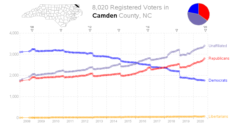
I also find it interesting how there are more 'Unaffiliated' voters than either Democrats or Republicans, in the following 17 counties: Buncombe, Camden, Chatham, Currituck, Dare, Haywood, Henderson, Jackson, Madison, New Hanover, Onslow, Perquimans, Polk, Swain, Transylvania, Wake, and Watauga. (See Camden in the graph above.)
Another observation - the cleanup of the voter registration data right after the 2018 election seems to have been more thorough than after the previous elections, because there was a bigger drop in the numbers.
What things do you find interesting in these graphs? Feel free to leave a comment - but please be civil (inflammatory or partisan comments will be deleted!)
How'd He Do That?
For the SAS programmers out there who might want to create similar graphs, here's some information on how I did it. The following marked-up graph shows the terminology I'll be using in the explanation below, and here's a link to the full sas code.
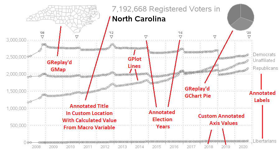
- I accessed the data snapshots directly on the NCSBE website (without physically downloading them) and then used a data step to parse the data into the fields I was plotting.
- I used Proc GPlot to plot the lines for each party, and overlay them on the same graph. I used the autohref and autovref options to add the dotted reference lines, which make it easier to see if the data lines are increasing or decreasing.
- In addition to the reference line grid, I also added some custom reference points along the top of the graph, to show when the elections occurred. For the presidential elections, I also added the 2-digit year to the triangular markers.
- I didn't want the year values to show 'at' the tick marks along the bottom axis, but rather centered between them. Therefore I annotated them.
- I also annotated labels showing the political party name at the end of each line.
- To get the title text positioned exactly like I wanted, I also annotated that. Note that I calculated the total, and stored it in a macro variable ... which I then used in the annotated title text.
- I could have annotated images for the map and the pie chart to add them to the graph ... but I wanted to have mouse-over text for the slices, and I wanted the counties in the map to allow you to drill-down to each county's graph when you click on them. I did this by using Proc GReplay to overlay the fully functional map (GMap) and pie chart (GChart) on top of the line chart (GPlot) - this preserves the HTML mouse-over text and drill-down capability.


2 Comments
Studies have been done on unaffiliated voters in NC and most are not really unaffiliated in that most vote consistently either for Democrats or Republicans. One study done in 2017 shows that about 1/3 vote consistently for Republican candidates, 1/3 vote consistently for Democrat candidates and 1/3 are truly vote-splitters (https://www.jdnews.com/opinion/20170902/john-hood-unaffiliated-voters-hold-key). So the # of unaffiliated voters practically is not as high as indicated.
One problem with political studies (based on surveys?) is that, according to many of my Republican friends, Republicans are notorious for not responding to surveys, or intentionally being 'untruthful' when responding to surveys. ... Of course, what they were telling me might, or might not, be true! 😉