Graphically Speaking
Data Visualization with a focus on SAS ODS Graphics
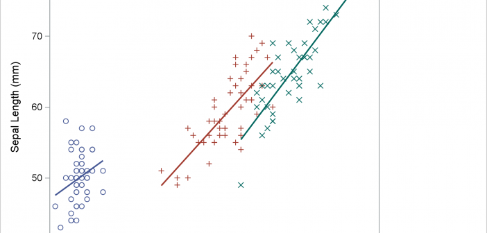
What you need to know about the graph template and data object in PROC SGPLOT
PROC SGPLOT looks at the PROC statements, it looks at the data, and it writes a template that might depend on the data. If you want to understand how the graph is created, you need to look at the PROC SGPLOT code, the graph template and data objects that it constructs, and the final graph.

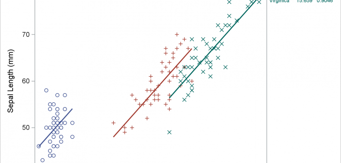
Displaying a grouped regression fit plot along with the parameter estimates
Usually, you use axis tables when there is a clear link between the rows of the axis table and the graph. I'll show how to use an axis table to create a table that is independent of the graph. This post also uses discrete attribute maps.

Advanced ODS Graphics: Processing ODS OUTPUT data sets from PROC SGPLOT
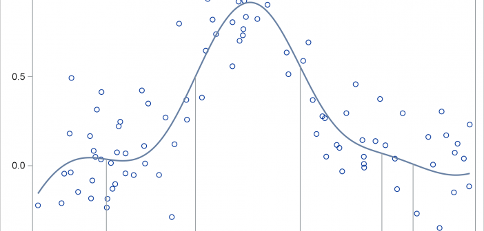
This post shows you how to run PROC SGPLOT, create smooth curves by using penalized B-splines, use ODS OUTPUT to create an output data set from PROC SGPLOT, and process it to display drop lines.
