Graphically Speaking
Data Visualization with a focus on SAS ODS Graphics
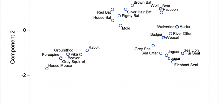
Advanced ODS Graphics: Applying the POSITION= option to scatter plots
The POSITION= option in the TEXT statement provides you with a way to position text in a variety of locations relative to a point. You can use this option to fine tune label placement in a plot primarily created by using the SCATTER statement and the DATALABEL= option.

Fun with ODS Graphics: Animating text
This post shows you how to animate text to create a message that appears one character at a time.

Little things go a long way
In my previous post, I described a new options to control the widths of the caps for Whiskers, Error and Limit bars. This topic could have been titled "Little things go a long way", as such details really make for a good graph. In a similar manner, another detail issue

