Graphically Speaking
Data Visualization with a focus on SAS ODS Graphics
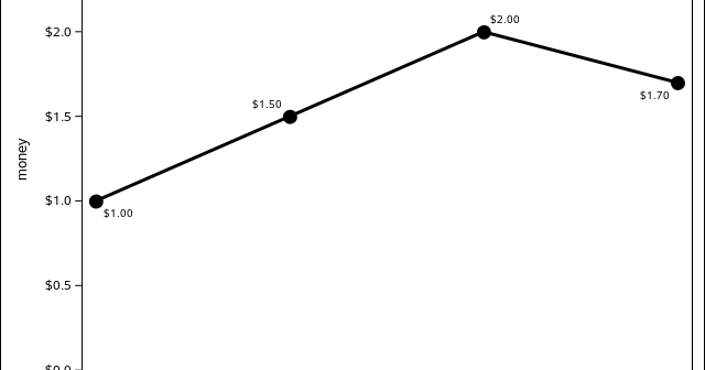
Recently, I was asked about a formatting situation where the DOLLAR8.2 format was specified on the data column, but the cents on the axis showed showed just one digit instead of the two requested by the format. data example; input time money; datalines; 1 1 2 1.5 3 2 4

The ODS Graphics software, first released with SAS 9.2, supported creating graphs directly from statistical procedures. Prior to this, very few statistical procedures created graphs on their own, and in most cases creating graphs was a post process or creating the graphs from the saved data using SAS/GRAPH procedures. With

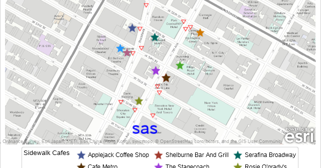
As mentioned in other PROC SGMAP blogs, several SAS/GRAPH procedures have been moved to 9.4M6 Base SAS to be used with PROC SGMAP. You can use these to create PROC SGMAP output even when using the free SAS University edition. In this blog you will use the: IMPORT procedure for


