Graphically Speaking
Data Visualization with a focus on SAS ODS Graphics
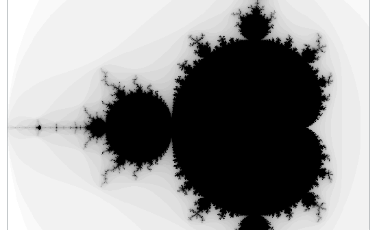
A few years ago Mandelbrot sets and fractals were all the rage! (Am I showing my age? Hahaha!) I thought creating some plots of this type of data would be a good way to sharpen my SAS programming skills, and it would make a nice/interesting example to help teach people

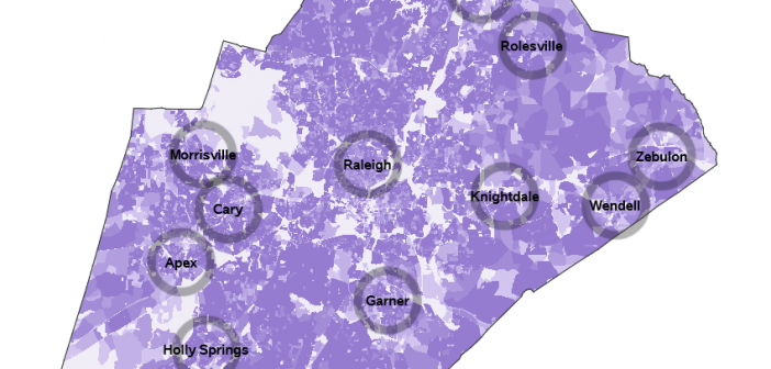
As the 2020 Census approaches, I'm getting my code ready to plot the data! And a question I often hear is "Can you use SAS software to plot data on a Census block map?" Rather than tell you 'yes', let me show you 'yes' 🙂 Preparing the map First I

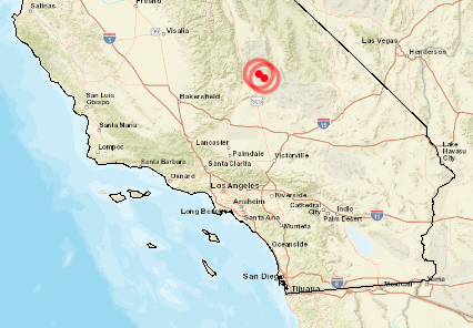
Earthquakes have been in the news lately - in particular, two very strong earthquakes that recently hit California. Exactly where did they hit? ... Let's plot it on a map! But before we get busy analyzing the California data, here's a picture to get you in the mood for studying
