Graphically Speaking
Data Visualization with a focus on SAS ODS Graphics
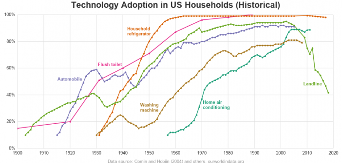
We've had record high 90+ degree temperatures here in the southeast US this past week (September / October), and it has made me appreciate having an air conditioner. Indeed, air conditioners were pretty much invented here in North Carolina (see Eric Cramer). They are used in pretty much every building

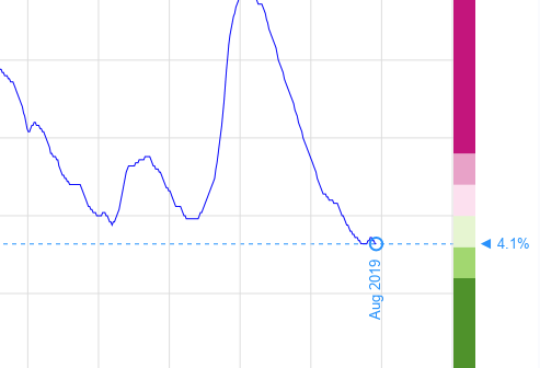
Lately we've been hearing a lot about "record low unemployment" in the news. Being a data guy, I wanted to see it for myself. Follow along as I create some custom unemployment graphs from the official data for California and New York (two of our most populous states). Or, if

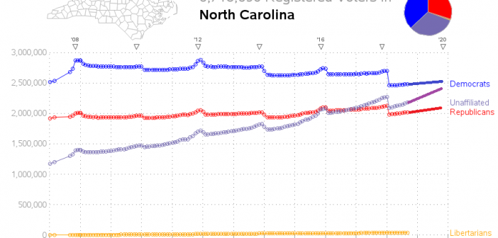
North Carolina is one of those key "swing states" that might possibly decide a national presidential election. And with such an election coming up next year (2020), I thought I would have a look at the voter registration data to see how it has changed since the previous presidential election
