Graphically Speaking
Data Visualization with a focus on SAS ODS Graphics
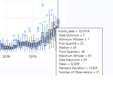
I saw an article that claimed Donald Trump recently tweeted 123 times in one day. This got me wondering how many times he typically tweets during a day, and whether this number has changed over the years. This seems like it might be a good topic to analyze with a

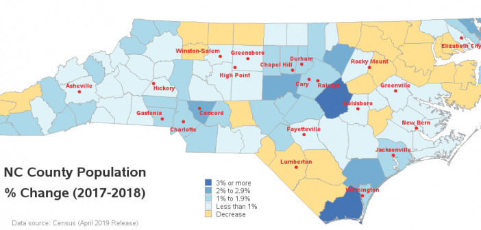
I can tell that my area (Wake county, NC) has a growing population, because the traffic keeps getting worse and worse. But it's a little difficult to quantitatively gauge growth by looking at traffic congestion. Therefore let's have a look at a more direct measurement - the actual population data!

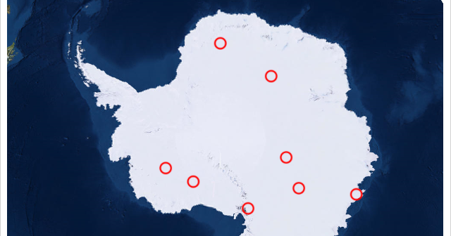
As we're getting into December, and the weather is getting colder, I thought it would be cool to plot some Antarctica data. You might remember I did this about 1.5 years ago, using good-old Proc Gmap, a special projection, and lots of tricky annotation. Well, this time let's use the
