Graphically Speaking
Data Visualization with a focus on SAS ODS Graphics
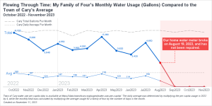
Have you ever been curious about your monthly water consumption and how it compares to others in your community? Recently, I had this question and decided to get ahold of my family's water usage data for analysis. Harnessing the power of data visualization, I compared my family of four's monthly

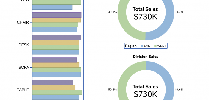
The Graph Template Language (GTL) is a powerful tool for creating a wide range of graphic displays. One feature GTL has is the ability to combine independent plots together into one paneled display. The SG procedures have some limited capabilities in this area; but in this post, I am going

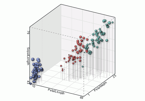
SAS SGPLOT already provides the necessary graphical elements for complex visualization. 3D or high-dimensional data can be easily visualized after being projected appropriately. With SAS' strong support for animation features, SAS users can create complicated 3D or high dimension visualizations quickly.


