All Posts


Appetizers usually play a significant role in ensuring a good restaurant experience…right? A good appetizer whets your appetite and gets you psyched and excited for the main course! This series of blog posts aims to do just that…whet your appetite for what’s in store at SAS Global Forum. In the
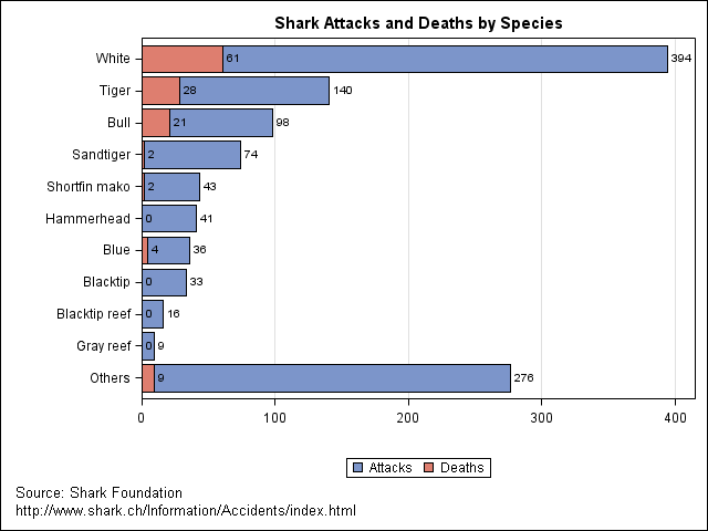

The Junk Chart blog discusses problems with a chart which (poorly) presents statistics on the prevalence of shark attacks by different species. Here is the same data presented by overlaying two bar charts by using the SGPLOT procedure. I think this approach works well because the number of deaths is

Over at the SAS/IML Discussion Forum, someone posted an interesting question about how to create a special matrix that contains all combinations of zeros and ones for a given size. Specifically, the problem is as follows. Given an integer n ≥ 1, produce a matrix with 2n rows and n


Most people don’t think about government when they hear the word “innovation”, but it’s happening, and has been since long before “The Great Recession.” However, the current economic conditions have certainly moved things along. Government responds very similarly to private industry when faced with challenges. SAS manages to do relatively

It's a New Year and I'm ready to make some resolutions. Last year I launched this blog with my Hello, World post in which I said: In this blog I intend to discuss, describe, and disseminate ideas related to statistical programming with the SAS/IML language.... I will present tips and
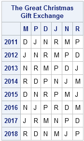
In many families, siblings draw names so that each family member and spouse gives and receives exactly one present. This year there was a little bit of controversy when a family member noticed that once again she was assigned to give presents to me. This post includes my response to


Many years ago I served as the program manager for the NC Alternative Fuel Vehicles program. The goal of the program was to promote the usage of various vehicle types that were alternatives to gasoline powered vehicles. One of the main programs in this set of grants was the Clean


A customer phoned up SAS Technical Support the other day with a problem. (Yes, that happens occasionally...) When he ran a certain program through SAS Enterprise Guide, the program didn't seem to complete and no results were returned. Here is a snippet of the program (modified a bit to make
When I wake up early to write my blog, I often wonder, "Is anyone going to read this?" Apparently so. I started writing The DO Loop in September, 2010. Since then, I've posted about 60 entries about statistical programming with SAS/IML software. Since this is a statistical blog, it is

You might be too young to remember Clara Peller. She was the star of a series of fast-food burger commercials in the 1980s, in which she demanded meatier meals by shouting "Where's the beef?" at the pickup counter or drive-through window. Alas, the competitor restaurant meals were afflicted with "Fluffy


When I joined SAS Institute I had no knowledge of SAS. I studied, researched and practiced. The questions I asked would make even the most seasoned programmer blush a beetroot red! Those were an intense nine months—I’ll tell you more in a later post about the learning system at SAS
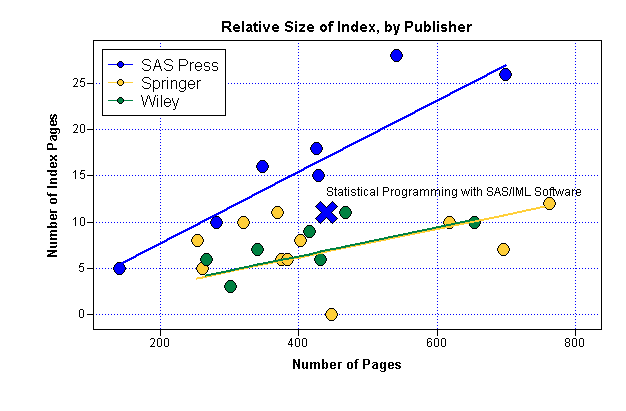
When I finished writing my book, Statistical Programming with SAS/IML Software, I was elated. However, one small task still remained. I had to write the index. How Long Should an Index Be? My editor told me that SAS Press would send the manuscript to a professional editor who would index


Paula Joshi wrote last month about how what we learn from the commercial world can be applied in government. She also promised to post a few examples. I’ll get that ball rolling. This week SAS announced the availability of SAS Enterprise Case Management. While the announcement focuses more on the
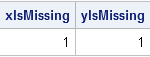
Recently, I needed to detect whether a matrix consists entirely of missing values. I wrote the following module: proc iml; /** Module to detect whether all elements of a matrix are missing values. Works for both numeric and character matrices. Version 1 (not optimal) **/ start isMissing(x); if type(x)='C' then
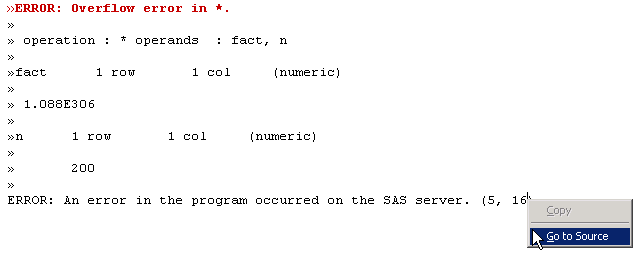
NOTE: SAS stopped shipping the SAS/IML Studio interface in 2018. The references in this article to IMLPlus and SAS/IML Studio are no longer relevant. There are three kinds of programming errors: parse-time errors, run-time errors, and logical errors. It doesn't matter what language you are using (SAS/IML, MATLAB, R, C/C++,