All Posts


In September 2010, I questioned whether you should care about native 64-bit client applications (or the lack thereof). At the time, SAS did not have a 64-bit version of SAS Enterprise Guide or SAS Add-In for Microsoft Office. A skeptical reader might assume that I was just trying to make


When I first attended SAS Global Forum, you had to wait until you arrived at the conference to get connected with other attendees. There wasn’t a good way to find out in advance who was going to attend or what they were interested in. And if you weren’t attending for

A user recently posted a question in the SAS communities forum about how to best display two measures by one classifier using a Bar-Line graph, where the scale of the two measures is vastly different. This got me thinking about various different ways to represent such data. Here are some of my thoughts,


A 23-year Harvard and Columbia University study was recently published shedding new light on the long-term impacts of teachers with both high and low value-added estimates. Researchers Chetty, Friedman, and Rockoff tracked math and reading assessment data on over 2.5 million students from 1989-2009. They then incorporated 90% of these
The topic of cluster groups comes up often. By cluster group I am referring to the feature in bar charts where the group values are displayed side by side. With SAS 9.3, SG Procedures support stack or cluster grouping for Bar Charts and overlay or cluster grouping for all other

There may be some of you who don't remember this song, but in high school and early college it was one of my favorites. "Get a haircut and get a real job," by George Thorogood and the Destroyers, really spoke to the rebel in me. Most of my rebellious days are behind

In a previous post I showed how to implement Stewart's (1980) algorithm for generating random orthogonal matrices in SAS/IML software. By using the algorithm, it is easy to generate a random matrix that contains a specified set of eigenvalues. If D = diag(λ1, ..., λp) is a diagonal matrix and

“When I started using predictive analytics in 1991, I had a desktop computer with a 600 megabyte hard drive running SAS® 5.0 something,” said Olivia Rud, respected business intelligence thought leader and author of Data Mining Cookbook: Modeling Data for Marketing, Risk and Customer Relationship Management. Technology has vastly improved
ODS Graphics system was initially motivated by the need for high quality graphs for SAS Base, STAT, and other analytical procedures. Use of SG Procedures, ODS Graphics Designer and GTL by users too has initially focused on analytical graphs. But just like wheels on carryon bags that started for the specific needs of flight


Did that set off a trigger for you? It did for my SAS SQL 1: Essentials class, packed with SQL and SAS programmers alike. To clarify matters I pulled up some examples to help get the differences quickly. Set operators and Joins are similar in that they both combine multiple
Earlier this week I described a common programming pattern in the SAS macro language. The pattern sets up a loop for processing each distinct value of a classification variable. The program uses the PROC SQL SELECT INTO feature to populate SAS macro variables. The effect: you can roll your own


As public safety officials leaf through their favorite criminal justice periodical they are greeted with pages and pages of analytics advertisements. These ads are laden with promises of robust and scalable solutions, improved efficiencies and, yes, the promise of prediction. While reading the advertisements, the mental conversation may go something
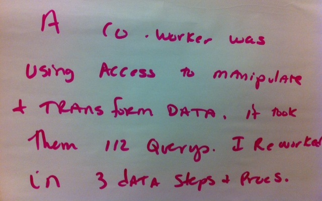
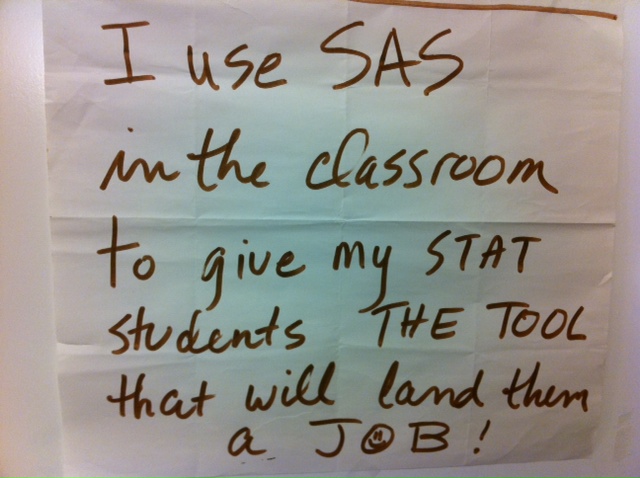
I think this DATA step Post-It author may be a bit like my mother. When I was a child, my mother was always coaching me on two things: being independent and being efficient. I believe those are the two traits she considered most admirable in a person. It's little wonder
Creating a graph that looks nice, with readable, high resolution fonts is important and should be easy to do. With SG procedures and GTL, this is easy to do with a simple option, but not the default. Creating a high resolution (image) for a graph consumes higher system resources. When working on a graph,
How to write a SAS macro program to repeat your SAS processing for each value of a BY grouping variable.