All Posts


Who's gearing up for SAS Global Forum? I am! I am! (waving my hand enthusiastically.) I'm excited about this conference because that's when I get to meet so many potential authors. Folks come by with ideas they've had percolating for years (or sometimes weeks, days or hours ... the length


Many of us will travel domestically to SAS Global Forum, but some will travel across the border. Regardless of where you are traveling from, everyone who attends will have an opportunity to get a stamped passport at the conference. This year we are bringing a SAS Passport Program - It’s


PROC STP is a new procedure for SAS 9.3 Stored Processes. It's so new and different that I have not had the opportunity to use it yet in a customer engagement. When writing about it for the now released "The 50 Keys to Learning SAS Stored Processes" book, I had

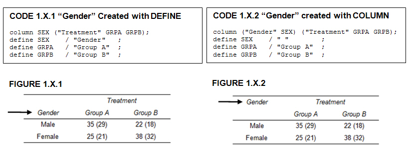
Recently, a user asked about creating a Bar Chart of Value by Date, where the dates are displayed on a scaled interval axis. Consider this simulated data set of value by date and treatment shown below. This data set only has one value for each date and treatment combination. We can use the VBAR statement

You could easily become overwhelmed by the number of presentations available at SAS Global Forum. But the savvy SAS Global Forum attendee knows how to select the most suitable sessions in a snap. How?
ODS Graphics have matured. With SAS 9.2, GTL and SG procedures were a new direction for creating analytical graphs in SAS. The motivation and design of the GTL framework and the SG procedures was driven primarily by the needs of the procedure writers within SAS to enable the automatic creation
Watch live streaming video from sasglobalforum2012 at livestream.com I have 8 days before I board my plane for Orlando; 9 days until SAS Global Forum officially kicks off with Opening Session; 10 days before the first official mixer with all of my SAS friends; 11 days before the Kickback party,

I’m a SAS user in the Pharmaceutical industry. I switched to the Pharmaceutical industry (from Marketing Research) four years ago and had a lot to learn! I started my new endeavor by purchasing some excellent SAS books, joining my local SAS user group, attending conferences (Michigan SAS User Group, PharmaSUG,
Today, I have truly taken a chapter from the book - perhaps in more ways than one. I happened to notice that Art Carpenter's most recent book is titled, "Carpenter's Guide to Innovative SAS Techniques." Of course, you know that linking innovation and SAS are going to be a trigger

[cue movie trailer voiceover guy] In a world where tabular data is too difficult to read and interpret, an unlikely hero is born. A small chart learns how to share BIG meaning. From humble beginnings as a SAS macro, SPARKY changed the world.
I'm sorry to say that there will be no "Dummies around Me" smart phone app for SAS Global Forum this year. That means that if you want to catch up with me, you'll have to do it the old-fashioned way: plan to be in the same place that I am,

The bookstore is a happening place at SAS Global Forum. You can shop onsite and save money on books, mingle with 30+ SAS authors, try to win giveaways (hint: follow @SASPublishing on Twitter and monitor the SAS Global Forum hashtag #SASGF12 and/or enter a couple of surveys) and chat with


Chances are you have at least one paper or research project this semester. If you are using SAS as part of a project, there are some great student scholarship opportunities to allow you to attend a SAS users group conference this year. You can present your work and build your
A recent article in the SAS and R blog was about current winter temperatures in Albany, NY. The temperature data for the recent winter (Dec 2011 - Mar 2012) was plotted on a polar graph. Robert Allison posted an article on displaying the same data as a Polar Graph using SAS/GRAPH . Here is his
A small, North American marketing firm (a division of a much larger international firm that provides data-driven, multichannel marketing solutions) provides its clients with "effective one-to-one marketing and ROI-focused strategies by applying advanced predictive analytics."