All Posts

Let us ring in the new year with something simple and useful. A recent question by a user over the holidays motivated this article on what is likely a commonly used graph. We want to compare the preformance of two categories along with a third measure. This could be something like "How

Today, every organization is running on too few resources - getting it done with fewer people, a reduced budget and less time. Grid computing enables SAS to automatically use a centrally managed grid infrastructure to achieve workload balancing, high availability and parallel processing. Do what once took days in minutes


It’s a time for excitement, laughter, getting together with friends and family, and best of all cookie exchanges! It’s kind of sad that in a few days it will all be over. Does it have to end? Can’t another holiday or event bring about the same feelings? How about SAS


Ron Cody and his supremely helpful book Learning SAS by Example close out our weekly SAS Author's Tip of 2011. Ron Cody is a household name in the SAS user community. And he deserves the moniker on his license plate of "SASMAN". Just mentioning Ron's name at user conferences incites awe. Sometimes
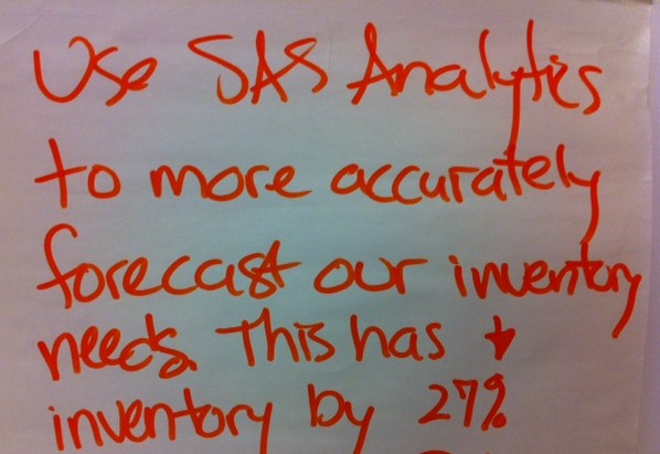
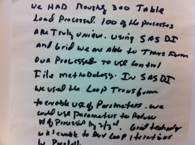
As you probably remember, this innovation series is really Brainstorming 2.0. I've taken the Post-It Notes that SAS users put on the Innovation Wall and reposted them here to help spark new ideas for using SAS. I'm also adding posts here and there when I have an interview with a customer

When I give presentations on using the SG procedures, I try to describe how you can take simple plots and layer them to create more complex graphs. I also emphasize how you must consider the output of each plot type so that, as you overlay them, you do not obscure


2011 saw incredible change in the states as more than half of the governorships changed hands. As expected, that caused significant turnover at the State CIO level, as well. So while executive and technology policies changed in many ways, the dismal budget situation reinforced the need to allocate tax pay
In Simple maps can go a long way, we discussed some techniques to create simple outline maps from map datasets in the MAPS library using GTL. Now, let us take this a step further to do something more useful with this feature. For some graphs, the map information is an essential part of the
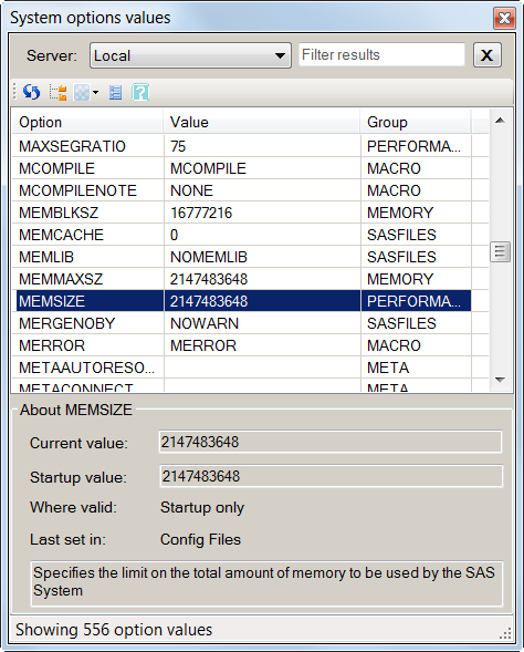

On the heels of the release of the popular SAS macro variable viewer from last month, I'm providing another custom task that I hope will prove just as useful. This one is a SAS options viewer, similar in concept to the OPTIONS window in SAS display manager. You can download

From the largest corporation to a small startup, data overload can be a crippling problem. Just ask this big guy ... Now you know. Happy holidays!
A new book from SAS Press, "Statistical Graphics Procedures by Example" co-authored by Dan Heath and I has now been published (phew!). For both Dan and I, this was our first foray into writing a book, so it was highly educational to say the least. The key idea behind the presentation

After my November blog post about achievement gaps between affluent and poor students, Newt Gingrich cast some renewed energy on the topic with his inflammatory comments about poor children at a Dec 1st GOP debate. In case you missed his remarks, here is the quote that sent the media into
Charlie Huang recently posted an article on a new way to draw maps using SGPlot procedure. The basic idea is simple, just use the SCATTER statement to plot the (x, y) points from the data sets in the MAPS library. The GROUP option can be used to color the markers for each

SAS Press prides itself on being a place where users come to help other users. Collaboration is key here—not just between authors and the SAS Press team, but among authors alike. So we asked two of our authors, one experienced and one currently working on his first book, to share


Since joining SAS, I no longer run screaming from social media, blogs, etc. In fact, I embrace exploring different mediums to highlight how SAS is assisting today’s law enforcement. To that end, and in recognition that sometimes less is more, I give you this short intro. SAS continues to push