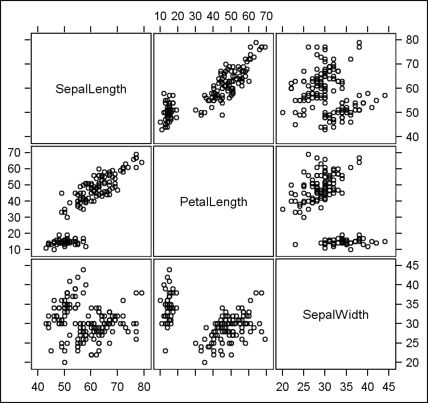
The Scatter Plot Matrix statement supports a couple of different configurations. The basic is the N x N panel of cells, with each cell showing scatter plots plot for a pair of variables at a time. Here is an example of a 3 x 3 scatter plot matrix for the IRIS data set.
Proc SGSCATTER Code for 3 x 3 Matrix:
proc sgscatter data=sashelp.iris;
  label sepallength='SepalLength' petallength='PetalLength';
  label sepalwidth='SepalWidth' petalwidth='PetalWidth';
  matrix sepallength petallength sepalwidth;
  run;
The diagonal elements contain the variable names, and each row and column have the axis range shown alternatively on each side of the plot. This plot type is useful to view not only the associations between the variables, but also keep the data ranges in context.
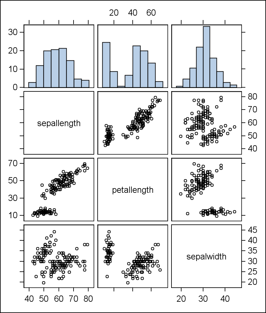
A second configuration draws a distribution plot like a histogram in the diagonal element for each variable. Since the diagonal cells are used up, the variables for each plot are moved to the outside. Here is an example of a 4 x 4 scatter plot matrix with histograms.

Proc SGSCATTER Code for 4 x 4 Matrix:
proc sgscatter data=sashelp.iris;
  label sepallength='SepalLength' petallength='PetalLength';
  label sepalwidth='SepalWidth' petalwidth='PetalWidth';
  matrix sepallength petallength sepalwidth petalwidth/ diagonal=(histogram);
  run;
In this configuration, the histograms are displayed in the diagonal cells, and the variable names or labels are shown along the side and top of the graph. The axis ranges are not displayed as they apply only to the data axis, and not to the response axis of the histogram.
Recently, two different SAS users expressed interest in viewing a scatter plot matrix that showed both the histograms and the data ranges. We sent them the suggestion shown below. When Rick Wicklin also asked a related question, I thought it was time to follow up with an example. In my opinion, a good configuration would be to place the histograms along the top, so the analysis (X) variable of each histogram is common with the scatter plot X variable. The response (percent) axis for all histograms can be made uniform.
Such a scatter plot matrix can be created using the Lattice layout container in GTL. Here is such a graph:
The complete SAS 9.2 GTL program is included below. This can easily be extended for higher order matrices and converted into a macro (for a future post).
Full SAS 9.2 Program: MatrixTopHist


4 Comments
I like it! Thanks for taking the time to work this out.
Very cool stuff
Very nice, but what do you do when you have 50 variables?
For that many variables, I wouldn't use a scatter plot matrix. I would write a macro that created "thumbnail" fit plots of the variable crossings (no scatter points or axes), laid out in a 50x50 grid. This grid gives you a "feel" for the data, much like a scatter plot matrix. The fits help you spot odd trends that you might want to investigate further. Hope this helps!